Breaking Down The Color Systems
Table of Contents Show
Over the years in my career as an in-house graphic designer, I mentored a few newbie designers who couldn't remember when to use CMYK or RGB, and had never even heard of Pantone colors before.
Since the terminology isn't exactly straightforward, I'm going to lay it all out on the table here, explaining it in the most basic way I know how.
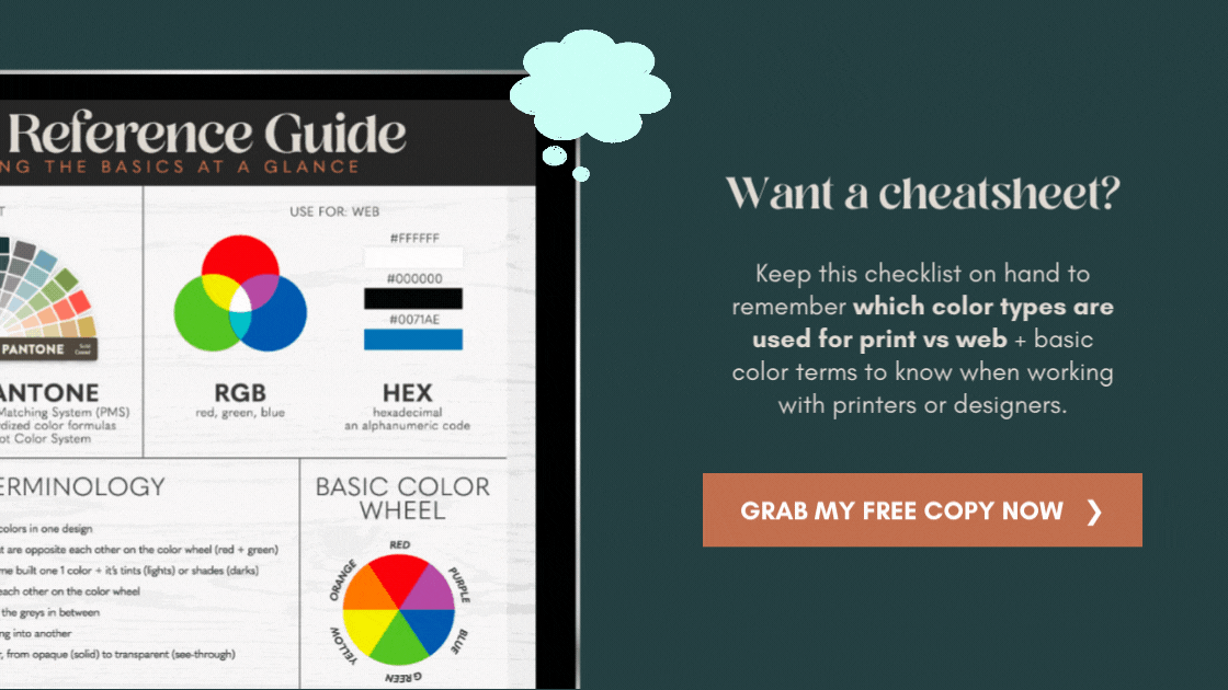
➕ I've included a FREE color guide you can download & use for reference later if you forget what you read today!
with overlapping blocks of color, we can create a lot of new colors using only 4 colors total
CMYK ✦ Print
Cyan, Magenta, Yellow, Black
CMYK is best used for printed designs that don’t need to be extremely color accurate. For more color accuracy, you’d need more than just these 4 colors.
In my previous post, 6 Common Design Terms Explained, CMYK is a subtractive color system that typically works the best on a white base, like white copy paper. There is no White ink in this color system. If your CMYK image is printed on anything darker than White, the printed colors in your image will appear incorrect. The colors will vary based on how dark the paper is (green printer paper vs. a thin sheet of brown cardboard, or cream resumé paper, etc.).
How do just 4 colors make up our printed images? They use a series of dotted patterns. Each dot being only 1 of the 4 colors, which overlap and print in varying distances from the other dots, which tricks our brains into blending & then seeing solid colors from further away. If you use a magnifying glass to look closely at a printed image, you may be able to see these tiny dots for yourself, but here’s an example you won’t need a magnifying glass for:
Closeup of a CMYK print:
showing how the colors work together to create perceived colors on the page
Here's an example:
Your printer prints out a light pink color on the page. The actual Magenta ink color in your ink cartridge never changes; the printer doesn't mix up new ink colors for each print. That Magenta appears lighter when there is more space between ink dots on the page, and appears darker with less space between dots. For a darker Magenta, the printer adds varying patterns of Black ink dots on top of the Magenta ink. The closer the Black dots, the darker it will be, etc. If you want a purple image, then the computer tells the printer to add varying patterns of Black and Cyan ink on top of the Magenta.
You can also simulate this process on your own with a set of fine pointed markers. You can overlap color dots to manually recreate the process your inkjet printer uses, for example:
• a lot of Magenta + a little Yellow = Red-Orange
• a little Cyan + a lot of Yellow = Lime Green
Again, you can control the colors you’re trying to mix together, by simply spacing the dots further apart or closer together. If you want more of a Yellow-Green, then you space the Yellow dots closer together, and the Cyan dots further apart. That gives your brain space between the two colors and allows it to visually blend the colors in our heads! It’s a pretty neat process!
You can also break down any CMYK color by looking to see how much of each ink color is in that space. For example, the CMYK colors that make up this color Teal, are about: 78% Cyan, 10% Magenta, 45% Yellow, and .09% Black.
here you can see the percentages of RGB that make up this color
Zoomed in: pixels on a screen
RGB ✦ Web
Red, Green, Blue
RGB is best used for digital designs. Since our technology’s screens are made up of light and color, rather than ink and white paper, it can’t use the same color display system as our printer's system, because it's a different medium. Now, hang on for a minute, because it gets a little technical here and we’re only covering the basics!
Again, as I mentioned in a previous post 6 Common Design Terms Explained, RGB is an additive system, meaning that as you add colors to each other you eventually get white, and as you remove them you eventually get black.
Since RGB is digital, pixels make up the displayed colors on the screen. Each pixel consists of a box with a Red, Green and Blue bar. Each color bar in that pixel has up to 256 values, 0 being off and 255 being on (full color). That means that each pixel is capable of producing more than 16.7 million color combinations (256 x 256 x 256 = 16,777,216)!

Each pixel’s color combo is either on or off in varying degrees of light, in order to display the objects we perceive on-screen
If the pixel is displaying purple for example, that means both the Red bar and the Blue bar are on, and the Green bar is off (displaying white). To display varying values of that purple, the bars can each be turned on at different values between 0 and 255.
The higher the screen resolution, the more pixels you will have in it, with each pixel displaying it's own color combination to produce the final image you see on the screen.
Here, again, is an example of what RGB combination makes up this color of Teal: 0 Red, 167 Green and 157 Blue.
here you can see the percentages of RGB that make up this color

a physical Pantone color palette card set
Pantone ✦ Print
Pantone Matching System
Pantone is the name of a standardized color matching system first developed in the early 1960's. The most commonly referenced colors seem to be in the Solid’s palette, which consists of about 1800 different colors (which grows a little larger every year). Each color is made up of a 3 or 4 digit number, followed by a C (Coated), U (Uncoated), or M (Matte) suffix.
On the Fan Deck for each palette, there is a formula under each swatch, which shows the printer the exact formula required to create that color. This makes it easy for designers to give the printers very specific colors to be used in the print production process.
Using the Pantone system, designers can ask printers to use red 185 C (for example), and as long as the formula is mixed correctly, the ink will appear exactly that color no matter where it's used. It’s a great system for companies that use specific colors in their company branding, marketing and print materials, who also want to maintain consistency in those colors.
There are also Pantone swatch cards that show the makeup of each color in RGB, etc., which is very helpful in displaying a color closest to the chosen Pantone color.
On a side note, higher-end inkjet printers can use additional color cartridges (aside from the basic CMYK colors), which gives it better Pantone color matching capabilities. These printers can print Pantone colors and can produce more brilliant colors on paper, than a basic CMYK inkjet.
Pantone colors can also be referred to as spot colors, and are used a lot in the screenprinting industry to simulate CMYK process color for prints that appear to be full color (more on that process in another post). This is useful for printing a photograph or design on a t-shirt, or a company logo in a specific set of colors, for example.

Pantone Connect (Adobe extension)
If you want your own set of Pantone color swatches, visit their website.
PRO TIP (2022) ::
Prior to 2021/2022, Pantone always had their own color palette in Adobe apps as a built-in feature.
Now they’re moving toward a subscription model and have removed many of their “color books” from the built-in color libraries.
Going forward, to access the digital Pantone color chart inside Adobe Illustrator, you may need a subscription to Pantone’s Connect extension in Creative Cloud, though it appears some piece of it may be free. I’m not in the print industry anymore so I don’t need these & haven’t investigated further enough to say for certain. 🙃
Use something like Code Beautify (free) to find a close Pantone color to your HEX color code