

Color Palettes & …Brand Personality?
Table of Contents Show
Today, I’m diving into the absolutely captivating realm of color and how they can play a crucial role in supporting a brand's visual personality.
Today’s post works best as a video so you can see the examples as I walk through them, but if you don’t have time, you can get the gist of it in the post below.
So, grab a cup of coffee (or chai!), get comfy, and let's dive straight in.
The Color Strategy: choose colors that support your brand’s character traits
When it comes to crafting a brand's color palette, it's not just about picking pretty colors. It’s not even about selecting your favorite colors, or colors that you personally like. –It could be, but it’s not centered around those things.
Instead, the strategy for choosing a brand’s color palette requires some planning & strategy behind each color (however many there are) and how they align as a group with the brand's personality, or overall “vibe.”
So basically, before you can even THINK about picking colors to use in a logo or a website, first we need to figure out the brand’s personality & character traits, in order to help us form an effective strategy for a curating a color palette that will SUPPORT that “vibe” and not push against it or rebel.
You’ve probably seen one of these brands before, but maybe you weren’t sure why you didn’t like it. If you think back now, I wonder if it was because the character traits you perceived them to have did not match how they presented themself, and so it their website or their store or their branding –felt disjointed and inauthentic.
It’d be like a photographer who has a website that has a light & minimalistic neutral color palette with pops of pink, saying she specialized in weddings with goth or horror-fan themes. It just doesn’t jive, does it? 😂
As a designer who THRIVES on working with vibrant brand personalities, I know the importance of crafting a color palette that actually resonates with the brand's identity and characteristics. Each color is carefully selected so that together, they support the overall FEELING of those traits.
Basically, we have to be the translator for the brand's “essence” so that their visual elements can visually speak as loudly as the text does, and that the two support each other. The right copy, with the right set of colors.
How I Choose Colors for a Brand’s Color Palette
Let’s start by breaking down the science of color, and start with base colors that each have their own “feeling” in their most standard and recognizable color.

a basic color psychology chart
Most people will agree that:
Yellows can either feel warm & optimistic, friendly & vibrant, –or cautionary & anxious.
Oranges can either feel friendly & happy, –or frustrated & immature.
Reds can either feel youthful & bold, exciting & passionate, –or angry & painful, warning signs.
Purples can either feel imaginative & creative, wise, –or superior & excessively extravagant.
Browns can either feel earthy & serious or authentic, –or dirty, sad & humorless.
Greens can either feel healthy, peaceful & represent growth, –or envious, sick, and stagnant.
Blues can either feel strong, trustworthy, & dependable, –or cold, emotionless, & depressed.
Blacks can either feel sophisticated, powerful & authoritative, –or evil, sad & oppressed.
Greys can either feel calm, balanced & neutral, –or depressed, bland & insecure.
White can either feel clean, simple, open & sophisticated, –or empty & sterile.
So the goal is to pick a group of colors that play on the STRENGTHS as a group, so that viewers perceive only the positive character traits & feelings you want the brand to have, and none of the negative ones.
In other words, they must support each other in this effort!
Let’s Look at Brand Personality Examples


From my own website's vibrant & strong color palette to client projects like Katherine’s with the soft & muted tones used in The Cotton & Crown Co., each color in both palettes serves a particular purpose. Whether it's creating a soft and inviting ambiance or making a bold & unorthodox statement, every color contributes to the overall brand narrative, and –for lack of a better word– “vibe”.
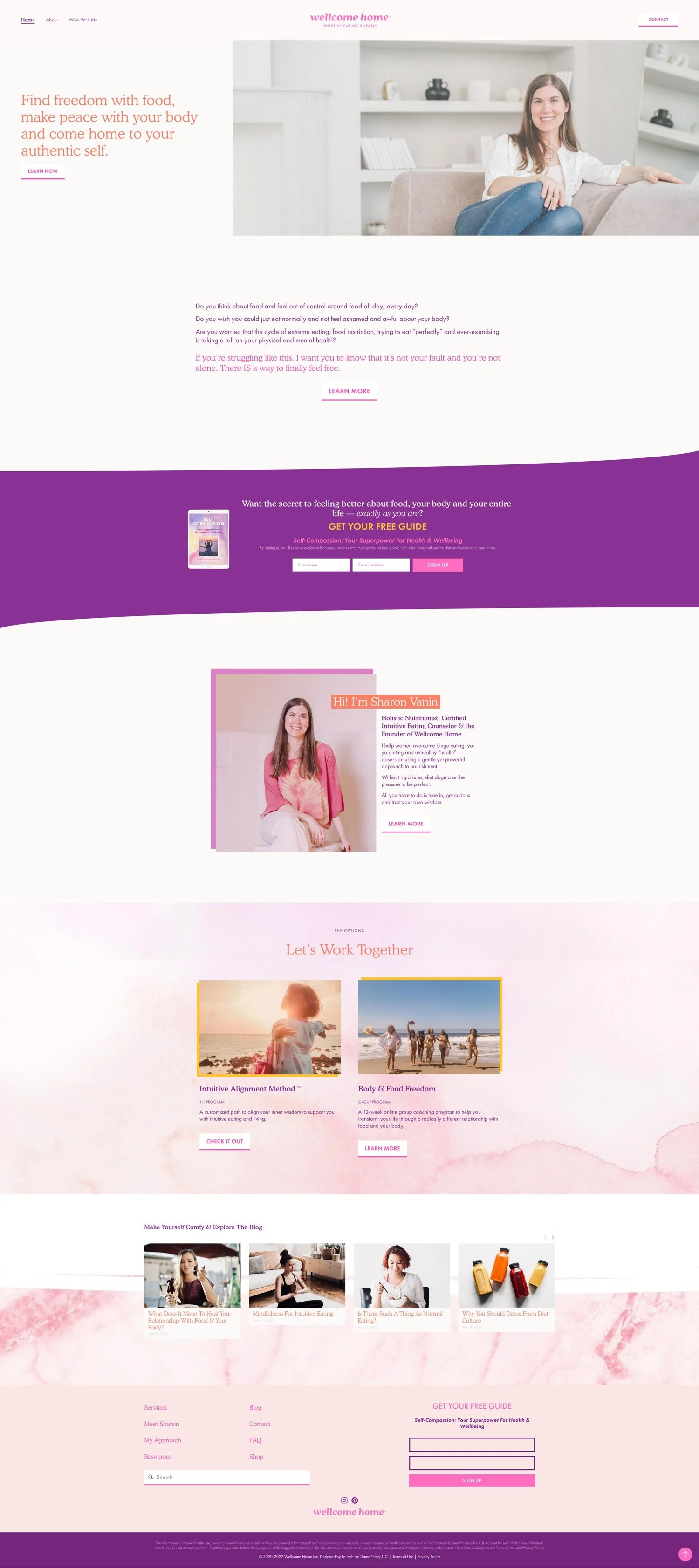
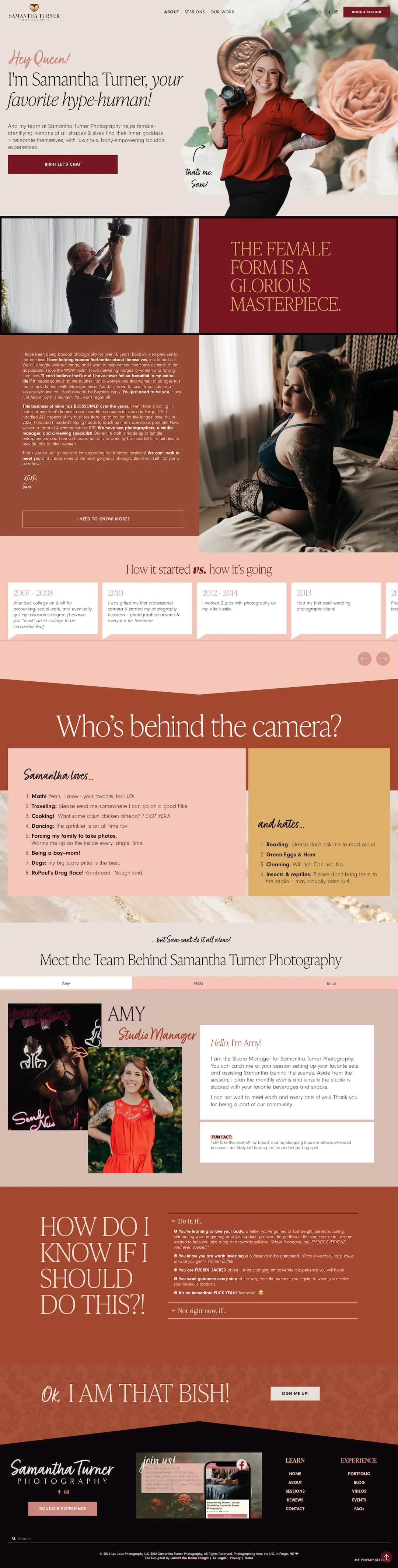
From Fred's Oral Prep to Samantha Turner's earthy and bold palette, each brand tells a unique story through colors, and it’s one we don’t have to “read words” to understand. Whether it's infusing humor into a brand with fun pops of high-saturated & youthful colors or creating a calm and soothing vibe with blues & greys, the chosen color palette speaks volumes about the brand's underlying personality AND the brand’s intended audience.
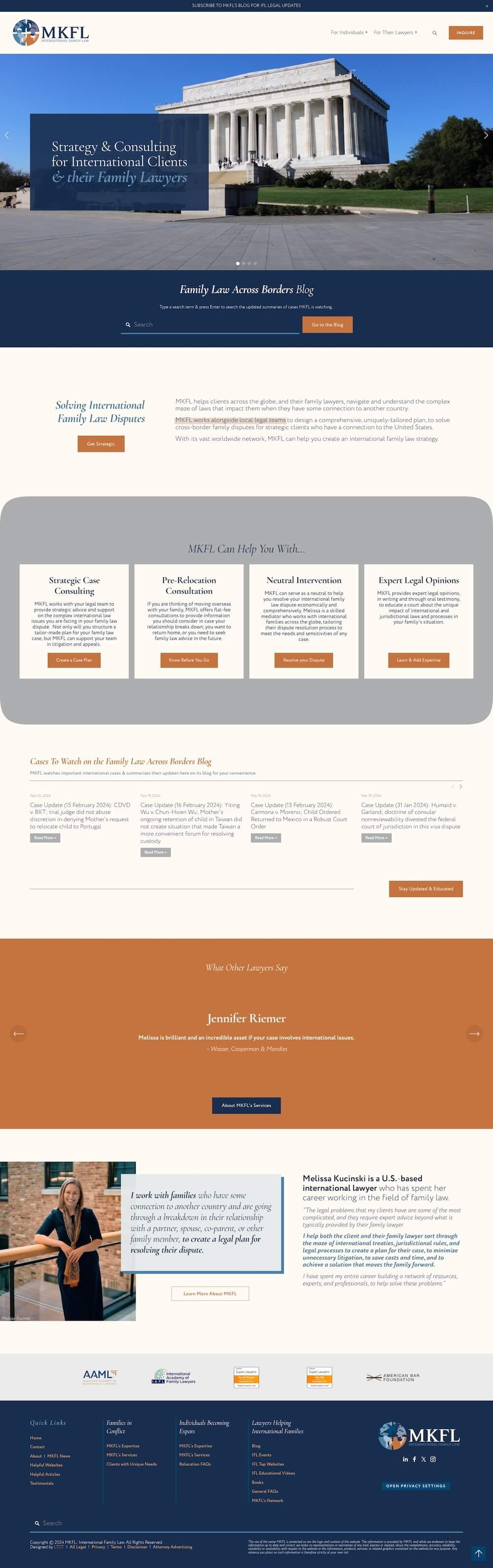
The color choices for an international family law attorney's website should take on a more somber and professional tone, versus the creative & wise but vibrant colors used in Wellcome Home, a nutritionist’s website.
For Melissa, her family law attorney’s website, the focus was on striking the right balance between conveying authority and instilling trust.
While Sharon, the nutritionist, was starting her practice to focus on helping others with their health; her passion was infectious & she wanted her creative passion for helping others to shine through the pages on her site, specifically also to make weight loss & health management feel less scary & overwhelming.
We can also see a before-and-after with Kim’s website, Grown Girl Divorce. This is another family lawyer, but focusing on divorce-related education for women of color. The color palette she had before felt too vibrant for the somber subject matter, but the after is feminine & mature. The difference between that family attorney and Melissa’s family law website is STARK, –but they were created for different audiences and should represent very different feelings for each one!
Finding the Perfect Palette
Landing on the perfect color palette is a legit journey starting with research & asking the client a LOT of questions.
From questioning the client about how they want their brand to feel (which can be an interesting feat in & of itself!), to pinning a bunch of shit to create a moodboard where you eventually find the gems, to tweaking saturation levels & adding complementary colors or removing conflicting ones, –the process of refining a color palette is both art AND science.
To create an effective palette, you have to create a blend of colors that evoke the desired emotions and resonate with the brand's essence, –together.
The Impact of Color on Branding
As we wrap up this nebulous world of assigning humanistic character traits to colors, ––which on the surface sounds ridiculous if you’re new to it, I know!–– remember that the colors you choose for your brand are more than just visual elements. For successful brands, those colors are not just used in the color, they’re also in the supporting graphics, text, images, and more.
Together, they have the power to evoke specific emotions, convey strategic messages, and shape perceptions of the brand ––within a glance or single interaction with it.
So, when you pick your brand’s colors, make sure to take a moment to reflect on the personality you want your brand to have, then let the colors weave their magic & do all the talking. 😉
