How I Create & Apply Color Palettes for Custom Websites on Squarespace
Table of Contents Show
Today, I’m going to walk through the process of using my client’s homework to create color palettes for web designs on Squarespace (or any platform).
Specifically, I'm going to share my detailed process of building color palettes for my custom website clients and how I use these palettes to breathe life & personality into their Squarespace web sites.
The Importance of Understanding Your Client's Color “Vibe”
Colors have FEELINGS. Maybe not for everyone, but they do for me and hopefully you too or this process will be a lot harder for you!
To figure out what each client’s brand “vibe” or feeling is, part of their homework is focused on defining their personality & their brand’s personality. I'm super curious about the difference between who they are as a business owner and the kind of personality they want their business to portray.
I hit them with a series of questions - about 30 of them. Now, I can't share the exact worksheet I use, because I got it from my time in Booked Out Designer by Elizabeth McCravy, but don't worry, I've got another source lined up for you further down, so keep reading!
I also get my client’s to think about physical spaces rather than websites for design inspiration, because once you've seen something, it's tough to unsee it, and I definitely don't want to unintentionally copy something I've seen before in their inspiration/mood board from their homework.
So, that's part of the early stages of a website project. By the time I'm ready to pick the color palette, I've got all their answers in my back pocket (in their client portal’s homework section) which helps me start with the right focus and speed up the color-picking process.
Using Pinterest for Inspiration
Armed with a solid understanding of my clients' personalities and vibes from their homework, I open their Pinterest mood board (part of their homework).
My clients create a pin board for me, filled with images that resonate with various aspects of their style and what a physical space might look like if their website had a physical lobby to invite their clients/customers into. It could be filled with anything from their favorite color combinations, to images of interiors that inspire them, font styles & color palettes they’re drawn to, quotes, and more.
The more pins, the better! Because this board serves as a visual mood board and allows me to identify patterns and color preferences the more they’ve pinned. On average, clients pin between 20 and 50 different images, usually closer to 30 total, so I don’t need a massive inspiration board for this process to be effective!
With about 30 pins, I can start to see repetitive traits and patterns, which colors are appearing the most, what trends are obvious, what are the pops of color, what kind of textures & patterns, skin tones, font choices, verbiage in any pins with words, or metallic tones (lean toward silver or golds?), and other things like that.
Crafting the Perfect Color Palette with Coolors*
Once I've gathered enough inspiration, I bring out my favorite tool: Coolors.
Coolors is a fantastic platform that I’ve literally been using for years to build color palettes and have at least a hundred color palettes saved in my account from past projects.
It allows me to create, adjust, and visualize various color combinations in UI design or different types of color blindness and color contrasts, making the process significantly faster & easier.
With a variety of tools including a color contrast checker for accessibility and a feature to visualize the color palette in different design styles from drawings to geometric patterns and various UI design (website, web apps, phone apps, etc), Coolors gives me the flexibility to experiment with different hues while ensuring that the colors remain accessible and visually appealing, and I can make adjustments to the palette while viewing all of that at the same time!
example screenshot of a real client's mood board on Pinterest
Studying a Client's Pinterest Mood Board for Personality Cues
My first step in Coolors* is to study my client’s Pinterest board and look for recurring themes and colors. Once I've picked the pins with the colors & patterns that seem to align best with the character traits they want their brand to have, I'll take screenshots of these pins and open them in Coolors’ Image Picker tool.
Then I use their image color palette picker to select colors from each image and create my own unique palette from the images they selected, whether it’s from a picture of a floral arrangement or an elegant & feminine bathroom design. For me, this part is super fun and feels like play time! 😄
Here’s an example of a Pinterest board from a recent client.
In her board, I saw a lot of floral, pops of gold, pink & black, a pretty strong emphasis on warmer color tones, pinks in particular, some neutrals and pops of red.
Building & Adjusting Palettes in Coolors*
Creating a good color palette always requires some fine-tuning. Once I've uploaded a screenshot from Pinterest into Coolors’ Image Picker tool, I scroll the the pre-chosen options they give me, and manipulate the colors to better match the vibe I'm going for, adjusting the color selections, shifting the hues, changing the order of the colors listed in the palette, and sometimes adding or removing colors. It involves some trial and error, but eventually, I develop a few palettes I'm happy with & move on to the next step.
Here’s what that process looks like step by step:
Screenshot Inspiration:
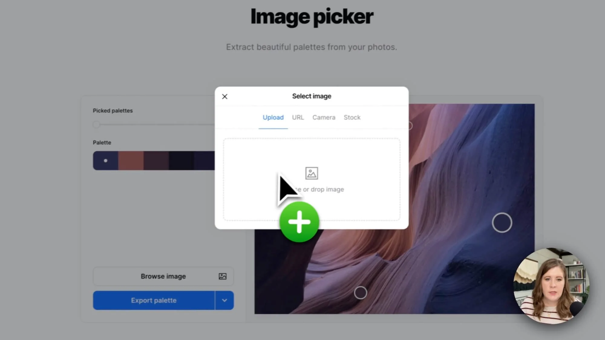
Start by taking screenshots of the images from the client’s Pinterest board that inspire you. These can be anything that resonate with the vibe or feeling the client wants their brand to have. If you're on a Mac, the shortcut for taking screenshots is Command + Shift + 4, which lets you click & drag to select the area you want to screenshot.Jump Into Coolors:
Start building a palette using their Image Picker tool, which you can access from the hamburger menu icon in the top right.Choose Your Image:
Upload one of the screenshots you took from Pinterest to automatically generate some palette options from that image.Slide & Select:
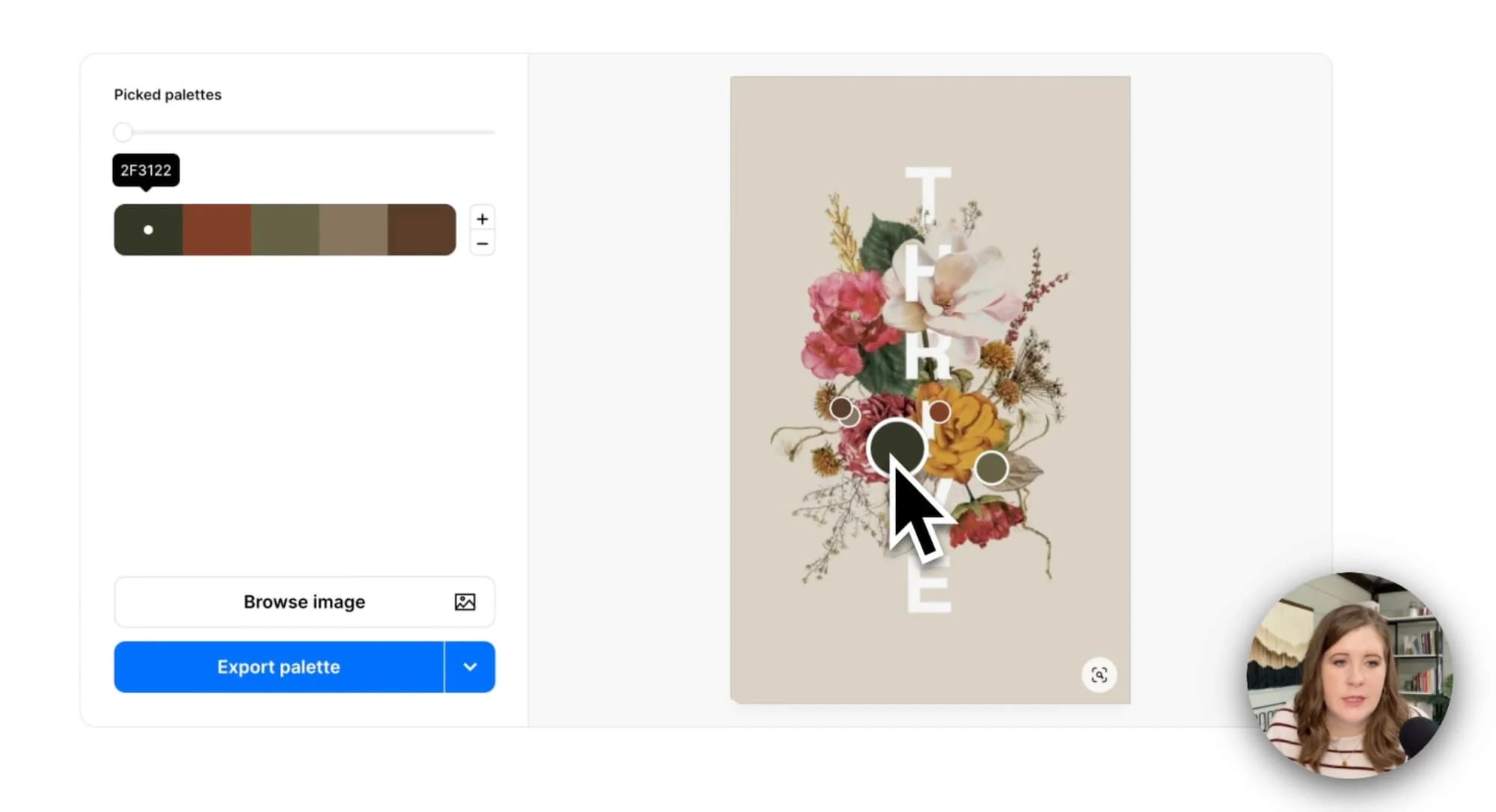
Use the slider to scroll through the various palette options and see if anything stands out to you. It shows where each color in the palette is coming from in the image on the right via those little circles, so move those circular nodes around to pick a color from a different grouping of pixels in the image. If you're not getting the colors you want (maybe you're missing a specific color you’d hoped to include), it's time to save & tweak the colors in the generator.Reorder the Colors:
Swap the color placement around (click and drag to a new spot) to reorder them to get the vibe you want & see how the palette might look in order from light to dark. If you're using Squarespace, remember their palette only has a spot for up to five colors total. Make sure to select colors that have enough contrast between each color & aren’t too similar to each other.Save & Repeat:
Once you're satisfied with a palette option, save it for later and go back to browsing the rest of the options for that image. To save one, click the ⌵ carrot icon on the right of the blue button labeledExport Paletteto open the currently viewed palette from the Image Picker in the Generator (in a new tab) so you can save & adjust it further outside of the Image Picker tool. Repeat this process until you have a number of potential palettes saved outside of the Image Picker.Compare & Contrast:
Open your new palettes and consider which one would work best on a real website. Use Coolors’ Visualizer tool to see how that palette could work in different real-world situations like drawings, patterns, and web apps or websites. While in the visualizer you can further shuffle the color usage in the examples and adjust colors if needed.Check for Accessibility:
Don't forget to check color combinations for accessibility and color blindness! The ratio you’re looking for is at least a 4.5 contrast ratio for that color combination to be compliant with accessibility best practices, which means it has the best chance of being easily readable by the most amount of people.Save Your Palette:
When you're happy with a palette, save it to your account (this capability might depend on your Coolors plan). Give the palette a name, maybe the brand or client name shorthand with a keyword to help you organize multiple palette options for the same client, such asLTDT - bold 1.
There you go! You've created a bunch of unique color palettes. This process is more of an art than a science, so it’ll probably take some practice before you’re comfortable with it & stop second-guessing every decision you make. 😉
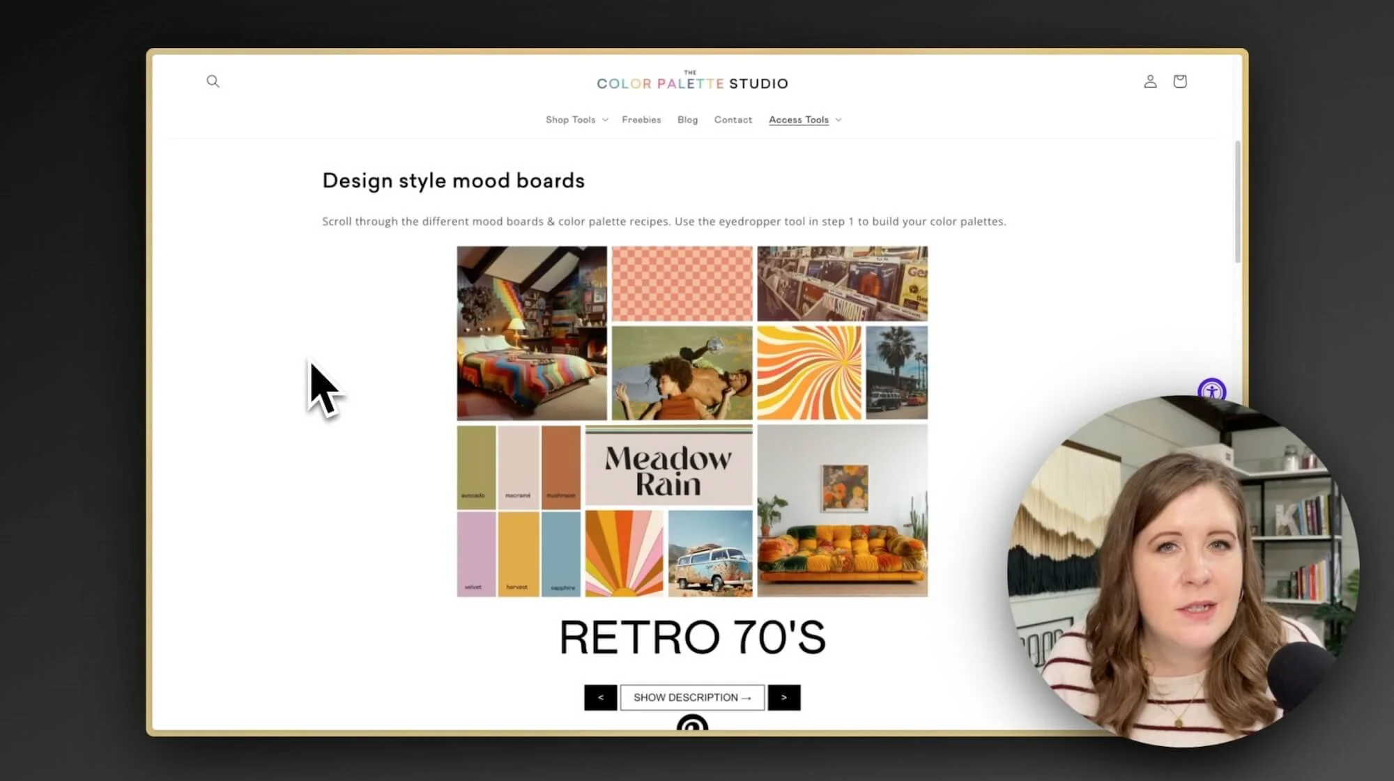
Using the Color Palette Studio’s Builder Tool
I recently stumbled upon the Color Palette Studio’s Color Palette Builder tool, –and before you ask– no I’m not an affiliate for it & they have not sponsored this post!
This tool is a game-changer for anyone who is new to color palette building, because it guides you through the process, helping you pick colors in the right formulas and ensures that your color palette will work in real-world designs WITHIN accessibility compliance.
It even provides the option to quickly name your colors with AI, checks contrast ratios for accessibility & shows which color combinations are compliant, ensuring that your color combos meet current best practices.
Here's how to use it (by itself or alongside Coolors!)*:
Choose a Color Style:
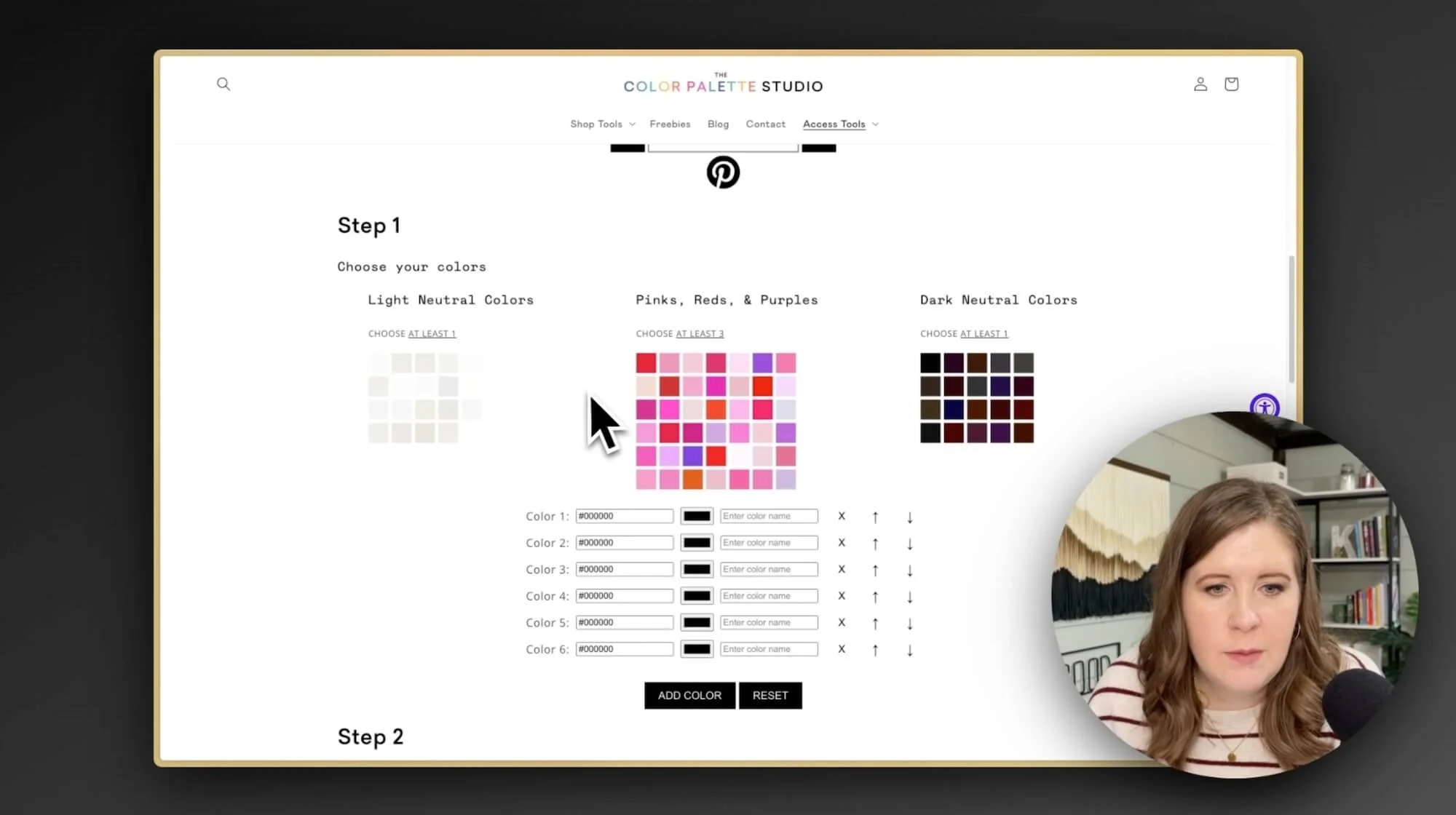
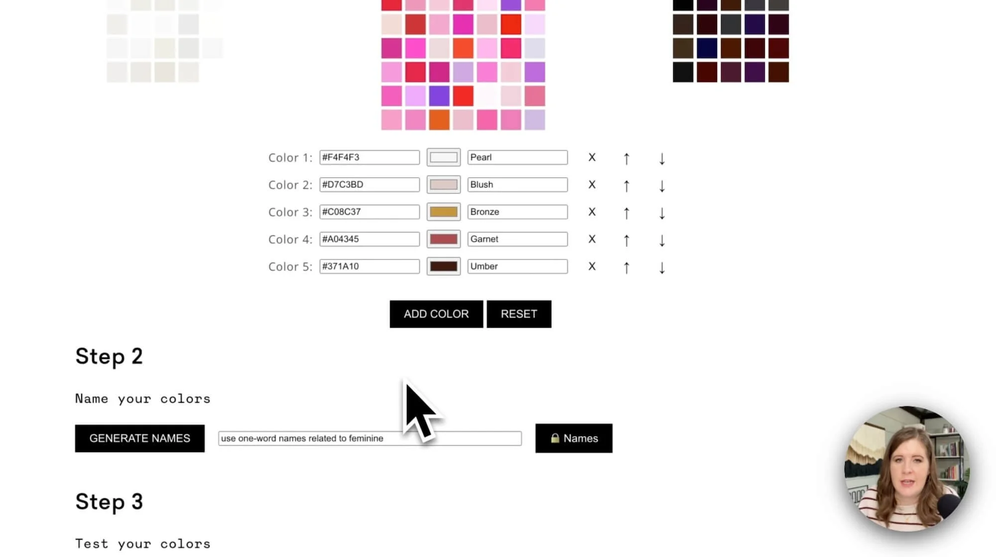
The tool offers around 20-30 different color styles to choose from, displayed in a mini mood board with a description of each style (& more are added frequently!). Select one that aligns the best with the client’s desired vibe.Understand the Color Breakdown:
After you’ve picked a style, the tool breaks down the color styles into light colors, brights, and dark colors, giving you lots of options for each with about 20% of the options being light, another 20% being dark, and the remaining 60% being brighter colors. This formula helps you build a well-balanced palette.Add Your Colors:
Click on a color in each of the 3 sections to add as many colors from each grouping as you want! The colors you click on will appear in the palette list below, and you can reorder, add more or remove them if needed.
If you’re NOT using the built-in colors from a moodboard, don’t click any of the colors from the 3 sections. Instead, go back to the color palette you've created in Coolors, copy the color codes and paste them into the Color Palette Builder tool, adding all the colors from YOUR Coolors palette.
Generate Color Names:
Now, use the AI generator to give your colors fun names! It saves time & effort, and now you don’t have to revert to standard color names that aren’t distinctive, just because you couldn’t think of anything appropriate for each one. 😂 (Coolors will do this for you automatically too, if you don’t use the Color Palette Builder.)Check Accessibility:
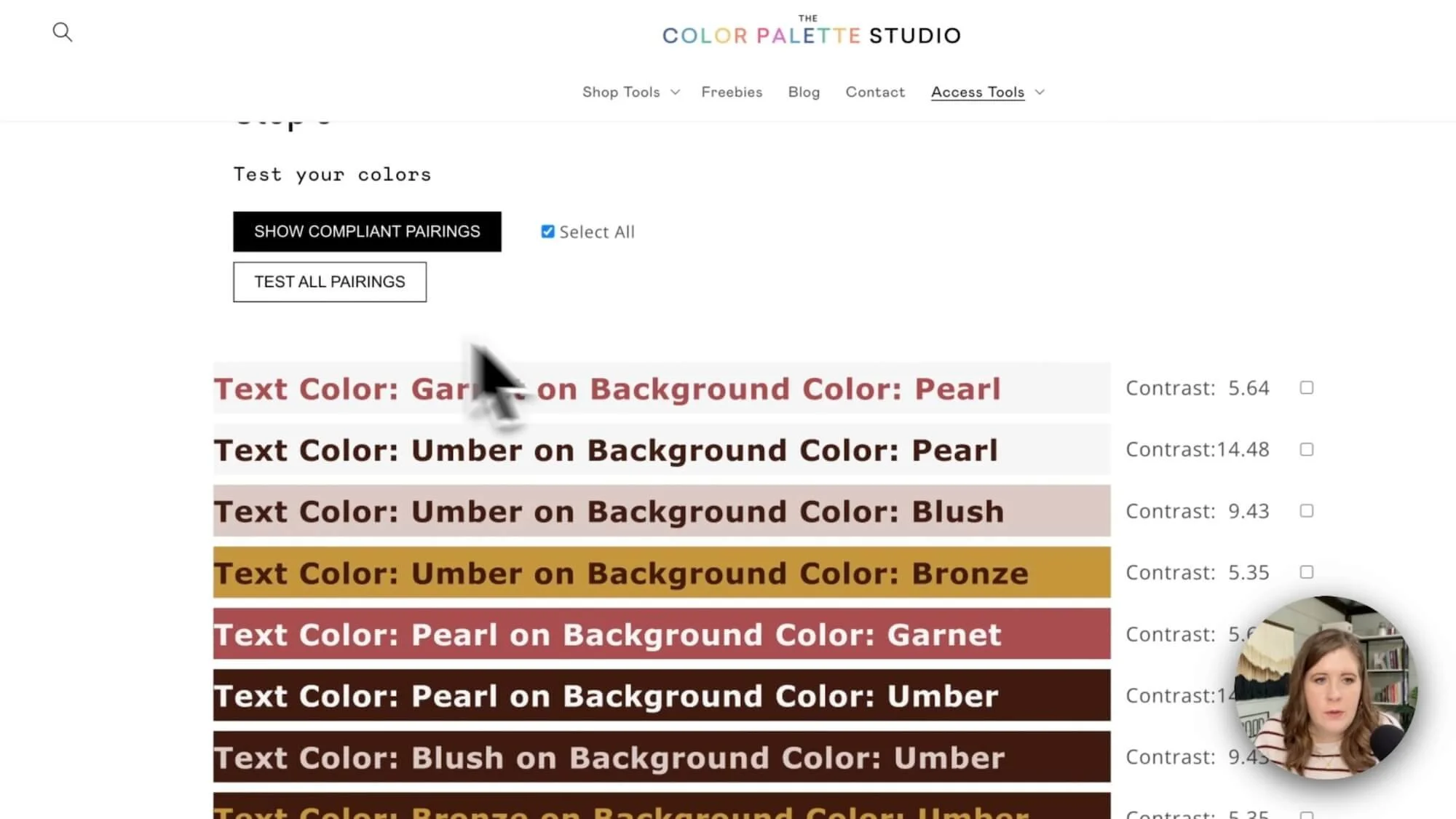
To ensure your colors are accessible, the tool can show ALL color pairings or only the compliant pairings and their individual contrast scores in either option. Remember, higher scores (above 4.5) mean higher contrast and better accessibility compliance!Show the Palette:
Your color palette is ready now! And complete with hex codes, color names, and background and text color combinations shown in an easy-to-digest list. It can be a professional way to share your palette with clients and assure them you've done your due diligence on selecting inclusive colors for accessibility, before you even begin the design!Generate a URL:
The Builder tool also lets you generate a URL, which is handy to share with your clients. Even if you have a Coolors account, this URL from the Builder can give your clients a free way to access the palette’s color codes easily right from their browser, which Coolors can’t do.Save & Print Your Palette:
In either tool (Coolors or the Builder) you can save your palette as a PDF to share with your client. Coolors generates a multi-page color document that’s customizable (on paid plans), but with the Builder you’ll need to make sure that when you use the Print dialogue to save the palette as a PDF, you check that the**background graphics**option is checked (on) before you save, otherwise the palette colors won’t be shown, just the information & empty boxes where the colors should be.Use the ColorBuddy Chrome Extension:
When installed, the Color Palette Studio’s FREE extension, The Color Buddy, can provide your clients with easy access to their color palette, with copyable Hex codes, RGB codes, and CMYK codes. It also shows compliant color pairings, so they know which background and foreground colors work best together!
FYI, the Color Palette Studio offers more than just the Color Palette Builder! It has an awesome Font Pairing Guide (built in Notion), detailing which fonts are available in Canva, along with lists of free and paid fonts, and where to get them. It also includes branding, vibe, personality & character traits to help you hone in on the right vibe for any client.
Applying Your Color Palette in Squarespace
Once I've decided which color palette I think will work best, it's time to bring it to life in their website! I head over to Squarespace (or whichever website builder you’re using) and apply the palette to the website’s style settings.
I suggest doing this while looking at a page with pre-existing content so you can see how the colors will actually look in headings, paragraphs, and buttons, etc.
If you don’t have a page built like this, you can grab mine in my Website Starter Kit template here, along with a lot of other pre-set settings, tools and video guides to make the process of starting a new web design faster, smoother & easier.
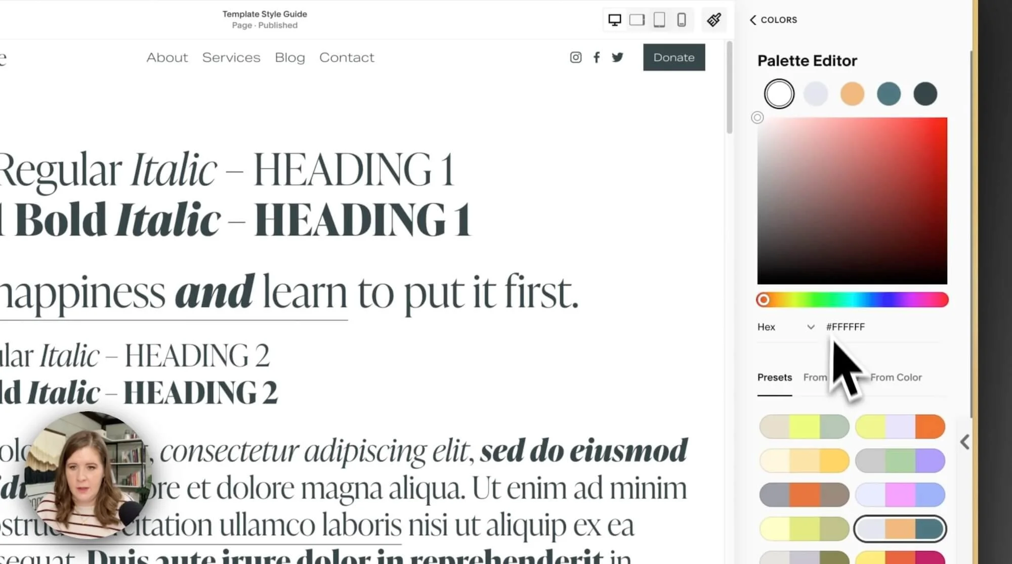
Here’s how I recommend you apply the color palette inside Squarespace’s Site Styles panel, in order to generate the best set of Color Themes (because there are 10 of those, each with a 100+ individual settings & you DON’T want to edit those granularly!):
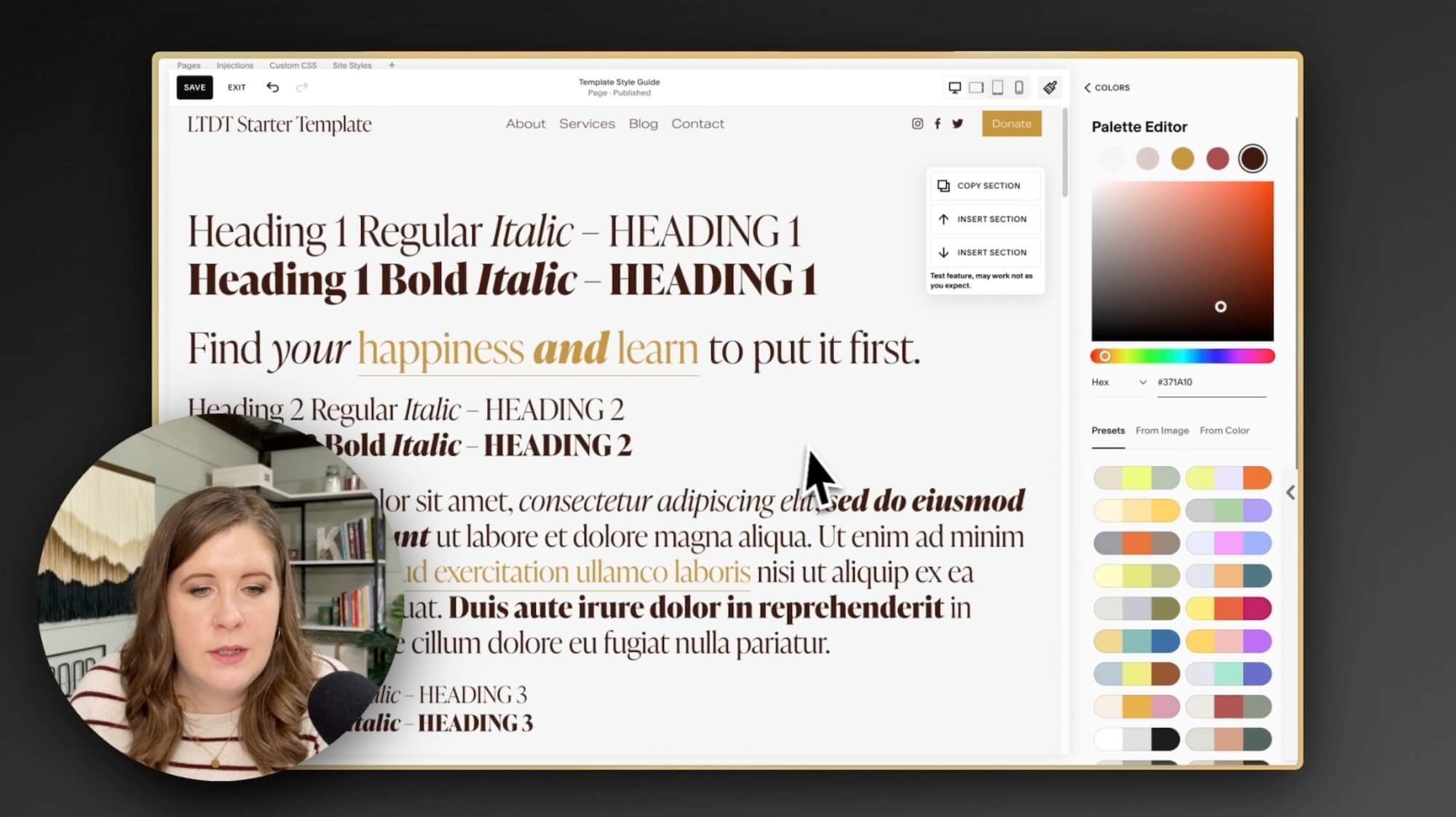
Start with a template:
Create your own, or use mine, but begin with a style guide template so you can see how the elements will look on the page with the new color palette you've meticulously crafted.Open site styles:
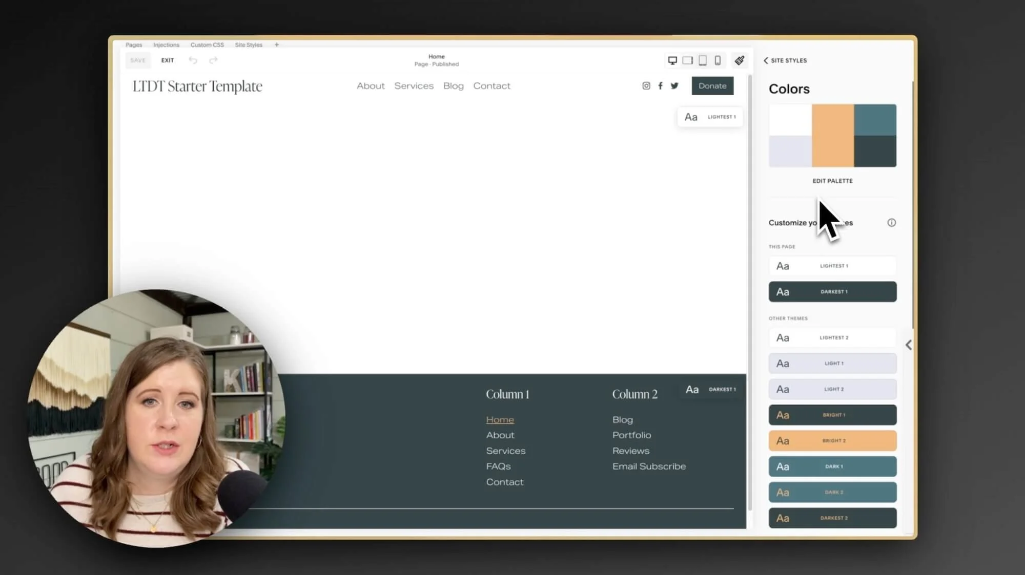
With your style guide open, click on the paintbrush icon in the top right corner of your website preview area. This opens the Site Styles while you're viewing the page, and navigate to the Colors section to add your color palette.Apply your colors:
The order (where) you add these colors MATTERS! If you've copied these to your clipboard, it's as easy as pasting them in with a tool like Paste, which I mention in this blog post as one of my favorite (affordable) tools.In the top left of the palette, add the lightest color from your palette; this is effectively your “white” whether it actually is or not, it will act as such & should be lighter than all the other colors.
In the bottom left of the palette, add the second lightest color; it should be darker than your lightest color, but lighter than other colors.
In the middle of the palette, this is your accent or “bright” color and is most frequently used for links & buttons, sometimes also headings. It should have a decent contrast up against your light AND dark colors.
In the top right of the palette, add your second darkest color; it should be lighter than your darkest color but darker than the colors you’ve already added.
In the bottom right of the palette, add your darkest color; this is effectively your “black” whether it actually is or not, it will act as such & should be darker than all the other colors.
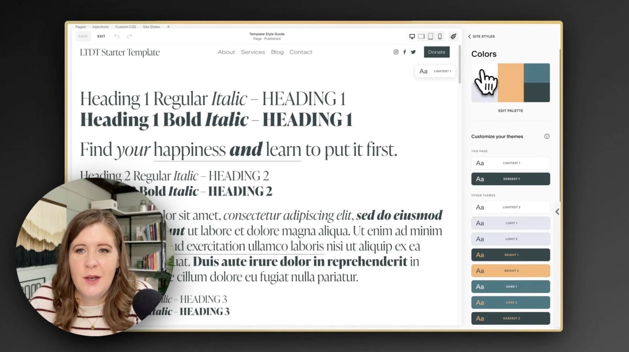
Check your work:
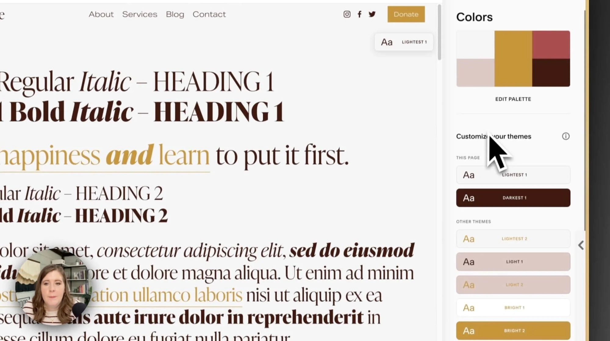
Once you've added all of your main colors to Squarespace, you can see how they’ll be applied in the content with the style guide preview. You might need to make a few tweaks, but remember, we've already checked the contrast ratio, so we know most of it should be readable and accessible.Remember to check the 10 Color Themes below the palette in Site Styles to see if any granular adjustments need to be made. If you apply the palette the way I recommended in step 3, it should generate better Color Themes for you.
To preview any color combination from one of those themes, you can edit the section(s) on the style guide page to use that Color Theme to help you make any refinements where the automatically generated color combos might not have the best color contrast.
Once you're happy with how your colors are working on the page, you're all set to move on with the design process! You can now move forward with building the rest of your website, confident that your colors are set up strategically and efficiently, requiring the least amount of back-and-forth edits as you add content to the site.
Quick Recap:
Let's do a quick recap because I just covered A LOT!
First, I send a personality questionnaire to the client, with the goal of understanding their individual personality as well as the vibe they want their business to project through their website (&/or branding if that’s also part of the project scope).
Later in the homework (once they have access to their client portal), I ask the client to build a Pinterest board to help them visually express their preferences and essentially build me a mood board for their project.
From that Pinterest board, I capture screenshots of images that I think resonate best with the client's vision. Then I import those images into a tool like Coolors*, Canva, Illustrator, or Photoshop, which helps extract and develop color palettes from the colors used in the image.
Alternatively, you can use the Color Palette Builder tool to create palettes based on predefined styles, choosing from a variety of lights, brights, and dark colors, which is GREAT for anyone that’s unfamiliar with this whole process!
Once the palette is ready, I apply it to Squarespace. If done strategically, Squarespace will automatically generate usable Color Themes for you with minimal editing to each theme. If you're using my Starter Kit Template, you'll get to see how your colors are applied to headings, paragraphs, buttons, forms, and other blocks on the included Style Guide page, which helps weed out any unexpectedly bad color combos up front & prevents constant changes & tweaks later as you start building the site.
When you're ready to share the color palette with your client, there are several options! With Coolors, you can export a multi-page PDF. If you're using the Color Palette Builder, you can share a link that allows the client to access the palette directly in their browser via the Color Buddy Chrome extension (free) with copy-able color codes and a list of their compliant color pairings.
Whew! That's the broad overview of my color palette creation process for client projects. There are many more nuances and it takes some practice to feel “good” at this, but that’s the gist.
I hope it helps you understand color palette creation and application processes, and where to find useful tools and resources to get the job done in the easiest/fastest ways.
It's a lot to take in, I know! I've been doing this for a long time, so it's become second nature for me. But hopefully, this video will make your next color palette creation process a bit smoother.