

3 best practices for easy mobile responsive designs in Fluid Engine
Table of Contents Show
The number one complaint I hear from new designers that are using Squarespace and their new editor Fluid Engine is that it's not mobile responsive or that they can't figure out how to make tablets specific edits.
And they're right. It's hard to do because it's not actually built into the editor, but it is responsive. So I want to start by saying that's not true. It's not that it's not responsive. It's just not intuitively responsive.
There are hacks and tips and tricks that I'm going to teach you today so that you can keep these best practices in mind, as you build the website to start with so that you will have much fewer of these issues cropping up. And also when you go to do responsive edits, what you do, how you do it. All the things.
QUICK NOTE:
Today’s transcript below has been edited for clarity so that hopefully it will make sense on its own if you don’t want to watch the video. However, the video will be easiest to learn from so I encourage you to watch & follow along!
EDITED VIDEO TRANSCRIPT:
Before I dive into that, if we haven't met before, my name is Katelyn, I run Launch the Damn Thing!™️ I'm a Squarespace web designer and educator, and I like to share these kinds of tips with you, –because if I don't share them, who will??
Thank you, Sarah!
DISCLAIMER:
First and foremost, I wanna give a quick disclaimer for today's video: in an effort to keep things interesting on a topic that might otherwise be boring, I have asked my current client, for permission to use her boudoir photography website in today's video. So thank you, Sarah, for letting me use your website as an example!
Let's dive in, but just note as we are going through the video, you might see some cheeky peaches. 🍑 (literally & figuratively), lots of extra curves and generally absolutely gorgeous photos!
3 simple best practices to help you create mobile-responsive websites in Fluid Engine & avoid headaches!
There are a couple of recurring themes here in today's episode. And I want to start off by introducing those best practices or hot tips, whatever you want to call it, because they will probably be something that I'm going to repeat ad-nauseum 5,001 times, you know me by now, hopefully, I am repetitive for the sake of clarity.
So, uh, let's start with the best practices and then we will actually dive into what these things look like, how they affect your designs, and how you can use that to kind of be your guide as you create the layouts so that responsive editing later is not such a huge pain in the ass.
There are three main things to keep in mind. As you build Fluid Engine websites. If you are new to Squarespace and Fluid Engine, this engine. This layout engine is all, you know, then it doesn't matter. You don't need to have known how to use classic editor before this to just use the use best practices.
For those of you that are used to Classic Editor coming into Fluid Engine as a new thing. I'm with you. This is totally new territory. We're moving into.
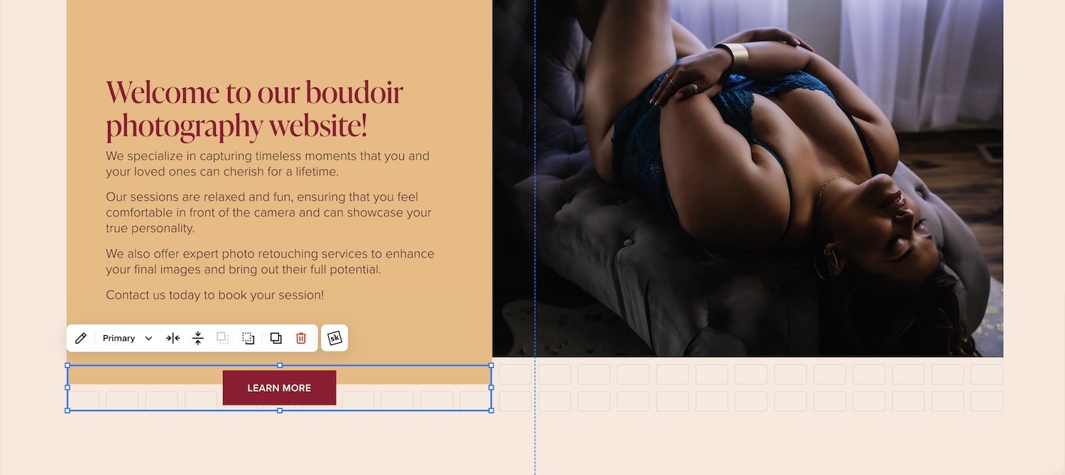
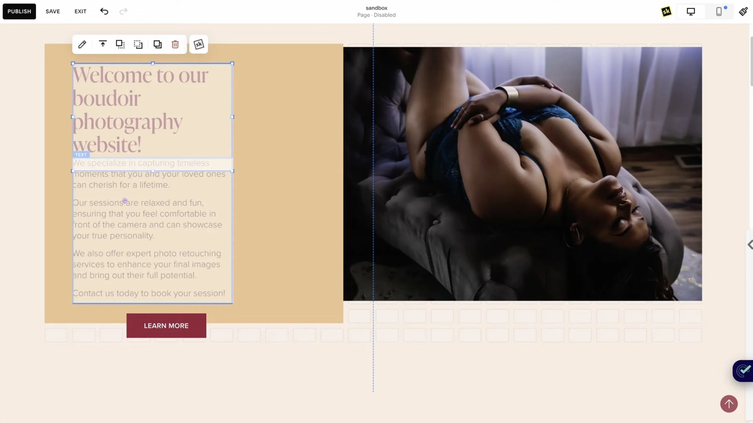
❶ Make Button (block) containers wide
The three things are, keep your button containers as large as you possibly can if the container is small, you are not giving the button text enough space inside the container.
When the screen size gets smaller, it's forced to wrap too early and create a multiple-lined button.
You can avoid that completely though by making the container longer than you would otherwise make it. There are tips & tricks to this too!
Make sure your buttons are as wide of a container as possible and use the fit or fill options.
If you have a long button and you're like, ‘Well, that's the size I need to make the container, to make sure that the text inside the box doesn't start wrapping into multiple lines,’ –but you don't want the button to be that big...
That's when you need to switch to fit instead of fill.
The fit option will make the button visually follow the styling that you have set in Site Styles.
The fill option literally just fills whatever grouping of cells you have the block sitting on top of, regardless of the spacing you’ve set in Site Styles.
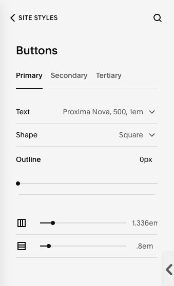
Really quickly, let's jump into Site Styles, under buttons so I can show you these settings.
You can decide how much spacing you want on the left or right of the button and on the top of the top and bottom of the button from this area of Site Styles using the sliders at the bottom of each button’s settings: Primary, Secondary & Tertiary.
These spacing settings don't show up when you use fill buttons, though, only when you use fit.
If you want to control the buttons on a more granular level, you're most likely going to want to use fit or fill based on what’s most important to you in each use case.
Either way, make sure you don't make the button block (container) too small.
Example: Two text boxes slightly overlapping presents a potential overlapping issue that will make the text hard to read where they overlap each other on smaller screens.
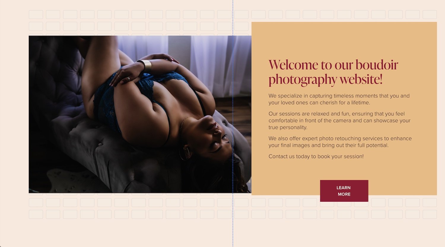
❷ Combine text into 1 container (block)
The other one is to combine your paragraphs and your headings in the same container whenever possible. The more you have stacked on each other on top of each other.
So for example, this layout visually looks good, but what I can see here is that the heading font’s text block container is overlapping the paragraph container. That’s bad, because if we resize this screen, the two text blocks start to overlap each other in a way that creates illegible text and we do not want that.
Option 1:
The way around that is to put both sets of text inside the same container, wherever possible; if you do, you’ll run into that a lot less.
Option 2:
You can also mostly avoid this if you make sure that the two text blocks are not actually overlapping each other, but sitting next to each other instead.
If you want them to be closer to each other, just change the alignment of the text in the block’s pop-up menu (shown in the examples below). That way you could, for example, make it look like it's in the same place as it was before in the above example where the two blocks are actually overlapping each other, –but now we can get the heading text closer to the paragraphs underneath it without overlapping the blocks, by:
placing the two blocks next to each other on the grid,
then aligning this paragraph copy to the top, and
the heading to the bottom of the container that they’re each in
That said, I highly encourage you to put both Headings & text in the same container whenever possible to eliminate the possibility of headings overlapping the paragraphs in an illegible way.

Heading text is aligned the bottom of the block

Paragraph text is aligned the top of the block
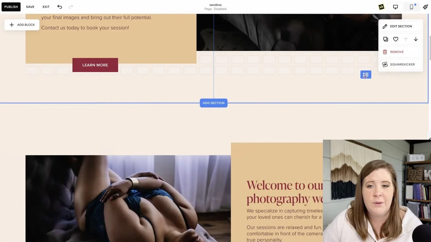
Keep visual groupings of elements in only ONE section; start a new section when you have a different clump of elements to prevent the grid from bumping things out of alignment further down as the design flexes for smaller screens.
❸ Create new Sections for every group of elements
The third piece is that the editor uses a flexbox grid. And while I'm not going to go into specifics on teaching you Flex Box because I'm not the best at it myself.
What I understand is that literally everything inside the grid reacts to everything else inside the grid in the same space. To keep things from reacting to elements that are further up the page, put them in a different section.
This is an example of a layout that I would not encourage you to duplicate in the same section. What I mean by that is, literally copying or duplicating this group of blocks (the shape block, button block, text blocks, and image block), then moving it down beneath the first group, but still in the same section.
Don't do that, because anything that wraps and creates a longer layout (starting at the top of the section) is going to push everything below it, further away, and eventually out of alignment.
You can eliminate this potential responsive issue completely by just creating a new section for each visual group of elements you add to the page. This is not just MY recommendation, but Squarespace’s too.
If you wanted to copy this top section’s layout, the easiest thing for you to do. Is to actually copy the section itself. Now you have the same thing that you had before, but in an entirely different grid that talks to itself in a different way than this grid. will. So anything that's reactive in the top half will stay reactive in the top half. Anything that's in the second section will stay reactive in that section. So they do not build off of each other in the same way.
When in doubt, any group of blocks that you can see –and finish– that go across the page and you have to scroll down to see the next grouping, put it in a new section.
That's my rule of thumb. Visual groups elements that get separated from each other where there's visual empty space in between (small or large), that's when you know you need a new section.
If I can see all of the elements right here, then I don't need to keep scrolling and adding rows and more content in the same section I'm done with that section. I don't need any more rows even though I could add more. Instead, I'm going to create a new section for the next visual group of elements.
recap
❶ Button blocks: make the button block as wide as you can, and use the Fit or Fill settings to adjust the button size within the block if needed, so that the button text is less likely to split into multiple lines on smaller screens.
❷ Text boxes: We want our text boxes to contain all of our text in one box, wherever possible. And when not possible, put them next to each other. That's fine. Make them each the same width if you can, to make sure they won’t start overlapping even if it looks like they won’t. If the container is overlapping another one at all, even if the overlapped part is empty, you have given Squarespace’s editor permission inside that container to use up all available space if it’s needed when the design compresses for smaller screens.
❸ Adding Sections: group visual elements that you can see at one time without scrolling in the same section, and add new sections when you need to create another group of elements. This prevents the grid from pushing content closer to the bottom of a longer section out of alignment during its responsive adjustments. Just because sections CAN have 1,000 rows doesn’t mean it should.
You can predict how elements respond in Fluid Engine
If we do something like this, what you're actually doing, –and this applies to all things in Fluid Engine. So listen closely.
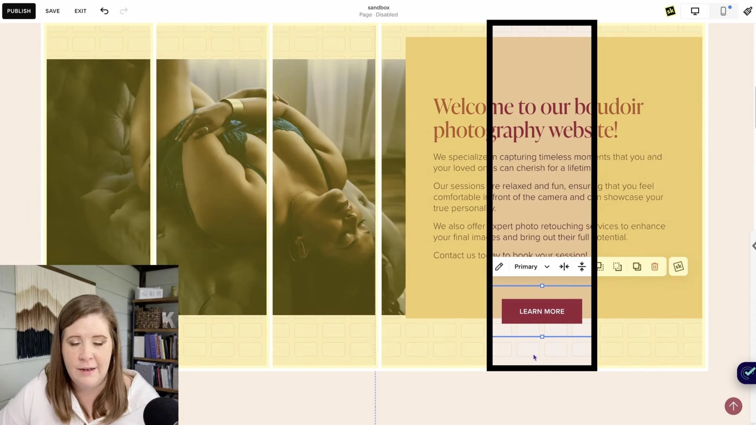
This button is 4 cells across, out of the available 24. That makes it approximately 1/6 of the total width of the section layout, meaning it will need to compress & wrap the text on smaller screens.
The grid on Fluid Engine is 24 cells across for desktop until it switches into mobile view, which is only 8 cells across.
If this button only takes up 4 cells, that's one-sixth of the total width of my screen on ALL devices until it switches to the mobile layout using only 8 columns (cells).
Since desktop screens are wider than tablet screens, when Fluid Engine resizes this section to fit 24 columns into a tablet-size screen, that button will still only take up one-sixth of the width.
So you have to think about the visual container you are creating, where you are putting content inside, and you need to decide, ‘how do I want this to react as the design compresses for smaller screens?’
If I were to start resizing this screen… notice what happens to a button with a narrower container (of only 4 cells) vs a wider container of 12 cells.

Example 1: a button block set to Fit that spans 11 or 12 cells (columns)
Example 2: a button block set to Fit that spans only 4 cells (columns)
I gave Example 1’s button a wide girth. The container itself is large. Example 2’s button, however, is not.
You can easily see the difference here in the way it responds if you give the button container enough space so that it has a lot more to work with before it has to wrap in order to fit that text inside the button itself. Wider button blocks mean you run into this problem a lot less.
The reason this text-stacking effect becomes a problem, beyond the fact that you may not want the button to look like a weird square, is that the button container size has to adjust vertically when the text runs out of space horizontally, which means it suddenly gets taller in order to make space for two lines of text.
That in itself is not bad, but if that sudden jump in height (now 2 rows tall, rather than 1) is up against a text block, it may easily mean the button will overlap the text above it, or the text may overlap the button (depending on how you set the layers in that group of overlapping blocks).
Think about it from the perspective of you, are creating a container for that thing to live in and resize within as the screen changes. That goes for getting wider and getting smaller. That 24-cell grid is very important.

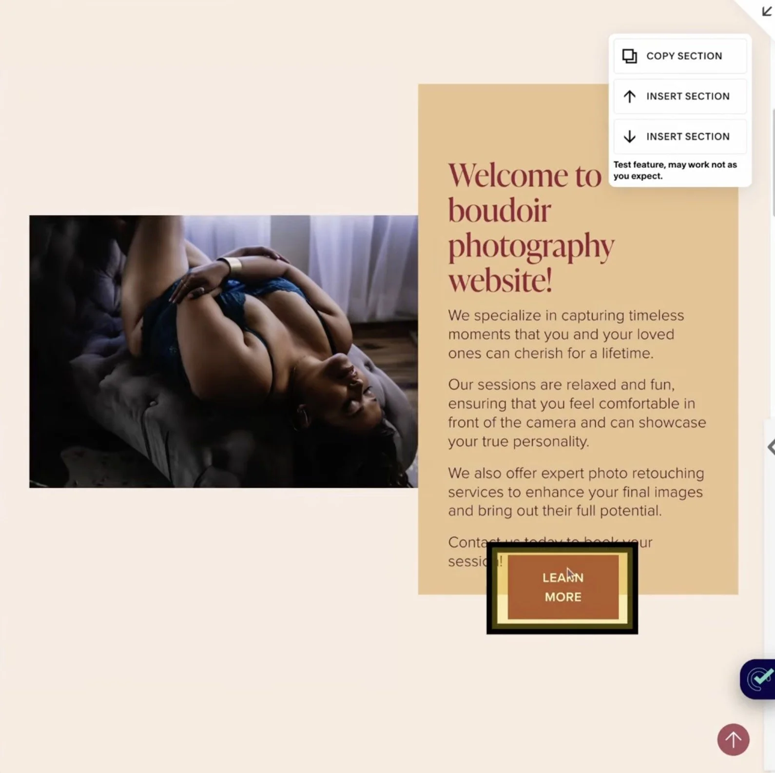
White box is the size of the button block.
Blue highlighted box is the full width of the grid.

A button set to Fit inside a button block (container).
So if you think about the size of the container as a percentage of the overall width of the screen, I think it will help you get in the habit of making your element containers larger than they might need to be and using the block alignment options to move the content in the direction you want it to sit within that space (block container).
Why? Because it's really hard to target these specific things (for smaller screens than desktop, but larger than mobile) in Fluid Engine.
You can’t say, ‘I only want it to do that on this size screen.’ You need code to do that. You need mobile queries in Custom CSS to do that, often per block, section, or page, depending on the layout.
But you don't need any code, if you just make the container the right size.
Those are the three best practices that I maintain as I build out new sites. As long as I do these things as I build, responsive edits are easy!
Now let's actually jump into the website and my favorite app of choice to see how this design reacts in multiple different screen sizes.
Using the Responsively App
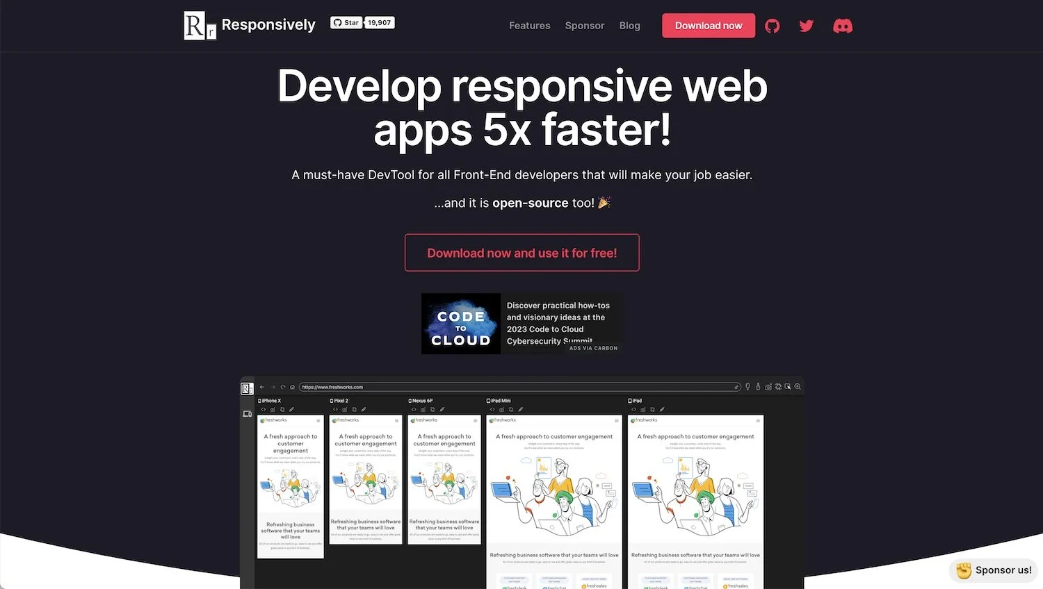
A screenshot of Responsively’s home page with an example of their app in use (this post is not sponsored; no affiliate link - image source: https://Responsively.app
First things first, it's really hard to know what your web design is doing if you can't see it.
This is the reason why professional designers like myself that use Squarespace as a platform have been –basically busting their asses– trying to get that tablet view back, because we can't see what’s happening.
We don't know what tablet view even looks like without these third-party tools in order to see what potential issues may be and try to make some corrections.
Since Fluid Engine was released, basically, I've been using the Responsively app to be able to see the website interactively and scroll through it at the same rate, across multiple different devices that maybe I don't even own myself, which is a fantastic way to do responsive edits.
No, it’s not an editor so you can't actually edit the website in it, just see the website on different screen sizes all in the same browser.
It's free, at least as of the time of posting, and it is a desktop app that works kind of like a browser. It still gives you the inspect tool, which is great if you want to investigate what the heck is going on in a particular spot, under the hood.
It also gives you access to full-page screenshots and screenshots of just what’s visually seen in the screen’s dimensions, without the long scroll –last I checked, though don’t hold me to that.
Go download Responsively now, then come back & I’ll walk ya through some of the basics for how to use it.
No, this post is not sponsored by them and I'm not an affiliate for them in any way. I don't have an affiliate link for you or anything. It's just an awesome tool that I highly recommend.
Tips:
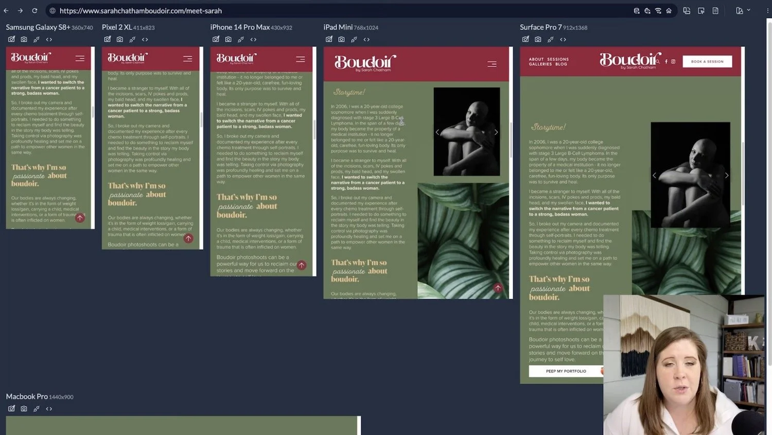
The way that I do this for client sites is I have two screens open, side-by-side: one that has Squarespace’s editor open, and an external one with Responsively open in full screen so that I can see all of the mini-windows inside it all laid out in a row (because my external screen is really wide).
If you don't have two screens, it’s not the end of the world. Responsively will stack the mini-device windows inside the app on top of each other in rows of whatever will fit across it, depending on how many you have loading at any given time, which you can control in settings.
You can choose which types of devices show in the display list whenever you want, from the settings panel. I tend to gravitate more toward Apple devices, but lately, I've been throwing in a bunch of other devices too, like Surface Pro and Galaxy because they have slightly different dimensions (pixel widths & heights).
––Okay. I'm assuming that you have Responsively now and you have pulled it up. Let me just go over a couple of specifics with you.
Setting a Site Password
How to set a site-wide password in Squarespace: Settings → Site Availability → Password Protected → choose a password, then Save.
First of all, you use Responsively App just like a browser. Go to the website by typing in the domain; it can be the Squarespace-issued domain or the custom domain the client has purchased if it’s already connected to the website; either will work.
However, if the website itself is not launched (Site Availability set to “public”) yet, you will need to set a password for viewing the site outside of the editor, then enter the password in Responsively, just like you would any other time while sharing a draft website with your clients.
If you aren't sure how to do that, go to Settings in Squarespace, then Site Availability, then select “Password Protected” to set a sitewide password for the website.
If the website is not on a paid plan yet, it can't be public.
If it needs a password because you need to be able to look at it outside of the Squarespace editor, so you assign a password and choose whatever that needs to be.
This does not require someone to log into the Squarespace account itself. This password is just to be able to see the password-protected pages that are not public yet.
If you haven't launched the site yet, and you're working with a client, you’ll need to be able to do this in order to share the draft with the client AND to see it in Responsively for the responsive editing process.
Set which devices you want to see in the app
Once you're inside the app after you’ve downloaded it & opened it on your computer, look for this little device toggle icon.


Click on that and then select Manage Suites. This is where you can select (check all the boxes) all the devices or device sizes you want to see on the screen.
Pro tip: Keep the number of devices to a maximum of 5 or 6 if possible; the more you add the more slowly they will all load.
You won’t need to see specifically an “iPhone” or a “Galaxy” just the fact that you can see different devices with differently sized screen dimensions; look through the list and pick a set that seems to give you a variation & try scrolling through the website with that set. If you notice that there’s not much of a design difference between say, an iPhone 14 Pro and a Pixel 2, then remove one of them and look for something that is wider or narrower to replace it with.
These are the ones that I have selected.
When you're done making your selection, click the little 🆇 over on the upper right to get back into the main view, then it will reload the website in those selected devices.
Per-Device Actions
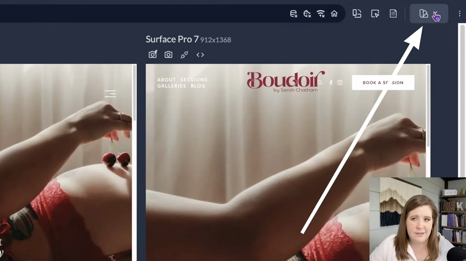
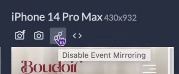
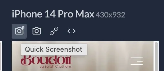
There are a couple of icons you can investigate which sit on top of each device’s mini-window.
Above each device, it shows you the pixel dimensions, screenshot actions, and disabled event mirroring (which basically means what I do, click a button for example, in one device won't affect the others where screen mirroring is disabled).
There are also development tools actions, which you can open for any specific screen if you want to pick an element & open the Inspect tool to investigate the code for any particular item in the design.
You can also right-click and inspect any element or open the developer console, just like you can with Chrome.


What Responsively does
This allows me to scroll through and use the website as if I were actually using all 6 of these devices.
It’s NOT a full-page screenshot of each page; it’s interactive just like it would be when published or previewing the draft any other way. So I can click on things, hover on elements, open lightboxed images and forms, scroll and change pages, –basically using this as if it were a normal browser.
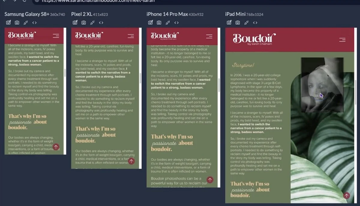
For example, previewing here helped me see a button block that needed to be wider so that the text, ‘peep the gallery,’ won’t wrap into two lines on tablet-size screens. Now I know I need to come back over to the Squarespace editor on my other screen, go to that page, and make that button container wider.
That may also mean that we need to switch the button settings from Fit to Fill or vice versa depending on the layout I want here, and align it to the left. Then stretch that container out to the right as far as I can to give it more space to breathe as the design compresses for tablet sizes.
I make those changes in Squarespace, then go back over to Responsively, and refresh (reload) the page so that I can see the updates to see if that fixed the problem.
Yes! That fixed the problem. So this is exactly what I’m doing throughout the entire site:
check in Responsively,
edit in Squarespace & save the changes,
then refresh Responsively to see if the issue is fixed.
I scroll through the whole website using Responsively, looking for anything that could potentially be an issue, and fixing each problem over in Squarespace, using Responsively to detect them.
This way I can see what the website will look like on a Samsung Galaxy, a Pixel 2, an iPhone 14 Pro Max, an iPad mini, on a Surface Pro 7, and of course on a MacBook, because that's the size that I designed it on so that helps remind me of what the original should look like & compare it to the rest.
That is my secret! I do this for every page of the site.
I promise you, if you follow all three best practices I mentioned earlier, the changes that you will need to make on the responsive side of the process will be very minimal!
Troubleshooting Responsive issues in Fluid Engine
There are a couple of cases where blocks elongate and you don't really love the look of them when they do that. This is when you have to decide, ‘how am I going to adjust for this compromise?’ Right?
On the About page for this client's website, we have a section down here where the gallery block is supposed to be overlapping this background graphic. That was the way that I had designed the section, but on smaller screens, I have to decide what adjustments to make to the layout because it doesn’t overlap well on tablet before it switches to the mobile 8-column grid.
Troubleshooting split-screen style layouts on Fluid Engine in Squarespace
This is a split layout or a two-column layout. Meaning that half of the screen is one element. The other half of the screen is the image elements and I can't change that. There's nothing that I can do that will make that layout work better for this size because that is the size of that image block. It is still overlapping, just not visually overlapping because we can’t see the part of the image that matches the background color of this section.
I could fix this easily if I cropped off the top half of that image, removing the solid stripe of color across the top, if I want that image block to take up all of the space that's highlighted in blue here. When I hover over that element in the code. Then I need to go into that image itself and crop it down to get rid of the solid green background that matches the background here, so it looks like it's as tall as it actually is.
So basically I just need to go in and crop the image a bit so that it will take up more visual height and actually fall underneath the image. So I've already done that over here. Now when the image block stops. We can see that here. It's just the leaves. Then I can bring the gallery block down so that on smaller screens, it will hopefully overlap in a more visually pleasing way.
The rearranged elements after some minor edits in the Squarespace editor
So let's see what happens!
It’s a little better!
What we're struggling with in this particular layout is the fact that we have a split layout design with 50% of the page being text and the other 50% of the screen being imagery.
What is happening is that the two chunks of content are directly linked to each other's size (height, more specifically).
Because of the grid, anytime elements on one side of the grid get longer than the other, the other one will adapt to fit the same height because Squarespace knows that we are trying to create a 50/50 layout here.
This is the case for any column-based layout in Fluid Engine, excluding Auto Layout sections or List Sections that don’t use the normal editor.
So you have to be very careful, and go into responsive edits with that in mind, because as the text wraps and gets skinnier on a smaller screen the text block itself gets much taller, affecting the height of whatever is next to it. In this case, about 50% of the width on a smaller screen for the text and 50% for the imagery.
Gallery blocks, however, don't tend to react in the same way as image blocks, much like Video blocks, which in this case I'm thankful for, because I did not want the black-and-white images to be as tall as this leaf image. Thankfully, the gallery is not resizing in the same way as the image behind it. But, that also means it's not taking up the majority of the space here, and changing the look of the overlap on tablet sizes.
This particular client’s story is more about the growth, realization, and empowerment that Sarah found in this experience she talks about. I don't want to focus –image-wise– on the black-and-white photo; I want to focus the imagery on the greenery, because of the growth that happened from her experience.
I don't hate this layout on tablet; it’s not what I was aiming for, but it’s not so bad that I need to revamp the whole section either. I don't love that the gallery is so small on tablet and the leaves are really huge, but there may be nothing that I can do so this is a great example of compromise which is very common in responsive edits.
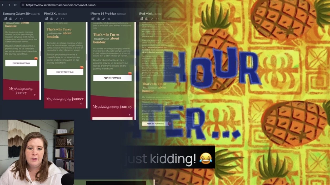
One hour later…
(Watch the video to see me troubleshoot this section first, and then I’ll explain what I did & why.)
Even though the layout that I just showed you, wasn't that bad, I just kept playing with it until suddenly it worked!
I can't explain why the leaf image is no longer taking up the full height of the right side on tablet, but that's better for the design so I’m not going to question it!
Visually, that's a lot closer to what I had intended for the design to do on desktop. It's just a little bit lower, aligned to the bottom of the section, rather than the top, but I'm not gonna touch it because now that leaf image is not stretched out anymore and the gallery is still overlapping the leaf image.
This is when it’s important to recognize when to quit messing with it and move on; I'm going to leave it alone.
Maybe it’s not in the exact right place that I want it to be for tablet sizes, but at least the shape and the layout is really close to the way that it is on desktop view, so I can’t complain about that!
Responsive design requires compromises
Again, this kind of troubleshooting is a perfect example of the compromise necessary to force our designs to adjust across a variety of screen sizes. All website builder platforms have their own version of this hellhole that we’ll fall into when we talk about responsive design.
I don't care if you're on Shopify, WordPress, Showit, Squarespace, Webflow, or Wix... they all have their own version of this issue.
Squarespace’s issues are related to Fluid Engine’s grid and how the elements on the page react to the screen size within that grid.
With something like Showit, the elements themselves are not responsive. You have to set one way that it looks on mobile. And one way that looks on everything else. You have some further editing capabilities regarding the ability to “lock” elements in their position, but it’s not a perfect solution either. Either you lock them to the sides of a section and you get weird empty space in the middle of the layout on larger screens, or you lock them in the center where they are and you get weirdly extra space along the outside of the section. As the screen gets smaller from desktop to mobile, but before it hits mobile, everything just gets smaller to fit inside the width of the screen, which can make some things harder to read or click on touch screens.
For Webflow, you have to build in the responsiveness by setting your own container sizes per element, so that elements can resize as needed, but from scratch or from presets you’ve created. yourself in the template or design you’r working in.
In various options for WordPress, depending on the builder that you're using, I'm sure each theme builder or template has its own settings you’d need to familiarize yourself with, and it would have its own limitations as well.
Shopify would be similar to Squarespace in that all themes are built using a baseline builder platform, but similar to WordPress in that each one may offer different options so it will depend on the theme you purchased or installed and the designer who built it.
In Wix, you also have a mobile builder and a desktop builder, I’m told, similar to Showit in that you can edit all elements you add to the page individually for each screen size.
Every platform handles it differently, but they all have their own pros & cons.
This is just how Squarespace manages it.
You're not going to find a platform that does not have a similar responsive/troubleshooting issue because it's just really hard to design something that's attractive on all screen sizes, unfortunately.
Go into the design-build & future responsive edits with that mindset, because there are 1,001 screen sizes out there! Everything from my Apple Watch to a 70+ inch TV, and you need to make sure that (to the best of your knowledge) that design will look legible and readable on most of those sizes.
For most people that will mean computer-based devices or phones, because the vast majority of all website traffic will be on those two sizes, and that makes things slightly easier.
Most people are not browsing websites on their TV, and it's not possible to do on your Apple Watch, so we’ve got something going for us!
For everything in between though, it often requires compromises. But if you keep my best practices in mind and you use something like Responsively so you can see what's happening on the in-between sizes, then you know what you need to go adjust in Squarespace-land. That does genuinely help!
A last-resort tip for troubleshooting
Another thing that you can try, which doesn't always work, is to go to the page in question, when you are in edit mode, specifically resize your window to fit approximately the same screen size to mimic what you see in Responsively until you start to see the design issue, then make adjustments while the window itself has been resized.
Save your changes, then Exit edit mode. (And quickly check that those changes didn’t affect the desktop size of the layout.)
For example, when doing exactly that, I found an image that was not set to fill, it was set to fit, and I would not want that image to be so small in that particular layout. Maybe I wouldn’t have noticed or found that issue, had I not checked that section on a smaller screen size.
Why? Sometimes, if you resize your edit screen and you make changes to remove extra space below a text block, for example, as you resize the window and things get longer and narrower, you can sometimes do this to fix weird extra-spacing issues.
When you are going back and forth, make sure you double-check the sizes of things EVERYWHERE, because the back-and-forth movement in Fluid Engine can create strange spacing issues in your layout when the grid keeps resizing.
Tell Squarespace Support you want the tablet view back!
We are hopeful that Squarespace will take this issue into account and build in some sort of solution that will take some of that burden off of everyone –both designers & DIY users.
But that’s much LESS likely to happen if they only hear this complaint from pros, so go tell them yourself! It’s VERY important for them to hear your voice too; not just mine.
TO CONTACT SUPPORT:
Go to Support.Squarespace.com and select Live Chat in the options, after picking a topic & answering the drop down questions it asks. When the live chat starts, the first thing you say is “talk to a person” to indicate you want to talk with an agent instead of the robot.Answer the follow-up questions, then wait in line.
It usually doesn’t take long & their support chat has great availability, though not 24/7.
In the interim, all we can really do is make sure that we're looking for those kinds of issues ourselves.
Keep today’s best practices in mind, be open to compromises, and be vocal to support. If you can do those things, I think you will have a much easier time making your website mobile-responsive.
REAL LIFE: