

6 tips for using Fluid Engine in Squarespace (or not)
Table of Contents Show

In a recent group coaching call, there was some amount of frustration as students started talking about their experience with Fluid Engine.
In fact, Liza specifically pointed out that because Fluid Engine is so new, Googling the answer to her problem didn’t work, because either no one knew the answer yet or it hadn’t been published yet –which is a great point!
So, in that vein, it’s time to talk about some issues that have surfaced in the last couple weeks since Fluid Engine was announced.
But first, …
Please keep in mind that because this is a brand new release, it’s subject to constant changes by Squarespace, so many of these (hopefully) will no longer be issues in the coming months. I’ll do my best to announce changes as Squarespace announces them, here on the blog to help you stay aprised of their hard work.
Fluid Engine is a whole new world for all of us Squarespace-rs. So we’re all kind of on an even playing ground at the moment.
If you’ve been playing with it these last couple of weeks and are feeling understandably frustrated with it, you’re not alone.
In my humble opinion… no matter how much I love the concept –and am genuinely happy with the direction Squarespace is moving for the new editor– I do think they released Fluid Engine too early.
Just while making this tutorial video today, I ran across multiple glitches, issues with blocks freezing so I wasn’t able to drag them around, and worst of all –straight-up crashes where the entire section was suddenly filled with text that said it came across an unexpected error. 🤦🏼♀️
That said, there’s nothing wrong with using Fluid Engine here and there while they iron out all these f*cking bugs, if for no other reason than so you don’t get left behind in the dust Squarespace is kicking up.
So, if that’s you and you have tried Fluid in a few places on your site… and now you’re feeling scared about converting your whole site at this point…
Here are some quick tips I’ve learned so far and some things that have changed since Squarespace announced the new editor in late July of 2022.
prefer to watch instead?

Fluid Engine Insights (updates)
Fluid Engine for desktop is defined by 24 columns, not the usual 12 we’ve been used to in the Classic Editor. On mobile, the grid switches to just 8 columns across.
❶ Giant spacing issues on tablet-size screens
This is/was a big deal, and all of us Squarespace experts, authorized trainers, and circle members are fighting to get it fixed ASAP.
While creating the tutorial videos for this today, Fluid kept crashing and when it was working, sometimes it would display the issue I was trying to show, and sometimes it wouldn’t. Weird, right? I don’t have the official word from Squarespace on this, but I have to assume that as I was filming on a brand new trial with no custom code on it yet, maybe –just maybe– Squarespace is already working on a fix for this. 🤞🏻
Since 7.1 has never (to date) had a tablet view like 7.0 has, you may have been somewhat oblivious to what was happening on tablet view so far on Fluid Engine specifically, as Classic Editor didn’t have this particular problem.
SCENARIO
When you place a block on desktop view in Fluid Engine (FE from now on) that block takes up a group of cells within the new grid.
Let’s say you place a text block for a Heading 1 and some short paragraph description underneath it. Then you place a button underneath the text block.
Between desktop-sized screens and mobile-sized screens, the blocks readjust a little for the different screen widths. The breakpoint (where the screen size is considered tablet view) is 749px wide.
After the design adjusts for 749px width, there’s suddenly a LOT of extra space under each block.
SO WHAT’S HAPPENING?
The space that text needs in order to fit across the Desktop screen is not the same as the width & height it needs to fill a tablet screen which is often half the width of any desktop or laptop.
The problem is that the size of the block which contains the text doesn’t resize itself based on the content. It’s holding the same number of grid cells on BOTH desktop & laptop, even when it doesn’t need all of them.
THE TEMPORARY FIX
On mobile of course, now you can resize the block if needed. But since we don’t have a tablet view, you need custom code to deal with this problem until Squarespace issues a fix.
Here’s what I’m using for this as of now, when I see this happen:
@media screen and (max-width:749px) and (min-width:400px) {
 .fluid-engine {
   grid-template-rows:none !important;
   grid-auto-rows:minmax(3vw,auto);
  }
}
I do expect Squarespace to implement a fix for this if they haven’t already. So hopefully soon, fingers crossed, we won’t need this code anymore! 🤞🏻
❷ Full-height sections
In 7.1’s Classic Editor, you could choose your section height to be Small, Medium, or Large, which correlates both to the padding on the top & bottom of your section, but also to the height of the section in general.
In Fluid Engine, to get that full-screen height, you just go into your section’s settings, then make sure the “Fill Screen” toggle is on, and select “L” for the height of the section.
Like in Classic Editor, you have to make sure the content you add to that section will not push the height to be taller than your screen size.
DOUBLE-CHECK FROM DIFFERENT DEVICES
PAID OPTION:
Use the SquareKicker plugin to see your design in any of 4 screen sizes: Desktop, Laptop, Tablet, and Mobile. You can also make per-device adjustments to the design while viewing your design in each view with this plugin. (NOTE: without it, you can only make per-device adjustments to Desktop and Mobile, and you’re much more limited in what you can do per screen size.)FREE OPTION:
Use the Inspect tool in your Chrome browser to access the Device toggle, to see the design in one of any device sizes. (NOTE: this doesn’t let you make per-device adjustments to your design, only look at the way it adjusts between screen sizes.)
❸ Responsive behaviors + Accessibility
In FE, the way blocks reorder themselves on mobile screens is based on the order they were added to the section on Desktop.
The good news is you can (& MUST) not only reorder them in mobile view, but you can also resize the blocks to fit on mobile screens a bit better.
The bad news is this is totally new to all Squarespace users because we’ve never had this capability before, but you MUST remember to check mobile before you’re done designing any FE sections or you will have a clusterf*ck of a design on mobile.
ACCESSIBILITY
One thing it seems that Squarespace has already fixed, is how that reordering was affecting screen readers for visually impaired people. Initially, the order the blocks are added on Desktop was written into the code and that order was maintained in the code itself, even when they were visually rearranged on mobile in the new FE editor.
Now, it seems, they’ve already fixed the issue within the responsive code so that the numbered order of the blocks in the HTML is reassigned when you rearrange blocks on mobile screens.
This makes it ALL THE MORE IMPERATIVE that you edit the mobile design before you save your changes & walk away from it. If you don’t, not only will the design not make sense with blocks displaying out of order, but it won’t make sense when screen readers read the contents to any visually impaired people visiting your website.
❹ Full-width grids
When using FE to create code-free split screens, you might notice that the remaining half of the grid doesn’t go off the edge, making it harder to center the content on that half of the screen. Womp, womp.
Luckily, all we need to do is add a code snippet to your Custom CSS for that section, and force the grid to display all the way across the full width of the screen. You will need the Section ID# for this to work, so make sure you grab Heather Tovey’s ID Finder Chrome plugin which can grab it easily for you.
#sectionID {
  .fluid-engine {
    --sqs-site-max-width:100vw;
    --sqs-site-gutter:0vw;
  }
}
❺ Using Classic Editor
If you want to have continued access to Classic Editor into perpetuity –or as long as Squarespace allows– then here’s a tip to make sure you will have continued access for as long as possible.
ACCESS TO CLASSIC EDITOR’S PRE-MADE SECTIONS
When you click “Add Section” on any page, scroll to the bottom of that menu where it lists all the pre-made section layouts and look for where it says, “Looking for sections built with our Classic Editor?”
(pictured in the highlighted black box in the screenshot below)
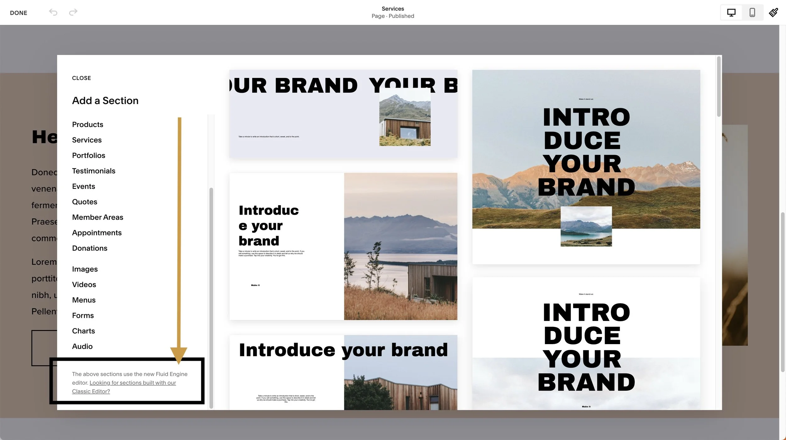
For now, you can click that to access all those Classic Editor pre-made section layouts you’re used to. ⚠️ We don’t know how long we’ll have access to this though, so if you want prolonged & more guaranteed access, try the next tip as well.
CREATE A YOUR OWN TEMPLATE PAGE
At some point, Classic Editor will no longer be available for new sections but we don’t have a date on when that will happen. So if you want continued access to CE past that point, here’s how:
While you still have access, use the previous tip to create a new CE section for every pre-made layout you want to have continued access to.
Keep in mind that the various pre-made image layouts (Card, Stack, Poster, Overlap, and Collage) will ONLY be accessible in Classic Editor but you won’t need one of each on this template page. As long as you have an image block somewhere in a Classic Editor section, you’ll be able to access the other versions of it from that block’s settings –as long as that section remains in Classic Editor.
Once you’re done adding sections for everything you want (you WILL have to go back to that same “Looking for sections build with our Classic Editor?” link each time to add a pre-made CE layout), save your page & label it something like CLASSIC EDITOR TEMPLATES.
Next time you need any of those layouts, you simply duplicate the whole template page and edit the duplicate. On that copy, you’ll be able to delete the content you don’t need, rearrange the sections, and use Classic Editor from there. You will not be able to move a section between pages though, so keep that in mind.
❻ What’s not expected to switch to Fluid Engine?
The following are all still working the way you’re used to:
Auto List sections,
Gallery sections,
blog post pages,
event description pages, and
the Additional Information sections of products
Auto List and Gallery sections still use that “other” editor; it’s not Fluid and it’s not Classic. Those are the section types that ask you to Edit Content from the section settings menu.
Blog post pages, event description pages, and Additional Information sections on product pages will both be using the Classic Editor.
⚠️ I don’t know whether/if any of these will be changing over to Fluid in time, but for now, Squarespace has told us that these page and section types will remain in their current editors & will not be using FE.
final thoughts
If you're frustrated with it, don't worry. I said my fair share of curse words as I recorded today's update video. I know saying "you're not alone" doesn't actually fix the issue, BUT at least you're not crazy. Amiright?! 😂
‼️ REMINDER:
The biggest impact you can make is to contact Squarespace with any issues and TELL THEM what they need to fix. They are listening and they can only address the problems they know about, so they’re counting on YOU to help them make it better. 😉
