6 common design terms explained
Some designers tend to use a lot of terms and industry lingo that you may not understand, but they don't do it for any reason other than we just forget you don’t know what they mean or there’s not really a substitute term that would convey the same thing. With that in mind, here's a quick list of the 6 most common basic design terms that you need to know if you’re planning to work with a designer or art department for print production.
Table of Contents Show
(Click to enlarge)
pixels and raster images or graphics
Ever wonder why sometimes an image becomes distorted when you try to zoom in too far? You'll see a bunch of square-colored boxes in the image, right? Those little square dots of color that make up the image are called pixels.
The more pixels there are inside the image, the higher the resolution; the fewer pixels there are, the lower the resolution.
PRO TIPS:
PPI = Pixels Per Inch
A high PPI number equates to a better resolution.
Images for Web are usually 72 ppi at 100% of the actual size.
Images for Print are usually 300 ppi at 100% of the actual size.
Raster images are made up of a pixel grid, like the above examples that use my logo. The further you zoom in, the better you can see the pixels inside. File types can include (among others): .psd, .png, and .jpg
More pixels should never be added to an already low-resolution image, in order to get a high-resolution image. That's just not really how it works. When the original photo is taken, or the design is exported at a certain resolution, it should only be scaled down in resolution. If you scale it up, the computer adds pixels where it thinks they belong, but the image almost always turns out blurry as a result.
🅐 Overlapping items with their own fill color. Each item has its own properties.
🅑 This is the wireframe that makes up each object. There are points that make up each one.
🅒 Here you can see the vector frame around the circle, and the handles that allow me to edit the shape of the circle.
Vector graphics
Vector objects are created with a mathematical formula. Essentially, they are objects made up of lines, points, and curves, and can have any color fill, stroke, and any number of other effects placed on each object. Vector objects are readjusted at every size, so they can be scaled up or down without data loss.
This is a great way to create a logo, so I will never fly into a panic if my client suddenly needs the logo at a larger size than it was originally drawn (for example, needing a logo for a business card vs. a highway billboard). File types can include (among others): .ai and .eps.
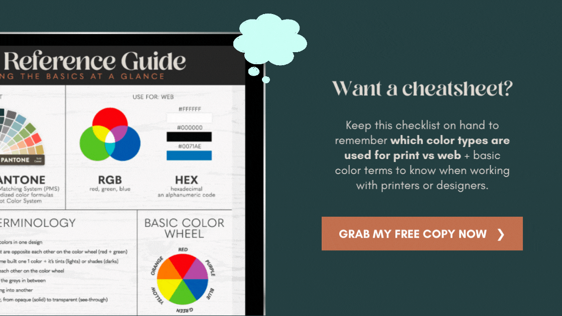
Color types:
RGB, CMYK + Pantones

CMYK stands for Cyan, Magenta, Yellow, and Black (shown above on the left). This is the color model used for print. It is subtractive, meaning that you start with White, mixing colors until you end up with Black. This is the way your simple Deskjet prints. You probably recognize the color names or the CMYK color wheel from the ink cartridges you buy.
RGB stands for Red, Green, and Blue (shown above in the center). This is the color model used in digital displays. It's an additive color model, meaning that it starts with no color (Black), and mixes in other colors until you end up with White.
Pantone is the shortened name for the Pantone Matching System (abbreviated as PMS). Pantone is a company that has standardized colors to form a giant color system that is used worldwide. Every color is assigned a number, which makes it easier for printers to use the right colors. For example, Tiffany Blue is Pantone 1837. Starbuck's famous green is 3298C. Wells Fargo uses Red 200, and Yellow 123. Most major companies have an assigned Pantone color (or set of colors) to use in their branding.