How do I design a pretty, reliable, & clickable email signature?
Table of Contents Show

📌 Pin it!
One thing I love to surprise my clients with when I help them do a Brand Refresh, is to give them a professionally designed email signature, because it’s not an easy thing to do if you don’t know where to go to make one.
You can make one in Google Docs, basic generators like Hubspot’s, or design an image in Canva, – but all of those methods can come with disadvantages and leave ya feeling like it’s better than nothing, but it’s not “the one.”
What are the disadvantages?
I share both the how and the disadvantages of using Google Docs or Hubspot’s generator over here, but if you create one in design software and export it as an image, the drawbacks aren’t super noticeable… until you’ve already got a problem:
the recipient’s email provider may make your signature design image an attachment, which means it doesn’t always show up as your actual signature… 😬
the recipient’s email provider may not show images if they don’t recognize your sender profile 🤦🏼♀️
if the recipient uses a screen reader, the image does them absolutely no good because there’s no text to read except for the file name, which may be something super unhelpful like “Launch the Damn Thing - email sig4.jpg” 😳
if the recipient checks email on a smaller device, the image can grow/shrink unexpectedly because there’s no structural parameters dictating how large/small to display the image 🙈
That doesn’t even include problems related to text displaying too large or small, images loading in poor resolutions so text is unreadable, and having one image doesn’t typically allow individual elements to be clickable, depending on how you added/created it in your email provider.
So what’s my solution? Does it fix all those issues?
Yep; pretty much!
Note: Today’s tutorial works best as a video, but if you’d prefer to read along, you’ll find the transcript below.
watch the video
TRANSCRIPT BELOW:
I get a lot of questions about my email signature these days. I've been using the same method for years now. It's proved tried and true, everything is clickable. You can design it however you like. And it shows up in all the places that I use it from Google signatures, inside Gmail, to Spark by Readdle, which is the email app that I use, it also works in Outlook and Apple Mail, even in my Dubsado account.
So it's time for me to show you the secret.
Before I dive in. If we haven't met, my name is Katelyn. I run Launch the Damn Thing. I am a Squarespace website designer, and I love showing the tools like this, that I use every day in my business. Because I believe that sharing is caring. And also I enjoy being able to nerd out with people who actually give a shit.

me making a silly frustrated face; been there, done that!
I used to wonder how they did it too!
Old me:
That is a badass signature. How do they do that? Oh, everything is clickable. I wanna be able to do that too. Oh, mine looks terrible.
Does that feel familiar? Because I have still been there too. Back when I first started, I had no idea how people were doing these beautiful signatures with photos and links to all the things. And I attempted to recreate it with an image, but that was never really quite right. So... What did I do? Well,
I have a blog post, an old one that goes through a couple of different ways for you to create some form of clickable signature relatively easily, but there are some quirks. Since then I have found a new way to do it. And today I'm going to share that secret with you too.
a screenshot of my email signature
My customized email signature & using custom fonts
This is what my signature currently looks like. I have a profile photo, very basic font. because Uh, you might not know, but fonts are particular to the computer that they're being seen on. So if I use my brand font, because I have that font installed on my current computer, that doesn't mean that everyone who receives my emails also has that font file, which means they can't see the displayed.
That's the reason why all of these tools like ConvertKit and MailerLite, they offer you a limited number of font files to choose from because they anticipate this being a problem. You can't force someone else to view the font that you're using if they don't also have it installed on their computer, without the font becoming an image of sorts.
So right out of the gate, we're starting very basic and that's fine with me. I don't need them to be in my particular font. But I am using my custom colors. I am using my logo. I even have a little GIF of coffee because everyone knows that I'm always drinking coffee on calls and meetings and all the things. That's my weakness.
I also have my social links. Everything is clickable here.
So how did I do this? what's my trick, right?
It's really, really simple.
What tool do I use to make my email signature?
I use a tool called signature.email and actually, I didn't know that they existed until they reached out to me. saying, 'Hey, I realized that you have a blog post about using a Google doc table to create a signature and I have a better option for you; test out my product.'
So I did. I fell in love with it and I started using it and I've never stopped. I don't remember how many years ago that was now, but if I had to guess, I'd say three to five years ago. So I've been using it for a long time.
They have paid options and free options. You can create a signature with limited features and use it however long you want to.
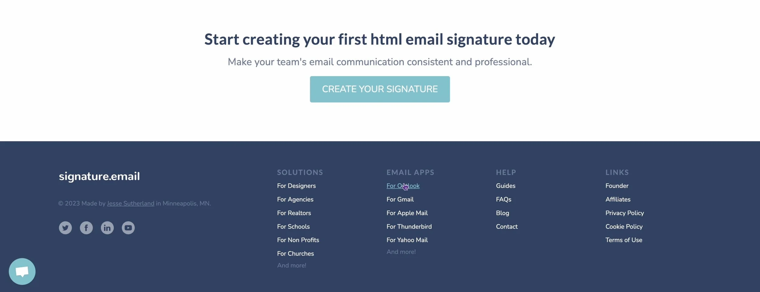
a screenshot of Signature.email’s website
You can only have access to the free ones for 30 days for editing purposes. So if you create it and you wait longer than that, you have to recreate it if you wanna edit something. Or you can buy it with a one-time license for 19 bucks. So that's what I did. I bought my template and I can edit it however many times I need to because I have that one template in my account.
You can also set it up where it can become a template for an entire company worth of people. And make it easily editable for all of those people. So it's a really cool system.
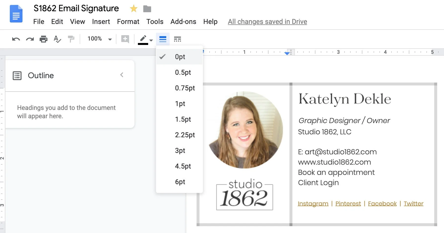
the Google Doc table method
Why it works + my past trial & error
But how does it work? It actually is an HTML signature, which means it's coded, which is why it works so well. I know that sounds scary, this gives you the freedom to make something that doesn't show up like this. When people receive your emails.
There's nothing worse than having an as a signature because when it doesn't come through as an attachment, someone on the other end doesn't know that you've had a signature, right? There is no attachment, so there's no signature. We want to avoid all of that.
And it works in all the places that you expect to be able to use it. Basically, all you need is to go in here, use their builder, generate the code and put it in.
Getting Started
Go to their website and you start with that button in the top corner, it says, create your signature or get started. It comes into the builder immediately, and you just pick from one of the templates.
All of these down here that have the little premium tag, basically, that just means that you need to at least pay for the one-time user license to access these more advanced versions. You can start with a blank down here if you wish.
I think I started with the simple photo one, so let's just start with that. It comes in a size that will work with mobile, you can name it here.
a screenshot of the Global Styles panel
Global Design Settings
There are global settings. So this is just the basic font options I am using Helvetica in mine. Basic font styles, font size, font family, line spacing, and color. You can see how this is way more functional and design-y than, say, a Google Doc table which was the old version of how I used to do this.
The signature width is the overall width, so basically, the code is saying like, we're gonna start with a box and the box is going to be 310 pixels wide. We're not gonna let the content go any further than that.
You can adjust this, but I would stick with about that width because that works really well with mobile devices, so your design doesn't get screwed up when someone looks at your signature on a mobile phone.
You can align it left center or right, which is nice, but I tend to lean more towards the left aligned because that feels more natural; centered might also be an option depending on your style, but right-aligned feels a little bit weird to me personally.
You can decide that the link color is going to be your brand's accent color, your text color, and all of that stuff. You can change the background color if you wish. So that's your global styles.
a screenshot of the editor
Rows & Elements
From here, then you're actually talking about the rows within the main container and that's where you can do all the fun stuff.
You do need to create a free account in order to upload an image, but you can change out the photo. You can add more content next to it.
On the second row, there's room for you to update the name and the title that you give yourself. You can edit the phone number, the fax number, and delete what you don't need. Click on it. There's a delete button. If you click directly on the box that you want to delete.
This works basically in a series of nests, right? So you have the overall container within that. You have rows within the row. You have elements, so you can add multiple elements within the row.
In this row, we have two elements, the name, and the title. In this row, we have a phone number and fax number. In this row, we have the address. In this row, we have the website and in this row, we have the social media links.
On the social media links, you can determine the styling. Some styling is a premium setting. You also have a limit on how many elements you can add to the signature.
Adding more elements
a screenshot of adding rows or elements
We have 11 out of 10 free, used fields. One out of two free images was used. So basically this template is starting with more than the free plan allows you to have, but you have lots of options. So if you wanted to delete, for example, the fax number, then we're at 10 out of 10. And maybe we wanna also delete the address. Let's go ahead and delete that row too. Okay, now we've simplified it a bit.
We can choose the brand's default color. We can set them to black, white, or gray. And then on the premium plans, you can do custom colors for the actual icons.
Then you can set the links up here for your website. This is the text that it will display and the link that it goes to.
You can set the spacing between letters, and the link color. You can even add separators.
We have one more spot on the free plan so we can look through personal elements that we can add.
Company elements. Contact elements. Social elements. Basically more social icons. There are all kinds of buttons that you can add on your own. For example, a YouTube button. And there are all these different options. Um, let's delete that one and look for a different one. Website button, app button upload your own button.
There are also generic elements you can add like additional columns, more images, links, images, text, paragraphs, horizontal spacers, and all kinds of stuff.
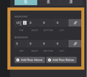
a screenshot of the Margins & Borders Settings section for Rows
Adding Lines & Borders
To get the borders, you select the row and then add the borders area. You can even add spacing between the elements inside the row and the border itself.
How to use the signature
There are all kinds of things you can do, but let's say, this is how I wanted it to look. I click preview and use signature. So this is how the signature will actually look when I start using it. I copy the signature to the clipboard. It wants me to create the account. And then it literally copies the signature to my clipboard.
Once you've created your account and you click copy signature to clipboard, then you have the HTML code option. There's a Gmail option. Any of these that you click on will give you a tutorial on how to actually apply the signature on that platform. And if you click the view, you get more detailed steps.
Where to add a custom email signature in Dubsado
And of course, the HTML code, which always works no matter where you use it.
So, if you wanted to, for example, copy and paste this design in Dubsado, you'd go into templates and then canned emails and then click on your signature here.
Select what you already have.
Delete it. And then this little button down here is the code view for your signature. So if you click that, it switches to HTML mode. You don't have to be scared of that. You just make sure you come in and grab the HTML from here. Select, Delete it, and then paste. Then save your changes. Then you will have that exact signature here.
And if it looks a little funky, you don't really have to worry about that. you just click here, hide/show borders, and it turns off all the borders.
So that is Dubsado.
Where to add a custom email signature in Gmail
In Gmail, you go into your settings.
Scroll down to your signatures.
Create a new signature, name it, and paste it in.
Then you have the signature with all the links intact, and you can choose that as your default for all messages.
And then scroll down. Save your changes!
my final thoughts
I can't show you how to apply it in Apple Mail or in Outlook, because I do not use either of those services, but they have their own tutorials for those.
Now you can get a real professionally designed, HTML signature with clickable links, that works in most software.
I hope this was helpful. If you liked today's tutorial, make sure you Like and Subscribe. So you get alerted when I add new content every week. Bye for now.