

PEEK at how I start every custom website build
Table of Contents Show
I always start the PAGES from scratch, but I do not start the WEBSITE from scratch.
🤯 I know, right?!
I don’t love to do mundane things over and over again, and I’m guessing you opened this post because YOU don’t either.
🤔 Or maybe you’re interested in working with me & you just want to know how ‘custom’ my website designs actually are. –yeah, that’s right. Caught ya red-handed!
Either way, …it (maybe ridiculously) took me years to figure out that I could create custom website designs by starting with my own template; that means now I can get started on the creative part of the website A LOT faster.
It also means shorter project timelines –just two weeks on average, three at most– from start to finish, which is my preference.
The short timelines are drool-worthy for anyone that’s just ready to LAUNCH THE DAMN THING.
Am I right?! –Yeah, you get me.
So today, I want to give you a little peek into how I actually start custom website projects for my clients.
If that first part’s got ya scratching your head, thinking ‘what the hell is she talking about?’
–Hang tight!
I’m going to actually jump into my Squarespace account and show you what that looks like!
Let's hop on into my account.
NOTE: Today’s post works best as a video, but you can also find the transcription below.
watch the video
TRANSCRIPTION
How a Squarespace web designer starts every custom website build for clients
This has the template site that I always start with when I have a new client build.
I do a lot of things on the backend before I ever get started on the actual page's designs and I don't like repeating that work. I don't think you will either.
I don't know why it took me so many years to figure this out, but it did.
I finally realized that I can start with the blank template that I designed and have all the features that I love to use and always install already in it so that I can get started with the designs a lot quicker.
That's what this is.
Basic/Main Pages
So if we start and go into the pages, you can see, I already have blink shells ready for design work to get started for things like the about page, the services page, contact, home, and even FAQs.
Although that one does already have two pieces of content in it because FAQ pages are pretty basic. I try to keep them simple.
Now all of these might be blank, but the time that I'm saving in creating a new page, giving it a name, giving it a slug, all of those pieces, those are already done for the main pages that I know I'm going to have on most websites.

Collection Pages
The other pages that I have in here are things like collection pages for all the different types of businesses that tend to need some sort of database or collection on the website, whether they're using the blog collection for blogging, for episodes, or for a directory testimonials, disclaimers, or even ads on their website.
I can adapt and get started really quickly because those things are already in place. Including the SquareWebsites plugin Universal Filter, which I've already installed on this particular blog. That will allow the client to give viewers the ability to sort filter and search through their content library.
I also have a shop set up with some demo content. I leave these things in here, even though I delete them every time, because it is actually helpful to see products in the shop to style them inside styles or with custom code, so I leave those elements in a lot of these collections.
Those things are easier to delete because they have the handy little checkboxes here. And when you start checking them, you can select all and move to a different collection, or you can delete them in bulk together.
So that's a really quick thing and this is one of the reasons why I leave that there.
Tip -“Not Linked” section organization
Before I move on, …
Fun fact: in the Not Linked section, folders do not represent dropdowns as they do in the main navigation area of your Pages menu.
So you can use folders to organize the loose pages in your Not Linked section, and it doesn't tend to affect anything.
One caveat: if you have the Advanced Maps Block plugin from Square Websites, the blog collection page it uses for the list of addresses can’t be inside a folder, in the Main or Not Linked sections.
If you’re using that plugin, you will need to pull that collection page out of a folder because it can mess with the ability of the advanced map block plugin to function.
On the other hand, if you have no idea what I'm talking about, ––you're probably not using that plugin.
So moving on!
The most important part is the under-the-hood type stuff that I always include in the settings. These are all pages that are not designed for public consumption on a regular basis. They're not designed to show up in Google searches.
Tip - Turn off Search Engine Indexing for backend pages
In fact, I've turned off Search Indexing for Google in the settings for all of these pages by going into the page settings, clicking on the SEO tab, and turning that toggle ON to hide each of these backend pages in search results.
Because it's not important for Google to populate the legal pages and policies and search results. If you turn this setting ON, you will not have your legal, error 404 page, thank you page, or template style guide competing for rankings against your public page like home, services, and about.
So, what's inside of these pages?
Website Legal Policies
The legal policies could be a blog, a portfolio collection, or something to house sub-pages, where each page has its own policy.
And the reason for that is so that if you ever had to prove that IP address did in fact land and look at your page, it's a lot easier to do that if each policy is on its own page.
Also as a perk with this kind of structure, each sub-page has its own link. So if you ever needed to link directly to your privacy policy, you would be able to do that inside a collection page. Like blogs/ whatever, it works the same way with either a blog collection working as a database for your policies or something like this, which is a portfolio collection. In this case, the main hub is backslash legal.
Then all the individual pages would be backslash legal bank slash whatever you tell it that page slug is.
If you provide the hub page, they come to a page like this, with a list of links to all the titles of those sub-pages or policies within this collection, when they click on any of these, they would have the policy in here and at the bottom, it would have automatic built-in pagination to go forward to the next policy or backward and forwards as they move into the sub-pages.
So it's a good thing for that structure to already exist so that you don't have to create that if you want it.
Tip - your website’s legal requirements
Side note here, as far as I'm aware (and I am not an attorney, so this is not legal advice) the privacy policy is the only one that's legally required in most places. No matter what your business is, you do have to have one of those.
I should note:
I do NOT provide the policies for my clients. They have to choose their own solution & submit those for me to add on the website, but the structure for where I organize them on the website already exists.
My personal preference for getting website legalese (for different budgets) are:
go to Creative Law Shop to grab the website policies bundle and more. They check their templates regularly throughout the year and update them if the law has changed. The huge perk is that you don't have to pay for it ever again, once you've already purchased it. I’m not aware of any other legal template shop that does that!
a one-time payment gives you lifetime updates
use affiliate code LAUNCH10 for 10% off
cost more up-front, but less over the lifetime of your business
offers more than 90 different templates for all kinds of contracts, policies, and add-on provisions
also has a great A-Z legal course for new business owners
website policies require manually checking for updates, manually editing the updated policy & manually updating the policy on your website
all templates are written by a U.S. attorney & are also peer-reviewed by professionals in the intended industry
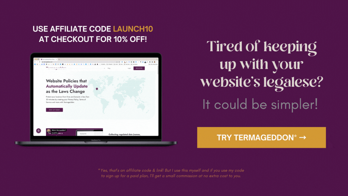
or use something like Termageddon*, which generates a policy for you that you can embed on your website, and keeps it up to date for you. It lets you know when there are new things to add or new questions to answer, based on changes or updates in the laws related to your generated policies.
pay monthly (~$10 USD) or annually (~$100 USD)
use affiliate code LAUNCH10 for 10% off
cost less up-front, but more over the lifetime of your business
offers just 6 website-specific policies: Privacy, Terms, Disclaimers, Cookies, the Cookie popup, and EULA
their cookie consent tool gives your website users more control over their privacy
updates to the policies are automated wherever possible, so it’s much closer to set-it-and-forget-it once they’re installed
“founded by a licensed attorney who also serves as the Chair of the American Bar Association’s ePrivacy Committee.”
“currently available for businesses formed in the United States, Canada, Ireland, United Kingdom and Australia. Please see the pricing page to see policies available per country.”

Error 404
The Error 404 page is a really important page.
Websites will have broken links over time. It happens to the best of us. Even the pros like myself. And when it happens, you don't want them to land on a page that is not useful for them to find the thing they were looking for. So please, for the love of all things holy, create a custom Error 404 page.
It can have things like
a Search Block buttons that link to specific areas of the site that you think people will most frequently be looking for,
a Summary Block to pull in testimonials or recent content from the website,
and even a Form Block that could help them let you know what's actually broken.
To set this custom version as the website's display page for broken links, you actually go back into your main menu.
Go over to Design,
Select 404 Page,
then pick the new page that you just created from the dropdown list of pages that exist in this account. (By default, it will be on the “System Default” page, which is the not helpful version.)
Pick the one that you created.
Save your changes.
You’re good to go!
READ MORE: How to make your own Error 404 page
Instagram bio link’s page
The next one on the list is the Instagram bio link. That's what I'm calling it. This page is designed to give you a custom URL that goes at the end of your domain.
So you can put that one link in your Instagram bio or your Pinterest bio, or your LinkedIn bio or your Facebook bio, or here YouTube bio, whatever it is. And give people one page that exists on your website, that is styled like your brand, that has the ability to link and show, automatically, recent content on your website... for free.
Because you're already paying for your website. You might as well do this on your website. If you use an outside service or a third party, like Linktree, you're paying potentially, or having to go to a different place to update that stuff.
If you want it to be branded perfectly to match the rest of your style, you have to usually pay for that. So, skip the third party. You're also sending traffic to them in between getting them from point a to point B. Right? You don't want them to go from point a to point B to point C the more clicks they have to click to get to the end result, the less likely they are to get to the end result. So skip all the hassles, skip the extra payment, and create this for yourself.
The good thing with Fluid Engine is now you can actually design the page to look great on mobile without any custom code.
All I have done on this website is establish in the code injection, for this page only, that I am going to hide both the header and the footer for this page. You can choose to hide the header only, or you can choose to hide the footer only, depending on what you prefer.
On this particular version, I'm hiding both because I want it to feel like a standalone website in and of itself, without actually having it be a standalone website.
Grab the CSS snippet:
Hide BOTH the Header + Footer (v7.1)
<style>
.header,
#footer-sections,
.tweak-mobile-bar-top-fixed .Mobile-bar--top {
    display: none !important;
}
</style>
Hide the Header ONLY
<style>
.header,
.tweak-mobile-bar-top-fixed .Mobile-bar--top {
    display: none !important;
}
</style>
Hide the Footer ONLY
<style>
#footer-sections {
    display: none !important;
}
</style>
I have a space to put in the company logo because we're hiding header navigation, which has the logo in it. We have to reapply it basically. I have room for several different links to your freebies page, to your services page, to your about page, to whatever.
And a summary blog that will pull in recent content, whether it's testimonials or blog posts or podcast episodes, or whatever it is. If it exists on your website, you can pull it in through a summary block.
At the bottom, there's also a block for adding your social media accounts. So if you want people to know where else your brand exists on the interwebs.
You can do that with a social media block and that'll give them the ability to go follow you in multiple places.
So that's your Instagram bio link page.
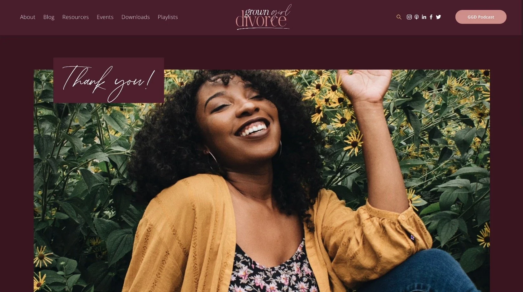
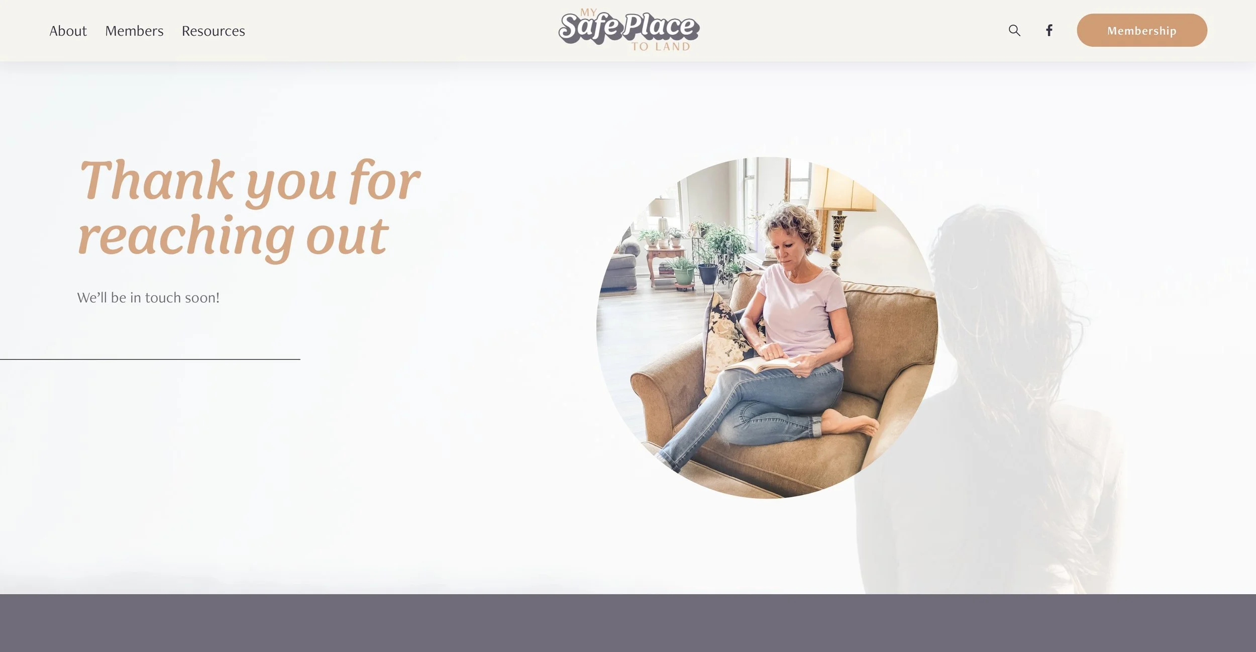
Thank you page
Next is your Thank You page. And that's really simple. I always start with the blank because again, really simple. Usually, it's just a photograph, some text, and maybe a button.
It's typically being used for things like a form submission redirect, when someone fills out a form on your website, the Post Submit section of that form can say, ‘Hey, go to this other page after they've pushed the submit button on the form.’ This page can be the page they get redirected to.
If you want to be able to use it for multiple purposes, then I would keep it really simple. Just say, thank you and let that be the end of the story.
Or you can create multiples of this page type for different reasons. You can have a thank you page for email marketing-related preference updates. You can have a thank you page for submitting forms on your website. You can have a thank you page specifically for client inquiry forms.
All of these things, but this is the starting point and I try to keep it really simple so that it can be multipurpose.
Here are some examples below:

READ MORE:
Everything you want to know about the built-in Squarespace forms (& how to use the post submit redirect)
The Custom CSS you’ll want to style your Lightbox and Quick View forms in Squarespace
Template Style Guide
One of the last pages is the template style guide. I have a separate tutorial for this to make sure you go check that out if you're confused. But basically, this is one very long page with a bunch of popular elements that I tend to use all the time so that I can see those groupings of elements in different color themes.
And if you're new to Squarespace. You may or may not have access to color themes, depending on the version of Squarespace you're using, it is unique to version 7.1. And it does not exist on 7.0.
And that's the reason why I built this.
I needed a way to see what all of this stuff looks like on different color themes.
So if you're totally confused or feeling kind of #jelly, and you want to know what the heck I'm talking about, this is your color themes.
On 7.0, you had alternating colors for “Index pages” and if you wanted a different color background for any of them, you had to upload your own image graphic of a color and use it as your background, or use custom CSS per section.
On version 7.1, you don't have to do that. You have 10 options that are built for you based on the color palette that you choose. If you want to learn more about that, I have a video linked below.
WATCH + LEARN MORE:
How to set Squarespace’s Color Palette & Color Themes with minimal editing
So when I'm designing a new website, I want to see how the font looks in multiple different styles, title, case, upper case, bullet, Italian, regular, all the things I want to see the spacing in paragraphs. I want to see how the link looks in a color.
All of the different button styles. If I'm using Classic Editor, I want to see all of the different image layouts and what those buttons, titles, and paragraphs look like. There are also overlay colors.
I also want to see what the lightbox form looks like and style that.
And going back to the redirect for the thank you page that is under the post submit area of your form settings in Squarespace.
If you want to redirect, you choose that tab right here and put in the link and it can be your own website.
I have a Lightbox form with one of every possible field option in it, because yes, I do style those with custom CSS. And in order to do that, I need to see it to see what it looks like to make those decisions. I also have an inline form because the CSS applies to both and sometimes it'll react a little bit differently in both places.
So I need to be able to see that. I also have a product block for the shop and also a newsletter block.
I've designed this section and I have duplicated it 10 times. I have one of those for every color theme so that I can see how the colors will react to all of those elements.
Those are the most popular. So that's what I want to see.
That makes it really quick and easy for me to apply that brand styling and feel comfortable that it's going to work in all the areas of my site. So in creating the about page and the services page and whatever, I don't stumble across things all that often that I have to go back into site styles and adjust later.
READ MORE:
Building your own Template Style Guide on 7.0
How to build your own Template Style Guide on 7.1
WATCH: Fluid Engine Playlist on YouTube
Sandbox
The last piece is the sandbox. The sandbox is unique to every client.
Essentially, it is a page that is disabled because I want to give the client a space to be able to practice editing their website without feeling like they're going to screw anything up. I do not have the enabled page turned on so that they don't have to worry about anyone accidentally finding this stuff.
This gives them a space where they can create new sections and use or reuse saved sections again. That's a feature for 7.1, not available on 7.0.
If they want to practice using Fluid Engine, if they want to practice in Classic Editor, I can give them a classic editor section as well as a fluid engine section.
And if you're confused about that, I have several videos about Fluid Engine too.
This is really customed to the client and how they are using their own website. So I tend to build it with that in mind, if they need a lot of practice with summary blocks, I'll give them practice with summary blocks. If they need a lot of practice with embedding a podcast player, I will give them an embed block. If they need practice with forms, I will give them a form. Accordion blocks, all the things, right?
You just want to give them a space to play and feel comfortable that they're not going to screw up their website.
READ MORE + WATCH:
How to re-use your favorite section layouts in multiple places (like design presets!)
Private Resources
The last area I'm going to touch briefly on (because I'll cover that in a future video) is a private resource area that I password-protect for clients.
I just started adding this to new client website builds because I wanted them to have quick and easy access to resources that will help them maintain their websites with confidence.
Basically, that looks exactly like what you see here. It's a copy-and-paste thing right out of my ClickUp doc.
And it has links to all of the popular resources that I think they will need as they move forward with maintaining and editing their own website, including quick access to the help center and the support areas of Squarespace. Learning a little bit more about accessibility, SEO resources, blogging videos, all the things, right?
The new page checklist is a big hit!
So that's a private page that I give clients. It is password protected on their sites so they can access it when they're not logged in, as long as they know the password and the link to get there.
Custom CSS
The very last piece and the piece that's not applicable for everyone that designs websites, because no, you don't need to know custom code in order to design on Squarespace, but for us, that designed for other people for living. It can help.
So over the years, I've taught myself and taken courses on how to write my own custom code. And so for that reason, I do have a fair bit of custom CSS on my websites. Including variable fields so that I can apply custom colors that match the color palette in Squarespace to the code beneath it, and only have one place to edit the code. I also have some breakpoints and other variables, custom scroll behaviors.

And a place to install custom fonts. Um, let's see, what else do I have? Slightly editing the search page that's built into Squarespace. Um, styling the comment box, styling the forms, styling the headers, editing the map customizations.
And of course, the cookies pop up.
So as you can see, that's a fair bit of code and that's just my starting point. And most of the websites that I do for clients have on average about 1,000 to 2,000 lines of CSS in it. Give or take, and I usually have the SquareKicker plugin* installed on top of that.
How to keep this template in your account
Duplicating trial sites
If you're wondering how I manage that, by the way (because Squarespace by default gives people two-week trials, or if you're a circle member, you get a six-month trial to do your new websites), just duplicate this template every six months to keep it.
Or you can also ask a Squarespace support member to help you extend the template’s trial length another six months each time. They are always happy to do it and asking takes about 5 minutes or less, once you get a human being on the live chat.
PRO TIP:
when you open the live chat, immediately type “talk to a person” to skip the Bot and get in line for a reall human, more quickly!
For either method, you will always have a copy of this template in your Squarespace account, without having to pay to keep it as a separate, live website.
That's a wrap on my blank client website template!
If you loved today’s post or accompanying video, make sure you leave a comment below with your “Ah-ha’s!” and like and subscribe over on YouTube so that I can keep delivering awesome content for you!
