

How many action buttons on the same page are too many?
Table of Contents Show
One problem I see with newer business owners over and over is that they're scared to ask for the sale more than once on ANY page, no matter how long. No matter how it's set up.
And honestly, I get it. I was there too, once upon a 2015. But here's the thing: You can never get what you don't ask for.
Just like playin' the lotto in America. Ya can’t win if ya don't play.
If you don't tell your visitor what you WANT them to do, and repeat it, they might miss the ONLY button you have that's asking. It's that simple.
It's kind of like throwing hints at your Mom when you were a kid, for what you wanted for Christmas or your birthday. You never just said it ONCE, right?
Call them action buttons, CTAs, Call-to-Actions, take-action, asks, –whatever. They all refer to the same thing.
How many should you have on the same page? Have you ever searched for the answer? Or did you search but can’t find a straight answer?
That’s because there’s not really a straight answer to give because it depends on several factors and each business is a little different.
There’s a happy medium ya need to strike here. Enough, but not too many. Clear and remindful, but not annoying.
General CTA Best Practices:
Let’s keep this super simple.
🚨 DON’T use more than 1-2 different “asks” or CTAs on a single page. That means requests of the viewer to do totally different things, like ‘Download my freebie’ and ‘Work with me’ in the same space. Confusing, right?
🚨 DON’T say things like “Pay Now” on your buttons. This is not Jerry -Maguire. I know you’re trying to be clear, but you also don’t want to seem like you’re demanding anything or yelling at them to take an action they might not be ready for yet. Instead, try a softer approach like “Work with Me,” or “Get Started.”
✅ DO use a minimum of 2-3 of the same “ask” or CTA on a single long scroll page. They can be worded differently, as long as they remain clear, but they all have to be asking the viewer to do or take the same action. It doesn’t matter what action (that will depend on the page & what the goal is for that page.)
✅ DO use 1 single “ask” or CTA on a short page, where no scrolling is required to see all of it. No need to pile on 3 different “Contact Me” buttons when the page is that short. If the viewer doesn’t have to scroll to see all of it or most of it, only 1 CTA is necessary.
One last, really important thing: Who would I be without including that famous JM scene? 😁
📌 Pin it!
Ok. Moving on…
How many different CTAs should be on 1 page?
Short answer: 1. Mayyyyybe 2, but “the devil is in the details” so let’s expand on that because you’re probably thinking, “…but you just said…” –And you’d be right, because I totally did. 😂
To clarify: How many different asks you have on a single page will depend on the type of page you have them on.
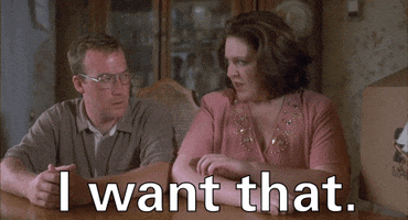
On a sales page for a service or a course, for example, you’re probably using a long-scroll or index page format. (That is a veeeeeery long page broken up into different sections or bite-size pieces of information that walk the buyer through the process from ‘hey, that seems interesting,’ to ‘holy shit –I WANT THAT.’)
For these types of pages, logistically, they’re too long to only have literally 1-2 CTAs even if they both ask the viewer to perform the same task. The statistical probability that all buyers will scroll all the way back through the page to find a buy button here or there is extremely low. So don’t make them do that. Give them ample opportunity to take action.
I know it feels redundant; even ridiculous. You might think it feels sales-y. Or even desperate.
It’s all in how you word it in the copy, what you say on the buttons, and your presentation of the material. Use their language! How does your buyer speak? Do they relate to buttons that say “Add to Cart” or “YES–I need this!”
You can ask that viewer to buy in every other section if you want, as long as you handle it with a genuine tone that shows how much you think your product/service will actually HELP that viewer, –rather than focusing on how much you want to SELL TO that viewer.
See the difference?
Business owners which provide services/products they truly believe in, find it very easy to sell. They don’t think of it as selling at all, they think of it as helping the viewer make an informed decision & genuinely helping people.
Business owners which provide services/products they don’t believe in, but think will make them a quick buck, feel sleazy when they sell. Desperate. Repetitive. That’s because whatever they’re touting just isn’t the right fit. Sure you can be successful at this, but will you LOVE doing it? Maybe not. (Hopefully not.) And isn’t that the point of going to all the trouble to start, run & grow your own business? To love what you do? 😬
Single CTA = 1
To clarify further, the proverbial “we” (web designers) consider the same action or “ask” to be a single CTA, no matter how many times it appears on the page.
That means, on your Services page, if all your buttons (plural) say the same thing or refer to the same action, that’s 100% OK.
What you’re looking for here is to encourage a single action, and strategically placing those reminders (buttons) throughout the design so the viewer doesn’t have to scroll forward/backward to find one.
Multiple Unrelated CTAs = 2 (max)
Here I’m talking about a series of buttons or asks referring to totally different actions within the same page. It confuses viewers, so avoid this as much as possible. Why?
Let’s say you walk into a grocery store & make a beeline for the produce section. You just ran out of apples last night & you need to re-up. But when you get there, there’s 14 different kinds!? No joke. Some are green, but the rest are red, or a combo of red/orange-ish/yellow. You’ve never heard of these apple types before… are these brands? What’s the difference between Ambrosia, Honey Crisp, Jazz, Sweet Tango, Gala, Red Delicious (–but are they, though?), Empire, Fuji, Granny Smith, Pink Lady, Envy, Braeburn, Golden Delicious (👀), McIntosh (isn’t that the tech company?), and so on.
What do you do? Do you pick what looks prettiest? Bail & decide to go to your usual apple spot where the choices aren’t so confusing? Do you abandon your apple-pickin’ altogether? Do you stare into the void hoping someone will offer some assistance because you look so confused? Do you whip out your phone to research what the difference is?
No matter what you decide in that example, statistics say the vast majority will bail because it’s just too many choices. You’re extremely likely to feel overwhelmed immediately and decide to move on. In the internet realm, that’s called a “bounce.”
We’re not comparing apples 🍎 to oranges 🍊 here. (Heh, heh. Get it?)
It’s the same concept on your website.
If you present 10 options to work with/buy from/interact with you, your viewer won’t know which action to take, so KISS. {Keep it simple, sister!}
Multiple Related CTAs = 2+
If you get to the end of the page and you need to have 2 related call-to-actions, that’s different.
One could be ‘Start a free trial’ and the other could be ‘request a demo.’ Both are related to the buying process for whatever that thing may be, and they only help narrow the viewer to wherever they are on their specific quest for that thing (ie: are they ready to go ahead & start, or do they need to see it in action first?)
final thoughts
Don’t confuse your customers with tons of options, but DO remind them more than once of the action you want them to take. Use the type of language they’d use themselves and avoid hard-sale tactics like “Pay Now” instead of “Get started.”
Why’s it always gotta be so complicated? 🎵
#MillenialMemories
