How to choose the right font style
Why do designers avoid certain fonts like the plague?
That's a great question and one I'm excited to address, because I love typography!
Unfortunately, some of the worst offenders tend to come pre-loaded on most computers.
You may already know this (but just in case you don't) there's a whole world of fonts out there!
Believe it or not, a lot of really cool people create new fonts for fun, or design them for a living. New fonts are always popping up, and trends come and go, just like in the fashion industry.
Some fonts came and stayed; and frankly, designers wish they hadn't. Which ones are they? Take a look at the example. These are considered the worst offenders, though there are plenty more!
Every font is different and there is a time/place to use (or not use) each of them.
How do you know what font style to use and when to use it?
Let's start by asking some questions first:
• What do you like about the font?
• Does it fit a theme you're using?
• Where will you be using the font?
• How long will the design be used? (years? months? days?)
Now, I know some of you are thinking 'why does it matter so much?' The truth is, the type of font you use has a lot of influence on the reader's perception of what they're reading and how credible you are.
READ MORE: Why is a good logo so important?
If you're a lawyer, and all of your contracts are typed in Comic Sans, it's highly unlikely that your clients are taking you seriously.
If you're a wedding planner and you use Brush Script for your custom event invitations, your brides are gonna choose to get their invites printed somewhere else.
READ MORE: What are the benefits of hiring a graphic designer?
Questions to ask yourself:
What do you like about the font?
Which characteristics do you like about it?
Is it super girly or really masculine?
Is it prim & proper or vintage & distressed?
Does it look like real handwriting or proper calligraphy?
Does it fit a theme you're using for your business, etc.?
Using a western 'MOST WANTED' style for a horse trainer? Maybe you were eyeing a font with heavy serifs (the little "feet" on the end points of each letter) for a political campaign ad.
Or maybe you're throwing a birthday party for one of your children, so you choose a font that looks like it was written by a child. These are the kinds of things you should think about before you make your choice.
Most importantly, where/how will you be using the font?
In a title or paragraph text?
On a cover page or a highway billboard?
The type of mistake I see the most is using a certain type of specialty font in the wrong place. See my examples below, if you're not sure what I mean by that.
These example fonts were chosen because, while they may work at a very large size, they are not legible at a small size. You can see the major differences in the detail when the size is big vs. small in my example.
EXAMPLE 1
I have seen this used in body text throughout AN ENTIRE WEBSITE, and all of it was very tough to read, because body text is usually 11 to 16 points in size.
That's too small to use a font with a lot of details in each letter. The text was so hard to read, that I bounced shortly after pulling up the site, even though the products shown in the shop were cute. I just couldn't read the information or the prices!
EXAMPLE 2
Here, the font doesn't have any lower case letters, so I feel as if the author is yelling at me. It's also not easy to see where the sentences begin and end, because there is no differentiation between the letters in each one.
Using a font that has no lowercase letters, no capital letters or choosing to only use capital letters in a font, is really only good for a title or headline, to grab the reader's attention briefly.
It's never good to use for long paragraphs.
EXAMPLE 3
This time a fancy script is used for paragraph text, when it's really only meant for short titles and other things of that nature.
The ascenders (the parts of each letter that extend upward like on the letters: b, d, k, l, etc.) and descenders (the parts of each letter that extend downward like on the letters: g, j, p, q, y, etc.) collide with each other between lines of text, making it very difficult to read.
To fix this, you could widen the space between lines of text, but with a font like this, the space would need to be so wide, that lines of text in the paragraph would no longer appear to be part of the same body or group.
Spacing that far apart would look more like multiple lines of text that may/may not go together, rather than a cohesive thought.
EXAMPLE 4
Lastly, this is a western style font that only has capital letters. This font doesn't have any lowercase letters at all, like Example 2.
It's different from example 2 though, because each letter has a design inside the fill color for each letter, that is really only meant to be seen at a much larger size.
Like Example 1, this font should never be used for paragraphs.
READ MORE: 6 Tips for Designer Newbies!
Next time you choose a font for one of your projects, papers, presentations, briefs, etc., give it a little extra thought. It'll help us designers cringe a little less 😂 and give yourself some added credibility and professionalism!
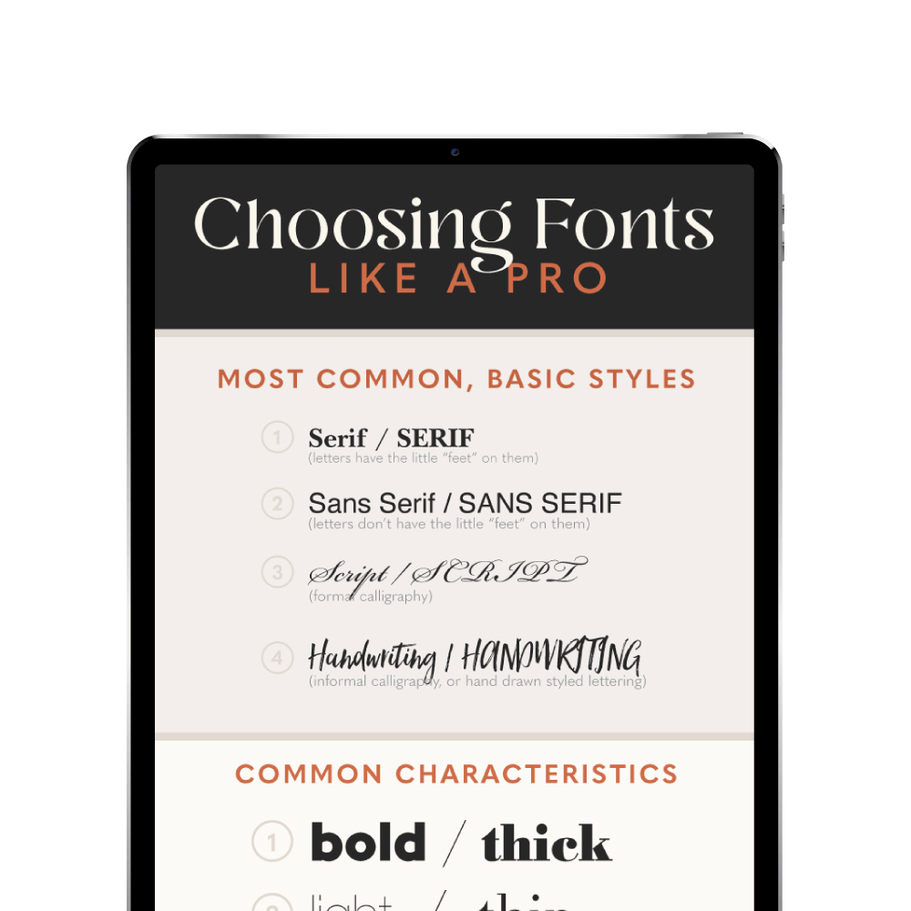
Don't forget to grab your free guide 👇🏻
Choose fonts like a BOSS.
Get the FREE guide to keep as a cheatsheet!


