

How to customize Termageddon policies on Squarespace + use it with our clients
Table of Contents Show
In the last video, we talked about how to set up and install Termageddon.
Now I actually want to show you how to customize it on your website, in Squarespace specifically.
So this is a Squarespace-specific tutorial for styling these pieces, but use your imagination because it probably works in whatever platform you're using instead.
Let's hop in!
here for the code?
jump to the Custom CSS for the custom privacy settings link (if you’re using that instead of the fingerprint icon)
bookmark Termageddon’s CSS cheatsheet, from their helpdesk article
VIDEO TRANSCRIPT:
Customizing the Policy Embeds with CSS
I wanted to give you an overview of what is in each of these snippets so that you'll know which elements you can change and mess around with, stuff that you could add or remove, that kind of thing.
First we're going to look at styling the policy itself. That's the embedded policy on your legal page.
Specifically that is, this part right here. Not this part right here. This part is the button for the settings.
This part is your policy itself. So this is what we're going to be styling because remember, when we were in Termageddon, we selected to change all of the h2s to h3s. So I have set that in the code here.
So notice at the top of the code it's there's notes in here, anything that is marked with two slashes ( // ) or a slash and an asterisk ( /* or /** ) at the front and the end, those are actually notes, not part of the code itself, just to tell you what each section is for so that you know what to change, and where.
Changing the heading font
/*change heading font*/

#policy h3 {
  font-size: 1.5rem;
  font-family: inherit !important; //change font
  font-weight: 400;
}
The first note is changing the heading font and we are targeting only in the policy, the h3 or heading three is supposed to be styled like this.
font-family: inherit !important;Means it'll use your regular heading font, whatever it’s currently set to.
But you can actually change the H3 font style if you want to. In my branding, I use a more display font, which can be harder to read in smaller sizes so I decided to change mine to the same font I use in paragraph styles instead.
font-family: exact font name here !important;Means it'll use your the font style you selected, as long as it’s already installed first.
There, I’m actually saying, use this font family instead of what's traditionally used in my headings and you can do that too if you want to.
Otherwise, just remove it. If you're happy with your normal heading style, you don't have to override it here in the code.
In that same vein, if you are changing the font, you may also want to change the weight.
font-weight: 500;font-weight: bold;
There are two ways you can do that, so it just depends on the font itself & what you know about it. My particular paragraph font has lots of different weights. So I can decide how heavy or thin I want it to be by changing the number in increments of about a hundred. I think it's like 100, 300, 400, 500, 600, 700, 900. I'm not sure if there's an 800. That's just something you have to know from having the font files, looking at it, and site styles and Squarespace.
If you don't know, just put bold for thicker, or ‘normal’ for thinner. If you do that & don’t see a change, check your code for correct formatting & punctuation. If it looks right but still hasn’t updated, it’s possible your font doesn’t offer more weight options.
If you don't want to change the font weight at all and you like how it is, just remove that line in the code.
/*change accordion title font*/

#policy .accordion-heading {
  font-family: inherit !important; //change font
  font-size: 1rem;
  font-weight: 600;
  color: #000; //change color
}
Styling the Accordion Titles
The next section is going to target the accordion titles, that is this area right here. So I don't remember what this was, but I want to say it was also a heading 3.
I didn't want it to look like headings so I want to make the heading, inside the accordion only, this font and this size in that weight.
font-family: exact font name here !important;
font-size: 1.3em;
font-weight: bold;
If you need to space your words a bit further apart, add a line for word spacing. That's actually the space between words.
word-spacing: .5em;
or
word-spacing: 5px;
There's also letter spacing. You're probably more familiar with the letter-spacing property value, which is adding space between each letter.
letter-spacing: .05em;
or
letter-spacing: 2px;
The color is for the text itself. Here, I wanted it to be black. Rather than the kind of dark, coral color that I use in the headings on my website policies. Reason being, I didn't want it to look like something necessarily clickable.
color: black;

color: #000;

color: rgba(0,0,0,1);
Note that the extra digit at the end of the RGBa value represents its opacity.
1 = opaque (not transparent)
0 = transparent (see-through)< 1 = transparent, in percentages ranging from .01 (1%) being nearly completely transparent, to .99 (99%) being nearly completely opaque
Examples:
• .5 = 50%
• .1 = 10%
As long as you know the three RGB color values, you can format it like the above RGBa color and add that last decimal point to set the color’s opacity (transparency) with it!
color: rgba(0,0,0,1); = opaque black
color: rgba(0,0,0,.25) = 25% transparent black
Color Variables inside Custom CSS
Please note: where it says @black, that is actually a variable CSS where I have established what that color is outside of this snippet. In my custom CSS on my website, at the top, I have variable fields. If I can scroll, there we go. I have variable fields that I am setting. That way, I only have one place to change the color or the hex code and if I'm using this variable throughout all of my custom CSS, then I know it will automatically update.
To learn more about this, check out this video from Bea, who teaches that way better than I ever could! 😄
So that is what the @black means. If you do not have those established, it will not work. So if you want to use a color that's specific to your brand, use the hex code. Or the RGB code, whatever you actually are familiar with or know. Or if it's a straight RGB color like " black," " white," "gray," those three are pretty normal.
If you're talking about like " red," " blue," " purple," " green," " yellow." Those are gonna be straight RGB colors that are blinding. Harking back to the nineties-era colors that we knew of on the internet. So you probably don't want to do that, but you can actually write normal color words here and it will pick that up, but they're ugly, typically, if they're not adjusted.
So customize that to be whatever you want. Don't use the at symbol, unless you know that you have color variables already in place.
This whole area is pasted into Custom CSS. So over here where I was just in, that's where my policy customization lives.
So that's where you are probably going to put it. If you have the color variables, it will work. If you don't. Don't worry about it.
/*add down arrow icon to accordion titles*/

#policy .accordion-summary:before {
  content: '▾'; //accordion icon
  padding-right: 10px;
  color: #000; //change color
}
Adding the Accordion Icon
The next step is adding the down arrow icon to the accordion table. I don't actually remember what it looked like before I put this in.
Maybe it was nothing. Maybe it was a plus sign. I actually don't remember, but whatever it was, I didn't like it. So instead I decided to say, before the accordion summary, add this icon, the content is that glyph, which I typed on my keyboard.
Actually on a Mac, you can get the keyboard viewer, which is this little thing right here and you can search through here for like arrows. I don't know how you do this on a PC. Otherwise, I'd tell you, but you can search for an arrow or a triangle, plus signs, etc.
That's where I got the icon from. Then I typed it in between the two quote marks there like this:
content: '▼';
The padding right, is the space to the right of the icon. So because it wasn't there before, when I added it, it was up against the first letter of the title in the accordion. That didn't look great. So I gave it some room to breathe. You can change that number value if you want to.
padding-right: 15px;padding-right: 2%;
The color is the color of the icon itself, so you can decide whatever that's going to be. Again, use your best judgment, make it match your brand.
color: red;color: (255,0,0,1);color: #DD0000;
/*policy table styles*/

#policy .accordions {
  border-radius: 0px !important;
  border: solid 1px #000; //change color
}


/* accordion content spacing */

#policy .accordion-content .accordion-section {
  margin: -.5% 3% !important;
}
Policy table/accordion styles
On the policy table styles, this is a really easy thing to do, all I did was adjust the border-radius from 2, 3, or 5 pixels, whatever it was by default down to 0, because most of my website has sharp corners and I want to stick with that theme.
border-radius: 0px !important;border-radius: 5px !important;
Then I gave it a solid 1px border of black. So again, I'm using that variable field. You don't need the add symbol, replace it with just a word color or your hex code.
border: solid 1px #000;border: dashed 1px grey;border: dotted 2px red;border: double 1px black;
You can change the weight, style & color of the stroke, or that line which boxes in the accordion or table design.
You can also get rid of it entirely by saying none in place of all of this. Or you can say zero here. Then that kind of leaves this part and this part hanging, but not applying because the stroke has zero.
border: none;border: 0px;
So there's lots of ways that you can play with that. I think by default, it was like a light gray color. Maybe. I can't actually remember!
Anyway, those are all of the values. That you can use to change or customize the policy. There may be a few more. I'll try to find the Termageddon in CSS cheat sheet.
the whole CSS snippet for policy embeds
// Custom CSS - TERMAGEDDON PRIVACY POLICY //
/*change heading font*/
#policy h3 {
  font-size: 1.5rem;
  font-family: inherit !important; //change font
  font-weight: 400;
}
/*change accordion title font*/
#policy .accordion-heading {
  font-family: inherit !important; //change font
  font-size: 1rem;
  font-weight: 600;
  color: #000; //change color
}
/*add down arrow icon to accordion titles*/
#policy .accordion-summary:before {
  content: '▾'; //accordion icon
  padding-right: 10px;
  color: #000; //change color
}
/*policy table styles*/
#policy .accordions {
  border-radius: 0px !important;
  border: solid 1px #000; //change color
}
/* accordion content spacing */
#policy .accordion-content .accordion-section {
  margin: -.5% 3% !important;
}
Styling the custom Privacy Settings button
I referenced that to get these class IDs and the property values and all of that to target before I wrote the Custom CSS for it.
Moving on to the second piece, which is the button itself.
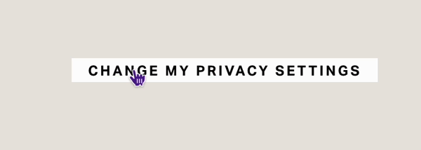
When you get ready to install the actual Termageddon button, which is this thing right here.
Grab that embed code from Termageddon, which is. Under policies and then your cookie policy and consent tool, view embed code, this last one right here for the user-centric policy settings link.
That is the thing that pulls up that module again, so that the user can choose their privacy settings.
When you paste that in, it's gonna look like this and that's why I said I decided to make it look like a button because this has no color associated with it. It has no underlying associated with it. So in no way does that look like a clickable thing until you hover over it. When I'd be out of edit mode, my cursor would change to a pointer, from an arrow.
That's the only indicator that it's actually a link. So I think that it needed custom CSS to make it look like something that you can click on.
I needed to add a snippet of custom CSS to the code block so that I could style it here.
So what we're actually doing, this is all in a code block. You can do it all on the same block. It doesn't have to be split between a code block and Custom CSS. The reason why is because this is an HTML style tag, which allows me to use CSS in between the style tag.
This is the HTML note, not part of the code, just to tell you what all is in here.
<!-- HTML Termageddon Cookie Consent Tool privacy settings button -->

<center>
  PASTE THE CODE FROM TERMAGEDDON HERE
  FOR THE BUTTON LINK ONLY
</center>
Termageddon’s button embed code
I have a center HTML tag, that's the first part of the tag and that's the end tag. You have to have both pieces.
Paste in your Termageddon code there, between the two <center> tags.
Then underneath that is where you can style the link that you just pasted.
/* button style */

#usercentrics-psl {
  font-weight: 600; /* change value, remove, or replace with bold */
  color: #fff; /* change color value */
  font-size: .7em; /* change size value */
  text-transform: uppercase; /* remove if not wanted in All Caps */
  letter-spacing: 2px;
  background-color: #000; /* change color value */
  padding: 3px 15px;
}
Make it look like a button
This is where you can decide what weight you want the font to be.
font-weight: XXX;
You can remove that for a thinner weight font if you want, or you can literally just say, bold here instead.
You can change the color; this is the text color, not the background color.
color: white;color: #fff;color: rgba(255,255,255,1);
What we're doing here is we're styling the link itself. We're saying we want the font color to be white.
We want the font size to be an EM rather than pixels, because it's more responsive in ems.
font-size: 1em;
Text transform states that I want it to be an uppercase. You can remove that if you don't want to fool with text case and just let it be. I think it's in title case when it comes through. So yeah, first letter is uppercase. The rest of the letters are lowercase.
text-transform: uppercase;text-transform: lowercase;text-transform: titlecase;
Letter spacing just says, give each letter some room.
letter-spacing: 2px;
The background color states. It puts the background state around the link itself. So this is what makes it visually look like it's a button. You can decide whatever that color is going to be. So change the color here.
background-color: black;background-color: #000;background-color: rgba(0,0,0,1);
The padding is what gives it space around the text, so you can play with these number values and see which one you think looks the best in your particular branding scenario.
padding: .25em 1em;padding: 3px 15px;padding: 1% 3%;
/* HOVER button style */

#usercentrics-psl:hover {
 background-color: #fff; /* change color value */
  color: #000;
}
The button’s hover effect
This second piece is the hover state of the button. So when your mouse moves over the button, what happens to indicate that it's something that you can interact with?
And the reason I gave it a hover state was exactly for that. Like I didn't want it to just look like a button. All the other buttons on my website have some sort of interactive hover state, and I wanted these to have that as well.
So in this case, I added a pseudo value of hover, which is targeting specifically what happens when the mouse hovers over the element. Then it changes the background color. In your case, you want to change that color. I use my gold or mustardy color for mine, but I just put red there so that you can see. You do want to change it.
:hover {
background-color: #fff;
}
This is the color of the text. So if you wanna keep the text a certain color, you don't need to change that again. You've had it up here, so that will stay when you hover over it. But if you want it to be a different color, for example, black, if you want to kind of invert it on hover, you can change that here.
:hover {
color: #000;
}
So if you wanna leave it the same, you can take that line out completely and just change the background color if you want. That's up to you.
So here I've said color is white, background is my light black, when I hover over it & I'm out of edit mode, it looks like this (pictured).
So just go back in. There we go. So in the hover state, as soon as my cursor is over it, it changes the Hover State style.
The whole CSS snippet for the Privacy Settings button
You can plug in this little snippet (below) everywhere you want the Privacy Settings button to show up.
So that's how you use the two snippets of code that I am sharing with you related to the Termageddon.
➕ Option 1: traditional button style + hover effect
For buttons that look like this 👆🏼 use the snippet below 👇🏼
<!-- HTML Termageddon Cookie Consent Tool privacy settings button -->

<center>
  PASTE THE CODE FROM TERMAGEDDON HERE - FOR THE BUTTON LINK ONLY
</center>

<style>
  /* CUSTOM CSS TO STYLE THE HTML LINK ABOVE */

  /* button style */
  #usercentrics-psl {
    font-weight: 600; /* change value, remove, or replace with bold */
    color: #fff; /* change color value */
    font-size: .7em; /* change size value */
    text-transform: uppercase; /* remove if not wanted in All Caps */
    letter-spacing: 2px;
    background-color: #000; /* change color value */
    padding: 3px 15px;
  }
   /* HOVER button style */
  #usercentrics-psl:hover {
    background-color: #fff; /* change color value */
    color: #000;
  }
</style>
➕ Option 2: underline style button + hover effect

For buttons that look like this 👆🏼 use the snippet below 👇🏼
<center>
  PASTE THE CODE FROM TERMAGEDDON HERE - FOR THE BUTTON LINK ONLY
</center>

<style>

  /* CUSTOM CSS TO STYLE THE HTML LINK ABOVE */

  /* button style */

  #usercentrics-psl {
    font-weight: 600; /* change value, remove, or replace with bold */
    color: #000; /* change color value */
    font-size: .7em; /* change size value */
    text-transform: uppercase; /* remove if not wanted in All Caps */
    letter-spacing: 2px;
    background-color: transparent; /* change color value, remove, or replace with transparent */
    padding: 3px 15px;
    border-bottom: solid 1px #000; /* change weight of stroke & color */
  }

   /* HOVER button style */

  #usercentrics-psl:hover {
    background-color: #fff; /* change color value */
    color: #000;
  }

</style>
How to use Termageddon with your web design clients
Using term again with your clients is actually pretty easy. There are a couple of things that I have learned that are not really hiccups, but like good things to know for the process.
The To-Do List for your Clients
So first and foremost, you're going to ask them to sign up on their own, like buy their own license. They only need one, one license per business, I should make a note of that. So if they have multiple businesses and they want to put this on multiple different websites, they need multiple different licenses also. Most clients of mine only need one license.
So they sign up, they get their own license and then they give you their login. So you can go in and grab the code once they are done doing the setup.
You might have to log in with them, show them how to use it a little bit. Like, this is how you create a policy, this is how you assign a licensed, and then you can create the policy. Then you have to answer all the questions, make sure they do this.
What NOT to do
Do not guide them through that part. You don't know their business. You don't know what they're doing. You can answer basic questions about what their website will or won't collect if you know, without a shadow of a doubt.
Yes, we are collecting names. Yes. We are probably collecting IP addresses because that's part of analytics. Uh, names are built into the forms, the contact forms or the CRM. They're also, probably in the email marketing signup.
So there are certain questions you can answer, but you don't want to say yes, answer it this way. Yes. Answer it that way, because that gives you some sort of legal liability. So ask them to fill it out to the best of their knowledge.
Clients: Where to ask Questions
Ask you about website, specific questions, not legal, specific questions, and then take all their other questions to Termageddon support. They will answer generic questions like that.
Pay attention to the popular tags, which it will say throughout the filling out of these questions. Like, this is a popular answer because this is right for most people, that kind of thing.
And also remind them that if they click the question mark, on any of those questions, they can actually read more about the circumstance and why that question is being asked in the first place, which might give them context to understand what's being asked.
So keep that in mind.
Designers: Grab the Embed Code & Customize it
Once they are done filling it out on their own, then you can grab the embed code and install it onto Squarespace for them. They will appreciate that most clients don't like to do that part themselves, anyway.
This also gives you the space to use what I've shared today and custom CSS to customize those pieces for them and make a really seamless experience.
Termageddon's Partner program (Affiliates)
For designers, at least as of time of recording, Termageddon has a great partner program where you can use it yourself and share an affiliate link with your clients and you can get a recurring commission from their use of the platform. So, if they pay annually, I think I get like 25 ish dollars, per-person.
Termageddon's Pricing
It doesn't cost much to start with. It's like a hundred ish dollars a year, 120 or something like that as of the time of recording. So it's not a huge expense.
The commission is pretty good and it's pretty easy because Termageddon can manage all of the onboarding for you. If you want, you can pass that through and send them a link and they can get onboarded from them.
Recap of Client/Designer To-Do List
That's pretty easy to manage. Share the link. Get the client to create the account, show them how to start the process, get them to finish the process. Then you log back in, grab the code, put it on the website. Done. End of story.
Long-term follow-up & maintenance
And Termageddon handles all the follow-up too. So when the law changes and there's another question for them to answer, they get an email. They know that they need to go into Termageddon and update their policy and it will automatically reflect on their website without having to re-install the code again, which is the one thing that I love about Termageddon for privacy policy and cookie policy stuff specifically, rather than the old template model, which is still fine if you want to keep up with that stuff yourself, but I have fingers and a lot of pie is these days. I don't really have time to do that, nor do I trust myself to keep up with it.
try it & see for yourself!
So it's easy to use this with clients, right? Uh, and I think that you should give it a shot, and test out all the different kinds of subscription model legal policy stuff to see what's a good fit for you.
Um, I really liked Termageddon specifically, but that doesn't mean that the other options aren't good ones. Like, I've investigated Iubenda, I just decided not to use them myself, um, because I just liked Termageddon better and I also like their partner program features better.
So that's it for this video. I hope that helps you style the pieces and figure out how to use it for your clients.
Affordability: Termageddon vs Legal Templates
I think it's a great solution. It's an affordable solution, especially for the clients that don't like the idea of spending a thousand dollars on policies. Which is understandable and also it stays up to date for them. So one less thing for them to worry about, on the average, it's a little bit of legwork to get set up, but once it's done, it's done and it's such a cost efficient, uh, time efficient solution.
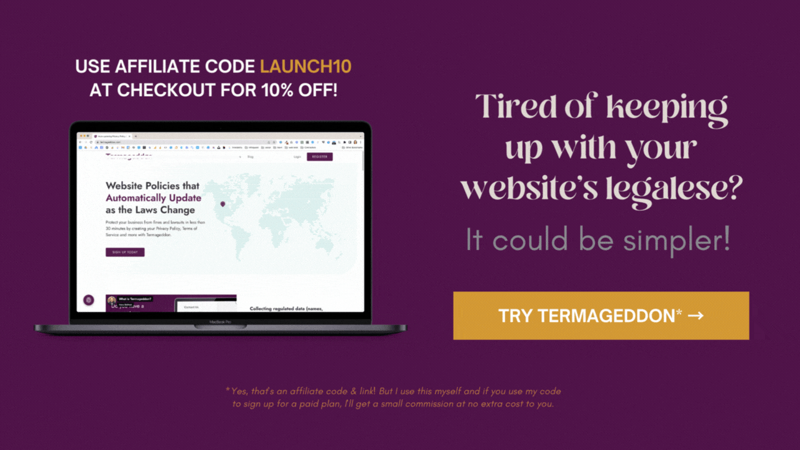
GET 10% OFF
So as a reminder, you can get 10% off your first purchase. If you use my code, LAUNCH10 for that discount. It applies to your first year.
So I hope that was helpful for you today. And I will see you in the next video. Bye!