Yari Launched the Damn Thing!
What's inside this post: Hide
For the first time –maybe EVER– my client wrote her blog post announcement for her new brand & website launch BEFORE I DID! 😂
I’m SO excited to share in that hype with my most recent client, Yari Ising, of The Ising Agency, a creative business operations management and support service-based business.
In her announcement, she wrote:
“I knew I needed a brand that had kick ass energy and was bold. I was lucky to find Katelyn. Her vibe told me she was it and it was time. And I knew I needed a partner with the same energy and personality that felt authentic to me. I didn't want a cookie cutter web designer and she was it.
The rebrand is better than anything I could have imagined.”
– Yari Ising,
Launch the Damn Thing!® client
This is more of a show & tell –emphasis on the SHOW– so if you can, watch the video to see Yari’s honest & unplanned reactions recorded during our draft design presentations. If you can’t, jump to the word-for-word-transcript included below.
I love getting to share these clips, because it’s fun to share in her excitement, –but it’s also proof that with the right homework & a deep dive into the business & personality, –I can hit the nail on the (design) head on the first try, every time!
#humblebrag 😂🤷🏼♀️
Why Yari wanted a brand & website reset
“Here I was with a brand guide I hadn’t used since 2020, and I knew I wanted to get back to work on my dream of running a successful woman/Latina-owned business doing what I loved (Can I get a “Hell Yeah!?!”).
… As someone who has spent the last ten years + in Media and Communication, I knew that having a solid brand and CLEAR messaging was vital in explaining to the folks that need my help why I am the right person. The branding I started with had an entirely different audience in mind (read: Brides), so the branding was very feminine and soft. I knew I needed a brand that had kick-ass energy and was bold.”
– Yari Isingquote pulled from her blog post announcement
Tha’s one smart lady!
Recognizing that her old brand was doing absolutely nothing helpful in reppin’ her NEW business (with a totally different audience), Yari decided it was time to dig in and find the experts she needed to get her brand, website & copy done the right way.
So she tracked down Erika Holmes to write the copy, and me to design the brand & website, the three of us becoming a dynamic trio of expertise, launching the final product in just a few weeks!
Custom Features on Yari’s website:
branding includes 1 main + multiple alternates & custom icons
full logo package with logos & icons in various colors & for different mediums, totaling ~500+ files, well labeled & organized
alternate logos applied in some website pages, as needed
brand fonts chosen & paired with complimentary in-house Squarespace fonts
custom ‘hack’ for adding script font strategically as wanted throughout the website
animated scroll effects
animated elements
filters, sorting & search on collection pages
button animations & hover effects
link hover effects in Footer
easy-to-add icons throughout
animated count-up for numbers
jump/anchor links
‘hidden’ lightboxed content
customized horizontal timeline for Auto List layout section on About page
Services page’s tabbed packages section to organize information
blog category & tag labels
automatic ‘more like this’ section at bottom of blog posts
automatic ‘affiliate’ notice at top of posts with affiliate links, per FTC requirements
styled Comments area in blog posts
styled lightboxed and inline Squarespace forms
more creative mobile overlay menu styling with transparent & blurred background
back-to-top button on scrolling down
hidden header/footer on custom social links page
INCLUDED EXTRAS
Media Kit template for networking or guest opportunities
Case Studies template for ‘portfolio’ pages
New blog template & checklist
ConvertKit email templates for newsletter & regular emails
ConvertKit signup forms to embed on website
custom CSS & fonts installed in Dubsado forms so they’ll match the website seamlessly
custom branded email signature for use in Dubsado & other places
Termageddon installation for website policies
customized Termageddon policies & privacy settings button
Canva-sourced graphics & videos, the templates shared
SEO scans of main pages with SEO Space
the result
“I love the energy that the new brand has. You nailed every aspect of my personality in the fonts and colors. Not to mention all of the animations on the website. I can't get over it.
You have given my business a sense of legitimacy that my former brand needed to have. I am confident that this new look will attract the right clients, which is so important because my ideal clients work in the creative industry. I've already gotten feedback from a client on the new look "Design is fab! Conversational, catchy, and thorough. Speaks instantly to Creative teams"... I mean, can't get better than that.
If you want to work with a true professional that treats you like she would a friend, Katelyn is it. Hands down.
No [feedback for what to improve], you really have a great system and you are truly talented.”
In the words of one of my recent clients, she said,
"I knew I needed a brand that had kick ass energy and was bold. I was lucky to find Katelyn. Her vibe told me she was it and it was time. And I knew I needed a partner with the same energy and personality that felt authentic to me. I didn't want a cookie cutter web designer and she was it. The rebrand is better than anything I could have imagined."
– Yari Ising, client
quote pulled from her blog post announcement
So, I mean, that was a freaking awesome review!
Well, let's dive into Yari's website and I'll show you a little bit of the, before we also did a rebrand for her, right before we did the website design. I'll show some clips of our presentation and then walk you through the website.
Before we dive in. If we haven't met, my name is Katelyn. I run Launch the Damn Thing!®. I'm a Squarespace web designer and educator, and I love to talk all things, Squarespace, business, productivity, marketing, all the things. So that's what I do here on this blog.
And today we're going to look at a past client site and we're going to celebrate her launch together! 'Cause that's always fun. Right?
Yari's Story
I'm gonna start a little bit in the middle this time. Usually, I start with the rebrand and show you the before and after. But Yari got ahead of me this time. It's the first client I've ever had that announced their new branded website before I got a chance to. Okay. And she did that really, really well on her own blog. So I'm gonna start here and show you how she says the story, how she tells her story, from beginning to end what it looked like before, what it looks like now, and all of those things together.
So first and foremost, We have. Her blog posts. And she has her origin story, her homepage Initially. That's not how it looked when she came to me. This is an older, different business that she had.
but she had the same branding, same colors. those kinds of things, when she came to me. So that was still in place.
She talks about struggling with, coming from the wedding industry and into more of a business-oriented world and the branding was still overly feminine and she wanted to kind of get away from that. Give it more energy.
So, this is what it looked like when she came to me, actually, this is the brand a piece or a snippet from the brand guide that she'd sent me. With those colors and those fonts.
And that was a snippet of her current website when she came to me. So that's what it looked like or by the time I saw it.
And then, a little bit about what she wanted to do, what her goals were and how she found me actually on YouTube.
So fun fact, if you find me on here and you like me and you wanna work with me, like you can do that.
So, what she found was an awesome combination of me and my personality driven design style, which is centered around the client, not my own. And also Erika Holmes, which was her copywriter who did a fantastic job on her copy and made my life a whole lot easier and Yari's because neither of us had to write the copy.
And The end result was incredible.
She says here, ' now that she'd found her dynamic duo, she was ready... and confident that they had captured her personality and showcase it to the world. So we got to work.'
Further down.
She says, once we were satisfied with the copy, Erica passed the Baton to me. And that's where the copy came to life, actually inside the design of the website. From the bold and energetic colors we chose to the thumbprints representing Jodi's personal touch and the hand drawn scribbles, representing the craziness that my clients experience, the chaotic mess that they often bring to her when they're ready to get some help. We thought through what would speak to her audience.
And she says she got to keep her beloved serif font and her navy. Yes, she did. I centered the whole thing around those two pieces. And I think it came together really well.
She says 'my brand accurately interprets who I am as a business owner, energetic, bold. And sometimes I use colorful language. Who doesn't am I right?'
Yes. Guilty as charged.
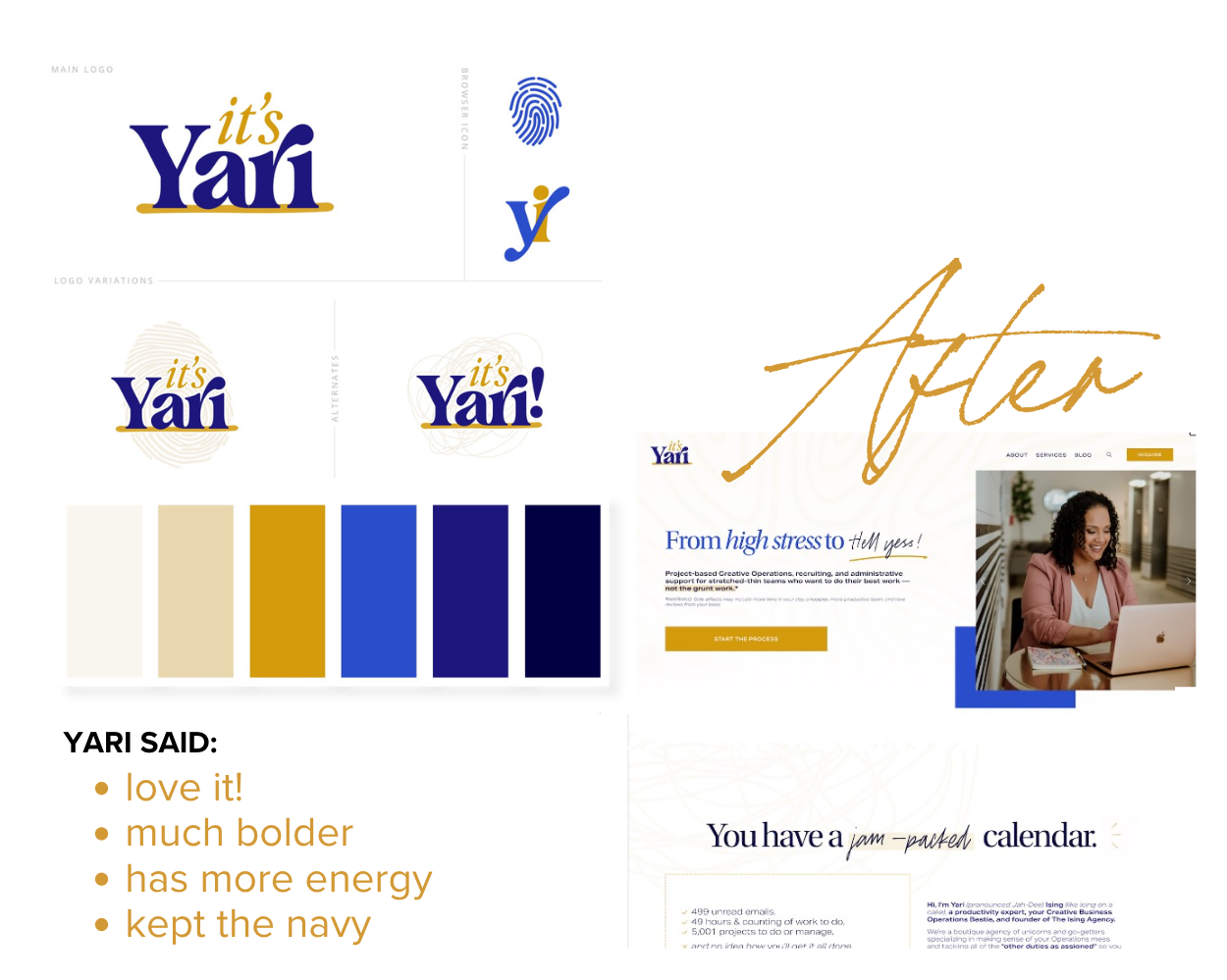
So here we have a snapshot of the brand after we redesigned it. Her business, as she wanted people to refer to it is just It's Yari. And we have a couple of icons that she can use for like browser icons or simplified use cases. And she also has a few logo variations. Actually, she has more than the ones that are displayed here.
The, after how it's applied to the actual website. Which I'll walk through in just a minute with you.
The Rebrand
So first we'll pull up the actual brand board. You can see the main logo here in the top corner, all of the variations of the browser icon and or favicon the alternate simplified initials. And then we have a few logo variations. We have one with circular scribbles in the background, one with her actual business name attached to it.
–uh, One with a designed fingerprint; it's not actually hers. And one with a chaotic mess behind it. So she can choose which one is applicable to any of the use cases she will inevitably find in her business.
We also established a color palette, which gives her the Navy that she wanted to keep, focuses on high contrast between her preferred combination of light versus dark, on the website, with lots of pops of this bright kind of Royal color, just for some vibrancy. And the complimentary color of the gold, which I think gives it a lot of energy.
If we removed the warmth out of this color palette, it would feel very cold. And the energy would be lost. So that was the infusion of sunlight, so to speak.
We chose serif text, that was fitting for her personal preferences. We have a custom font installed for script and with limited use, because it's designed to look like little handwritten notes, only in a few places.
And then a contrasting paragraph font that is the polar opposite of everything above that.
Now it's time to see how that's actually applied to the website.
Feedback from the First Brand & Home page Draft Presentation
Katelyn: So initial thoughts?
Yari: I love it. I, you know, I, for some reason, I, I, I was thinking about like the brown, like the, you know, the, the brown that you were talking about, and I was like, I don't know how that's gonna look, but I'm glad that you like that you kind of changed it up a little bit.
Katelyn: Yeah.
Yari: Um, I think it's cool looking. It's not anything that I would've like I, I would've put together because clearly I'm not a designer, but I like it. I dig it.
Katelyn: Yeah. Good.
Yari: Yeah, I dig it.
Katelyn: Okay. So with that in mind, um, I started working on a very basic
Yari: Ooooooo!
Katelyn: Home page.
Literally just started this like two hours.
Yari: I love this.
Katelyn: So just to give
Yari: awwwww
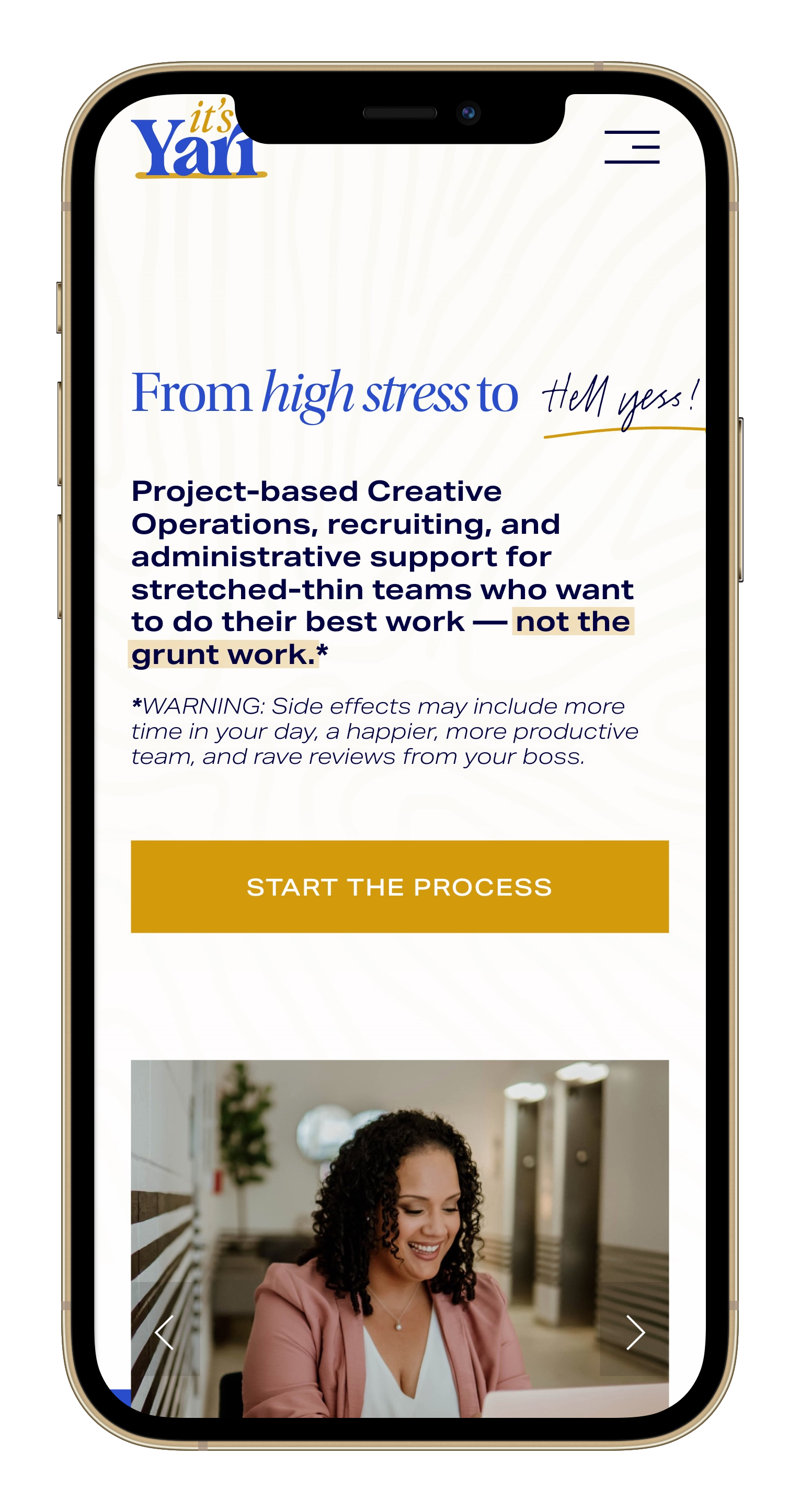
Katelyn: like a concept of how it could all come together. So, we've got like a little animation on the button and when the page loads, it has an animation on the underline.
refresh the page. So it'll underline hell yes. And highlight not the grunt work.
Yari: I love that. Oh, okay.
And then the next section down, oh my God, I love that the way that the numbers... changed.
Oh, I love that.
Katelyn: Yeah. That's an animated count up, so I'll show you how to use that throughout the website.
Yari: Oh man. Oh man. I'm so happy! Okay. Okay.
Katelyn: so I, that's as far as I got this morning, but I just wanted to be able to show you how that could all come together with the colors and the logo and textures and whatever.
Like, I don't know specifically if it'll end up like that, but I like where it's headed.
Yari: Uh, yeah. So do I.
Katelyn: Good.
Yari: Yeah. You know, it's so funny. I'm like, I'm looking at this and I'm like, it's not at all what I would've put together, but that's why you hire, like, that's why you hire pros like you to like, Think about it and look at it and, and do it.
Um, I'm speechless. This looks great so far.
Katelyn: Good.
Home
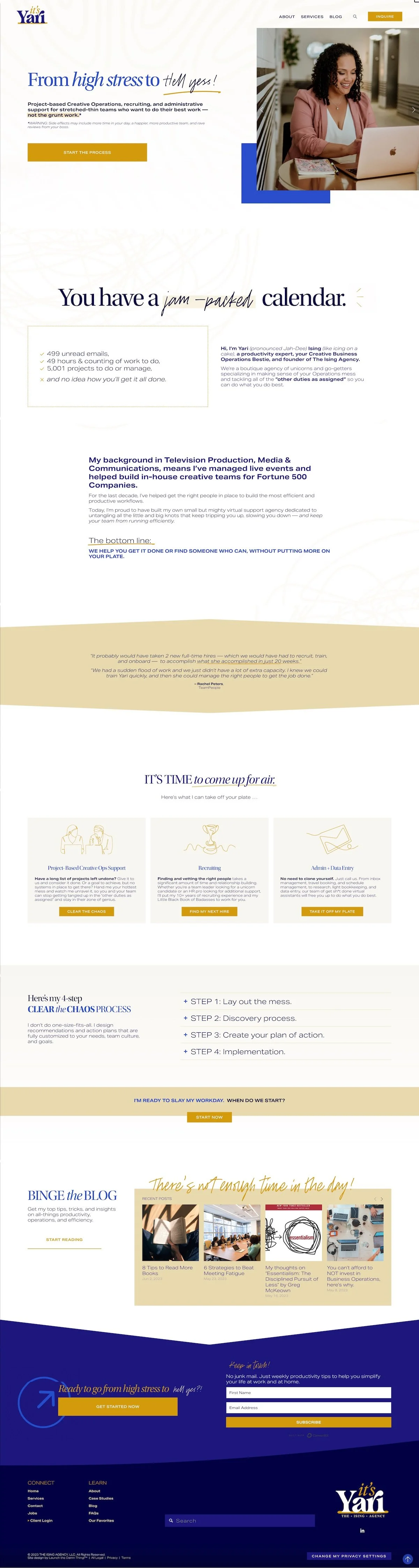
From that rebrand, we were able to apply it to the website, I think, beautifully. I love how it's professional, but it still has a high energetic vibe. And it also represents Yari's personality well.
I think Erika was able to bring a lot of that into the copy and various elements that are humanized in the design of the website and the engagement and the interaction that you'll see as we scroll through it together. Uh, I think you'll get a good idea of her professionalism meets her kick ass personality.
So on the website, we have subtle backgrounds here and there. You'll see little pieces of the script and lots of fun scrolling effects.
So this is one of the first ones you'll notice. And if you don't catch it on the left side of the page, you'll definitely catch it when it crosses underneath the photo, kind of in between these two pieces here.
As we scroll down, there's more mess happening in the background. Kind of a handwritten mad-lib style title.
And this block right here, if we refresh the page, the numbers actually count up from zero. So drawing attention to the 5,001 things that they have to do and need help with. Scrolling effects on text, sliding in, blurring out, blurring in, getting larger on scroll.
We have little hover effects on the buttons, accordions here to kind of compress details and keep text feeling minimal.
Here in the call to action, we have a kind of scale effect happening on the text. As they continue to scroll down the page, it gets larger. And draws more attention to the get started now button.
We have designed graphics in some of her blog posts to draw attention to those.
And then we have a really cool pre footer, I think.
we have a GIF here on a loop, so there's always animation happening, without code. And also the call to action. So we're always asking people to check out the services page.
We also are collecting email subscribers with a inline form here.
Then in the footer we're dividing navigation between connection and learning more about the business. We're getting to know Yari a little bit more, and we're also putting the navigation strategically on the left. Because on mobile, everything stacks based on left to right reading, and so if we were to put the navigation on the right side, it would show up last, which is not a great user experience. If someone has to scroll through all of this content in order to get to the links. So that's a strategic choice.
We also have the search bar here because I am a huge proponent of allowing people to search through your website to find what they're looking for. They tend to ask you fewer questions when you can provide something like that.
We also have a customized button here for privacy settings related to Termageddon.
We have a scroll to top button here so they can get back to the top really quickly.
And
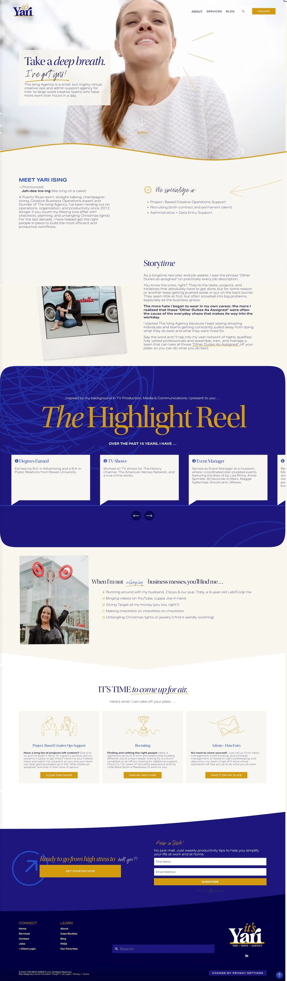
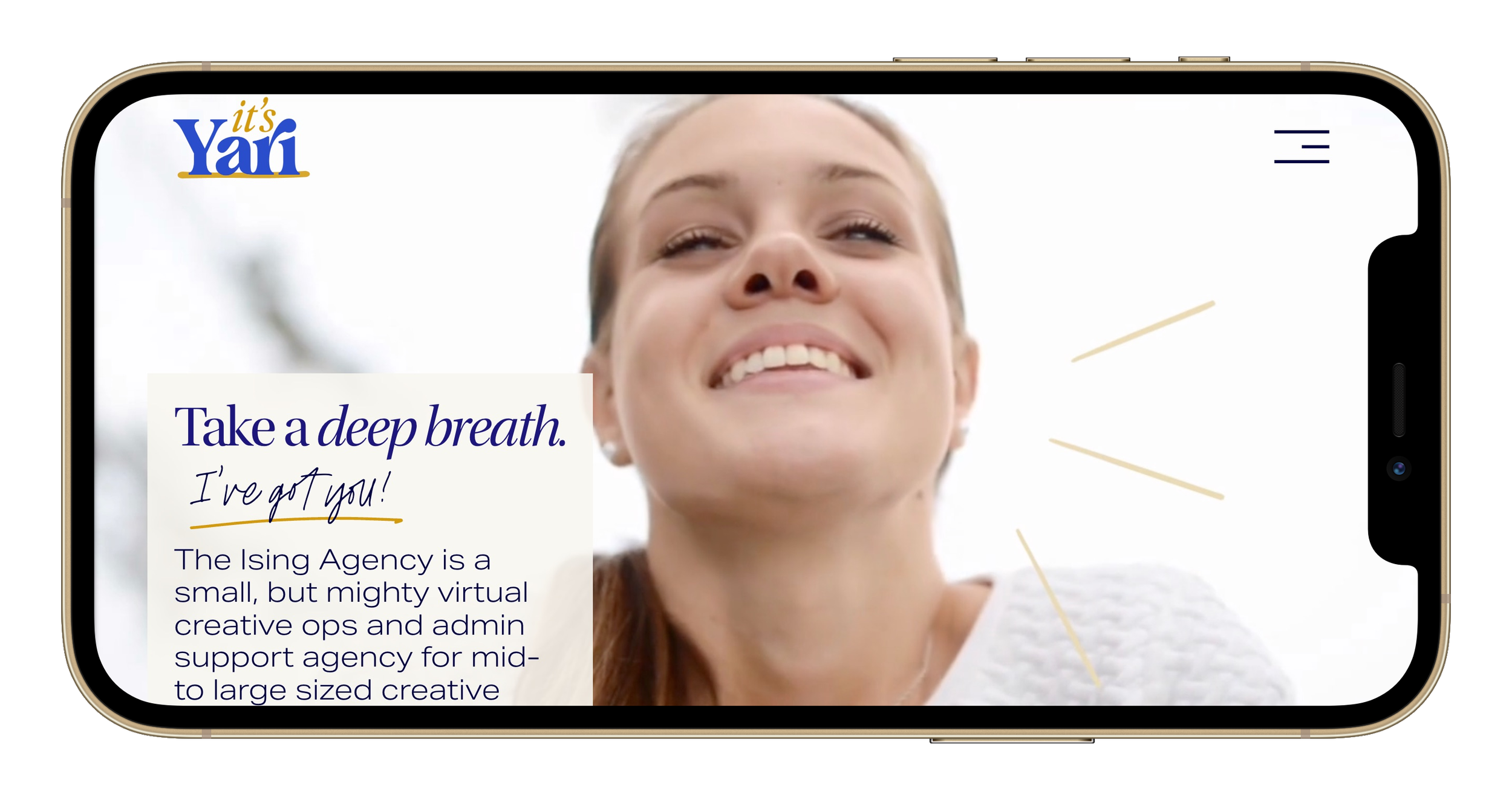
About
On the about page, we have a beautiful video of someone that just looks like they suddenly feel lighter. And that was the whole point. We customize it a little bit with some animated gifs, so you really can see how she is breathing, she is smiling, she feels like a weight is lifted. That's the whole goal here.
On scroll, the scrolling indication disappears. So if you get distracted by the video, hopefully you still know that there is more information to scroll down and see.
Down here, we have a pronunciation for how to say Yari's name because it is not intuitive for most people. And we have that actually in a few different places throughout the website.
We also have a little animated arrow here, drawing attention to what they specialize in the types of, services they offer.
And here we have a really fun animated Polaroid slideshow that kind of slides in and the photos stack. As you're reading through it and scrolling down, it gets bigger and tilted and overlaps the following section, which I think is really cool.
Then we have a highlight reel. This is one of the few places on the website where we are using the inverted color scheme with the dark background and the light text. So you can cycle through all the things that Yari has done in her professional career over the last 15 years.
Underneath that we have another animated image that slides in and slides back out.
Then we have another section, it's time to come up for air, and we're back down to the pre footer.
So notice the divider line here on the pre footer. That's actually different depending on whatever this last section is using. So it can fluctuate based on each page's individual design, which I think is a killer design choice by Squarespace.
To allow me to do that without writing any code. It's awesome.
From the about page, let's go to
Services
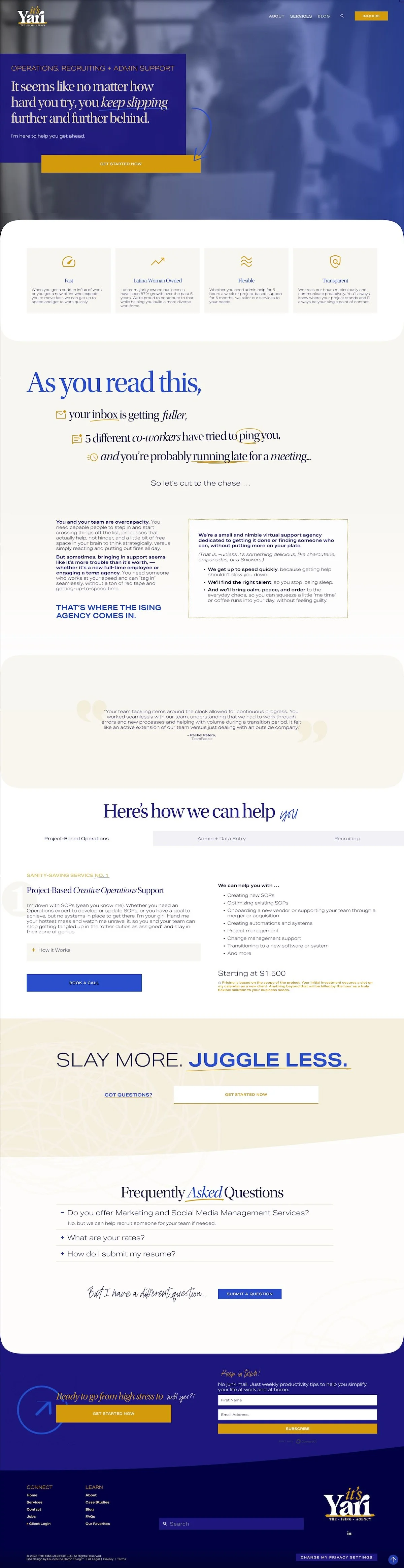
Yari's services page. We have a background video. Again, this is one of only two places we're using it on the website, but I wanted to have that kind of visual feeling of what it feels like to be in an office where you're inundated with reports and notifications and tasks and requests and questions. And I felt like this did a really good job of portraying that feeling.
So we have an arrow pointing to the get started now button, which has an animated effect on it. We also have anchor links that jump people down to the offers and packages section of the website.
A call out that tells people why they should choose this service or this company over others.
And one thing I forgot to mention up at the top, I've actually swapped out the logo. I don't know if you caught that.
So on the services page only we are using the full logo with the company name underneath it. I thought that was a nice touch that probably no one will notice, but I did and I wanted to point it out to you.
Okay, so this is my favorite part, maybe of the whole website, I'm just saying.
Thanks to SquareKicker and their awesome scroll effects, as you scroll down this page, this text swoops in, and you can read them kind of one at a time. The first one says, 'as you read this, your inbox is getting fuller, five different co-workers have tried to ping you, and you're probably running late for a meeting.'
And I love how that last one just kind of runs out. But you also notice as you start to scroll down, things are starting to blur and go away again, like 'oh, I've been pinged. I've gotta run.' And also some of the text is swinging out while the others are becoming chaotic and tilting out of control.
So I really like the combination of how these things are put together, because it gives that true sense of what it feels like to be in an office where you're inundated with things on your to-do list, that you will never be able to get to.
Underneath that we have another testimonial.
And here we have an interesting packages section where we are walking the potential clients through each of the different types of services available and details about how they work, but in the most condensed and simplified way possible.
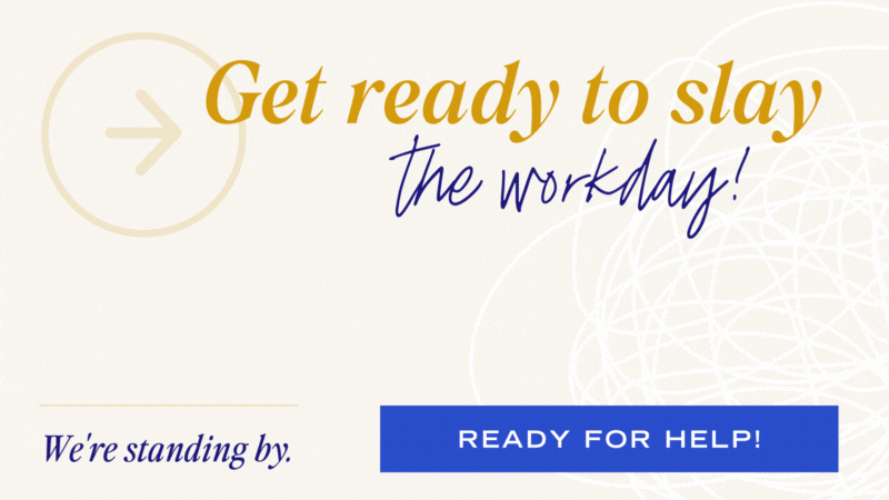
Underneath that, we have a fun call to action here, 'slay more juggle less.' And in the hidden 'got questions' link, there is a pop-up where people can book a call if they're not sure what they need, and they're not ready to quite fill out the form yet.
Under that we have some frequently asked questions and if they don't see their question, they can submit a new question.
And we are back to the pre footer. So from here, we're going to go to our contact page.
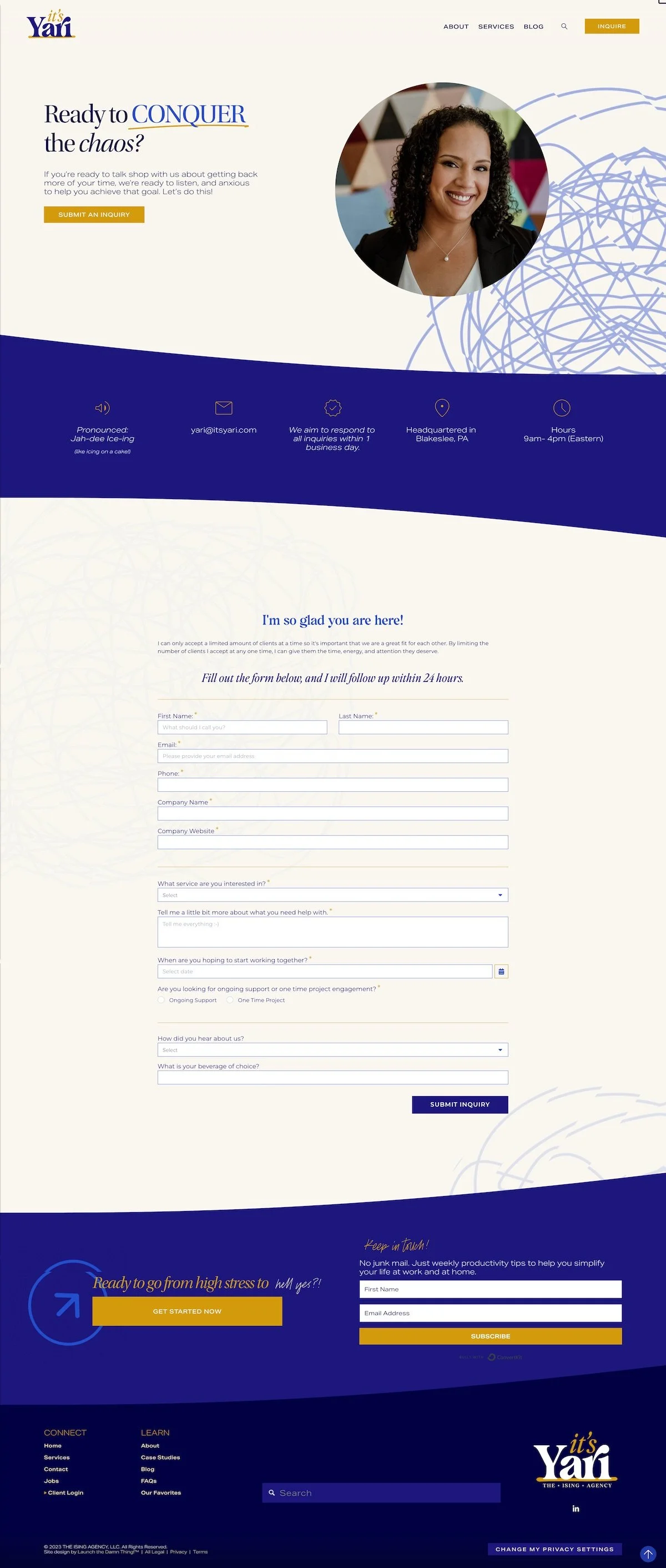
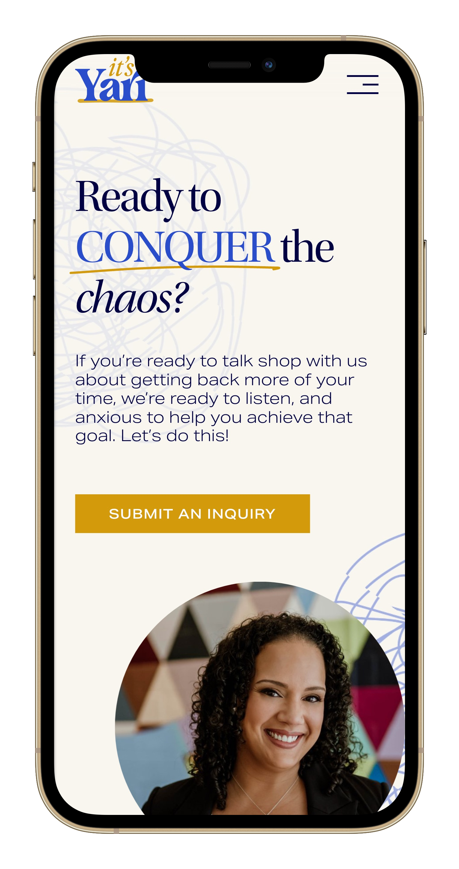
Contact
On the contact page, we have a very simple call to action, a button that scrolls down to the form itself, a photo of Yari on a fun, colorful background. We have more mess happening in the background here and a little bit peeking up at the top, like it's going to drop in at any second.
And as they scroll down, we have a mini section that again, reminds people how to pronounce Yari's name, contact information, where she's based, what her office hours are, and how quickly they can expect a response.
Underneath that we have an embedded Dubsado form and we have customized that with CSS, including the hover effect on the button, and even the calendar where they select a date where they're hoping to work together, so that the whole experience remains branded.
Underneath that we're back to the pre footer.
So now it is time to go to the blog page.
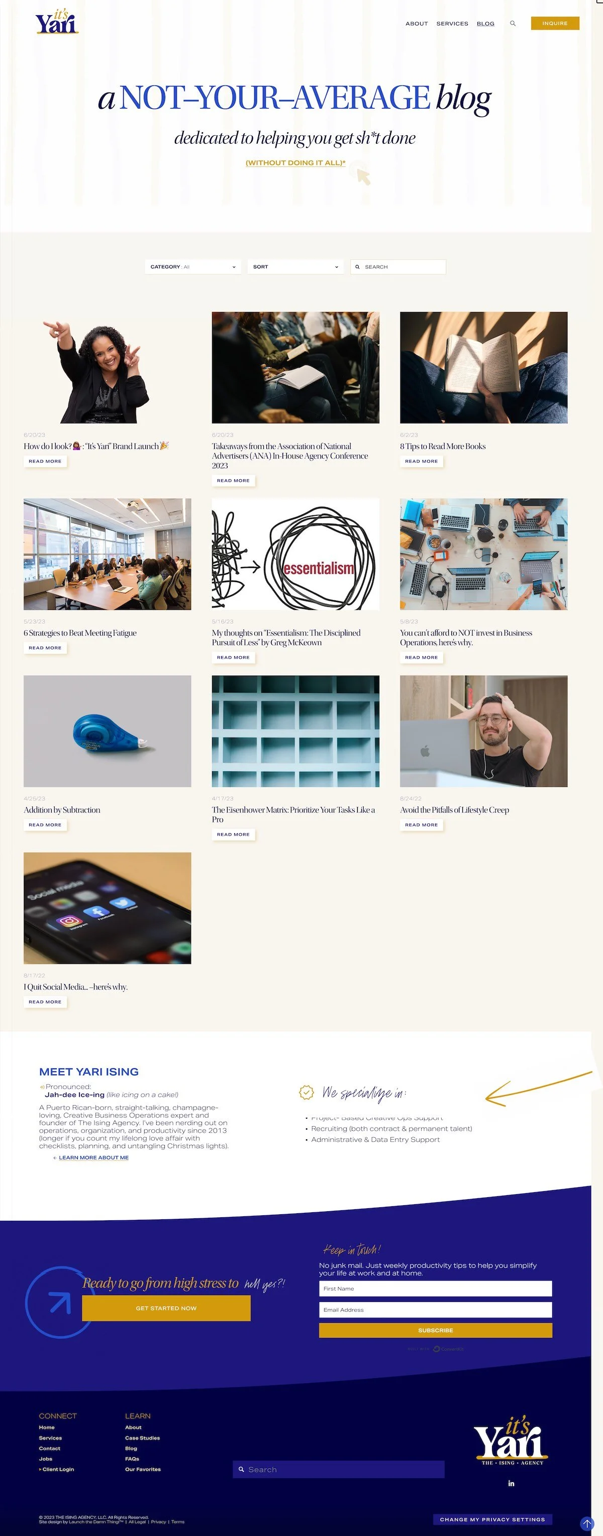
Blog
On the blog page, we wanted to make it a little bit more fun and exciting than the rest of the website, but still along the same vibe. So here we are saying, it's not your average blog. We're actually dedicated to helping you get shit done without doing it all in this little arrow animation here is pointing to this link, which is not very obviously a link.
And if they click on that, there is a brief explanation that will pop up in its place. Under that there is a sort, categories and search option for the blog post themselves.
There is a fun hover effect on the read more button.
There is also a about section here so that people can meet the author, easily get to the about page to learn more about Yari, see what she specializes in and all of that stuff.
If we dive into one of the posts, like this one that we were just looking at earlier, we have customized the way that categories show up. So in Squarespace, traditionally, they're not labeled. This is something that I've recently been playing with. I decided to label the categories, so people know what these actually are.
And not only that I made them look like individual buttons. So each category will have this white background with the dark text, and it will have a hover effect when you hover over. it. So that is a completely customized feature. It's a small one, but a mighty one, I think.
As you scroll down, we have a customized, 'more like this section' that will automatically populate with related blog posts that have similar tags and categories. So this is something she will not have to manually do, which I think is wonderful.
Underneath that, I have also labeled the tags so people know what that actually is. And these, I did not give the button styling, so it's less obvious, less than people's faces, but still labeled so they know what it is.
I've also styled a custom preview comment button that is the button that people push before they actually publish or post the comment. I've also styled. in a, given the hover fact to the post comment button. I've also styled the sort by usually just says newest first, which is supposed to be some indication that people can reorder the comments, but it doesn't look like a button or anything. So I've given it the sort by, and the arrow there as some sort of indication of what that actually is.
Underneath that, at the bottom of all of the posts that she already had, that we brought over from her website, we have a sign off here.
And we also have a call to action. Uh, that is animated and can be used, throughout the whole blog, as an ad for her own services. So it'll take people to the services page and draw their attention because it's animated.
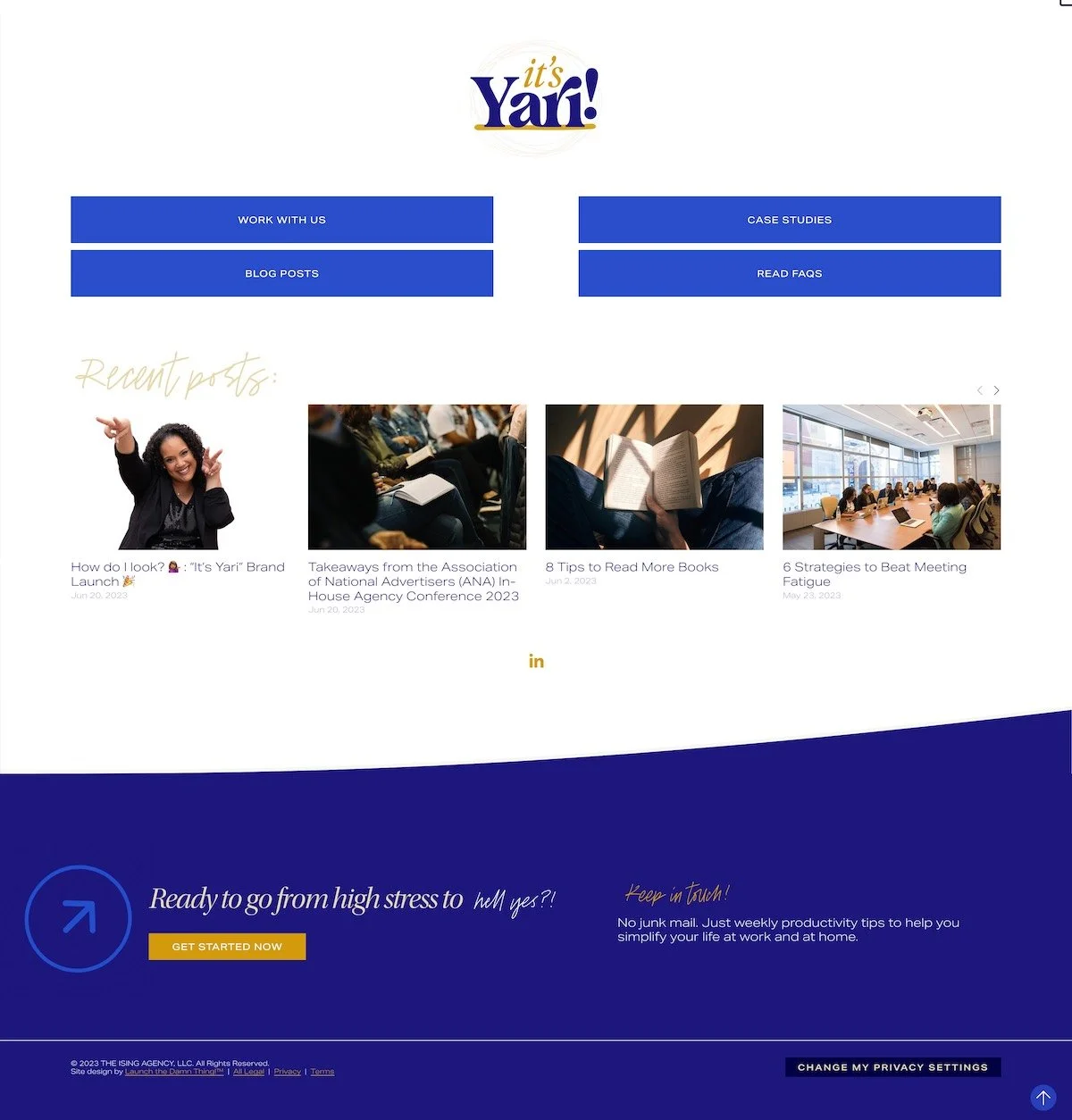
So that's the blog page. Next, we're gonna jump over to the favorites page.
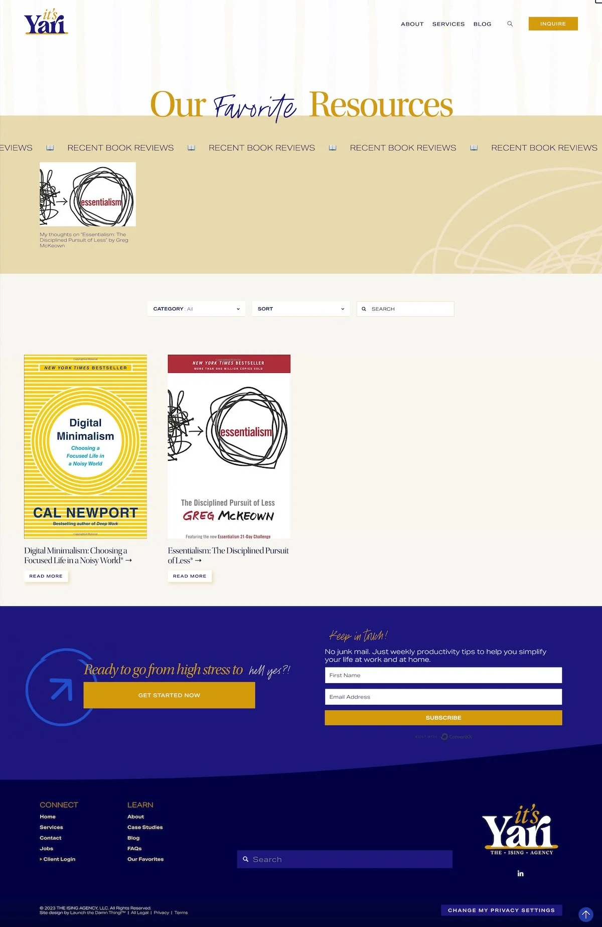
Favorites
The favorites page will be the place where Yari gets to put all of her favorite things, whether it's productivity tools or her favorite books or a recent article or whatever she wants to put in here. Including recent book reviews. So we have that kind of call out section across the top because like me, she likes to read, which I always respect a fellow reader.
So we're giving that lots of fun attention across the top. And we have a similar sortable area up here at the top.
It has a slightly different style than the blog. It still has the same button hover effect for read more, but these actually have a affiliate link here associated with each product and the ratio of the images is different. Just to help differentiate it from the blog itself.
On the inside of these, we have an automatic affiliate notice. So anytime she adds, on the back end, a particular tag, it will auto-populate the affiliate notice at the top of the blog post, which is one of those legal up and up things that you're supposed to do.
She also has a summary block here that pulls in the blog post on this particular book and a link to go buy it on Amazon, which makes things really simple and easy.
And it will also have the more like this section at the bottom to pull up similar book reviews and that are using the same tags and categories.
Backend pages: Resources
On the back end of Yari's website, I've given her a place kind of a hub of resources so she can manage, use and update the website herself going forward if that's what she wants to do.
So here we have links to the resource hub, we have the download button to the logo files, the Canva templates, the video overview of the launch, the launch checklist. A whole bunch of resources and instructions on how to use some of the custom features that I've installed on her website.
If she needs support where to go, where the video trainings are and how to access all of the shit.
Case Studies (Portfolio)
We also have a database for case studies and I've given her a template for that. So this is the actual template where she can input the client's name, their company, their client wins, the summary of the project, a photo of the client, problem and solutions, the tactics used, and of course the end result.
I've been able to give her the structure and the puzzle pieces to put that together herself.
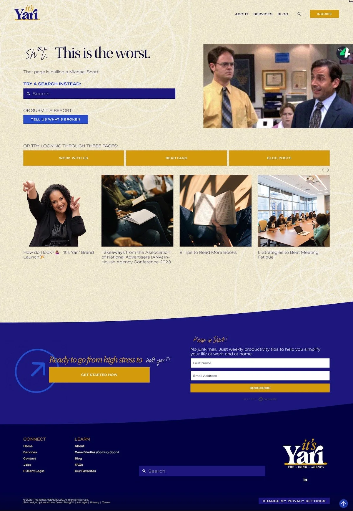
Error 404
I've also given her a awesome Error 404 page, and I have to give her credit. I did not come up with most of the funny parts, this time. Usually I do.
We have kind of a staticky background happening here and something comical to kind of, you know, nod toward the fact that we know if they end up here it's because they didn't wanna be here. So we're trying to make them laugh, but also give them a way to search the website for whatever it was they were looking for, submit a broken link in a form if they want to tell us what's broken, and ways to navigate around the website quickly, places that they may have already been trying to get to.
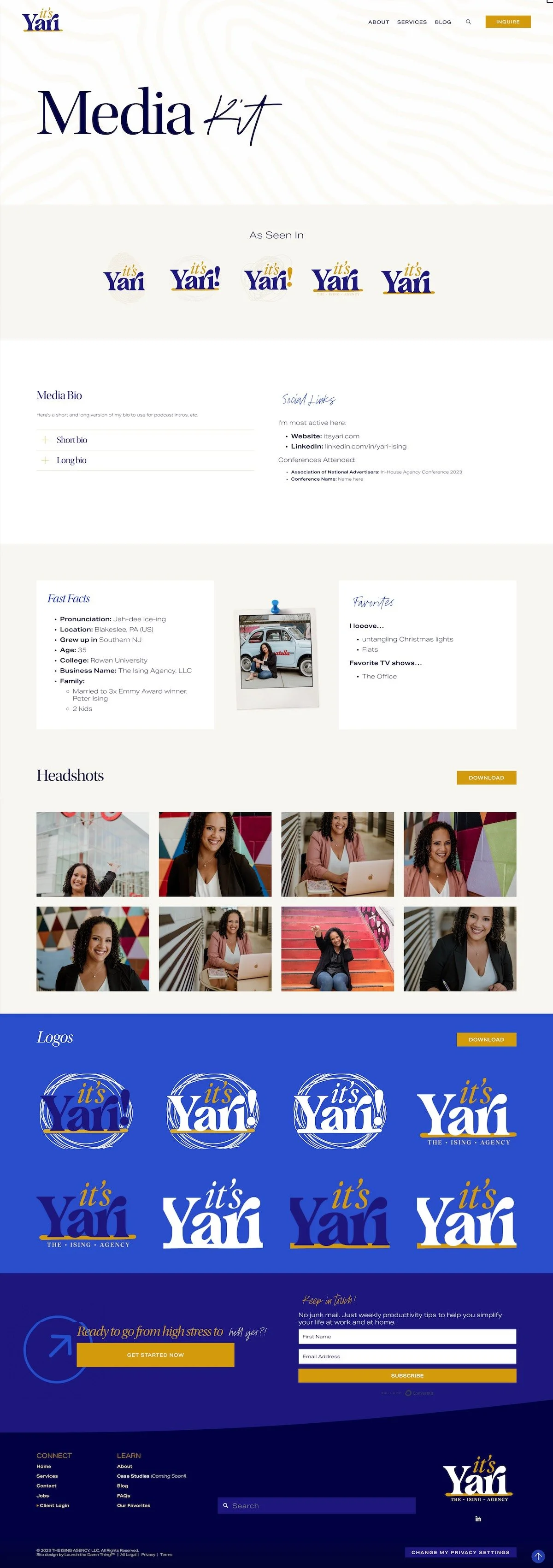
Media Kit
We also have a template for a media kit. So this has not been filled out obviously, but it can be and as she continues to network, she'll be able to put in places she's been seen and fill out her short and long bio and put her social links and her conferences attended, fill out the fast facts. Her favorites, her headshots, her logos, get that all in one place.
So that next time she's a guest on a podcast or something like that, she can quickly and easily just shoot them the link of the media kit and they can grab what they need in order for her to be the best guest possible. So that hopefully she could be a repeat guest in places that she enjoyed.
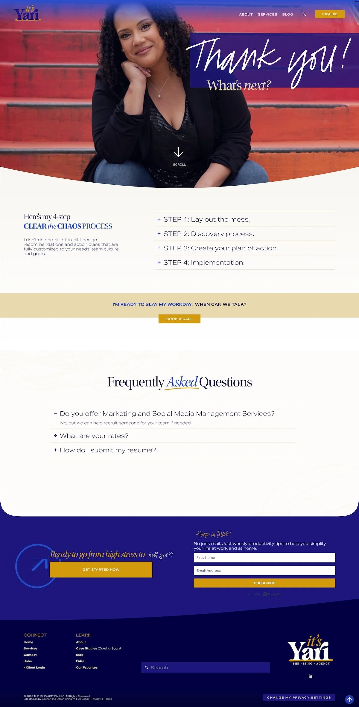
Thank you pages
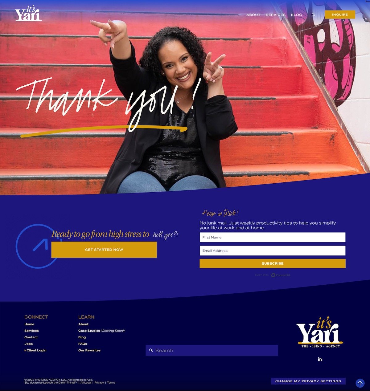
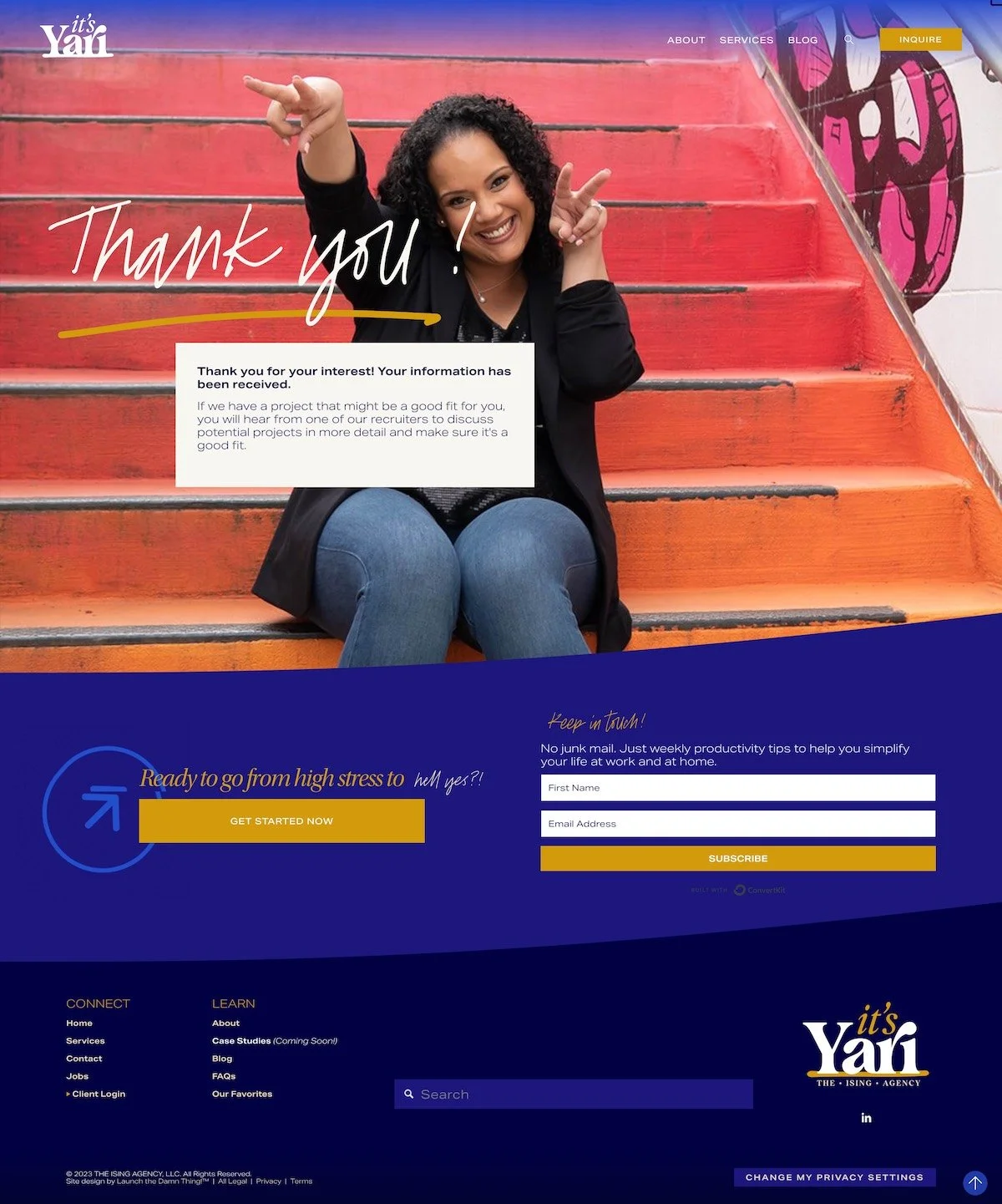
We also have a generic thank you page. So this is meant to be generic on purpose so that can be used in a variety of cases.
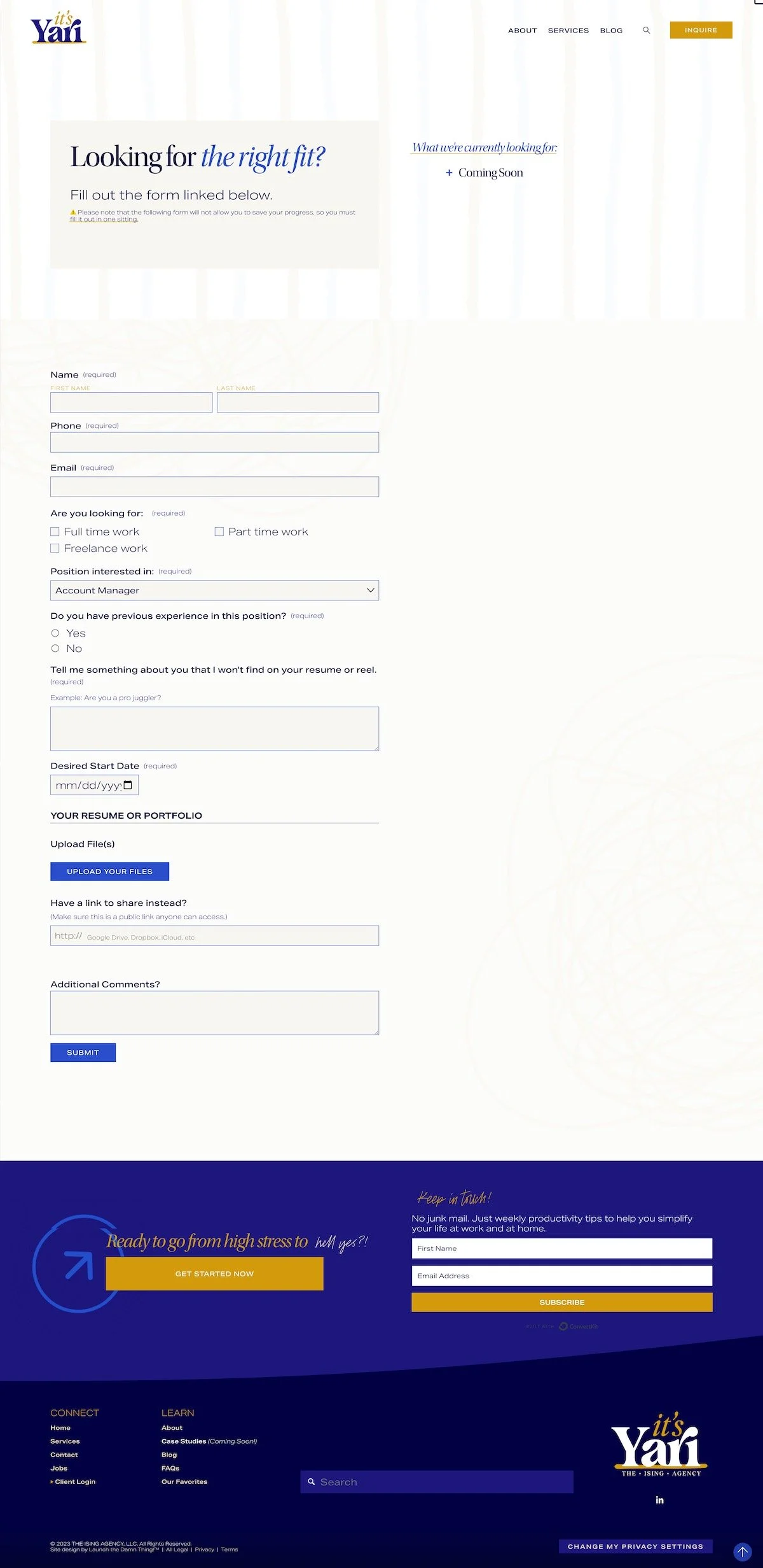
We also have one specific to the job submissions for the recruitment process.
We also have a more complex one specifically for people who reach out to her and to guide them through what the next steps are after they have inquired. So where to book a call and when, and what the process looks like and all the things.
Yari’s Website Presentation Feedback
Yari: Beautiful.
Katelyn: So I heard
Yari: Oh, and the change.
Katelyn: Yeah. So I heard what you said about using primarily the lighter colors, so I switched that.
Yari: Love it.
Katelyn: But there is a little bit of a subtle line pattern in the top half of this section and
Yari: I do see it.
Katelyn: There's a little squiggly arrow happening back there too.
Yari: Cool. Ooh. And it moves!
Katelyn: Yeah. I put some scroll effects in here for you. Trying to keep things interactive and engaging while it's still like has that kind of simple and airy vibe too.
Yari: I love it.
Katelyn: So we scroll down, we have that scribble again, got some like gifs that I've put in various places. So they'll just play on a loop.
And then you're like, Hey, that's,
Yari: Ooh, yeah! Fun. I love that.
Katelyn: So we have the bottom line and your, testimonial.
Yari: Awesome.
Katelyn: And it's time to come up for air and all of these link to the, services section where the actual offers are
Yari: Awesome.
Katelyn: And the four step process.
Yari: Oh my goodness.
Katelyn: And that's just a simple accordion block, so it'll be easy for you to edit.
There's a little bit of a scroll effect on the, when do we start and start now goes to services.
Yari: I love it. Oh my goodness. I love this.
Katelyn: So, start reading goes to the blog and this will pull in the most recent, I think 30 or so posts.
Yari: Cool.
Katelyn: So this is your pre footer.
Yari: Ooh, I love this!
Katelyn: So that'll be on every page, two call to actions, one to work with you and one to sign up
Yari: so cool.
Wow. It looks so good.
You are so damn good.
Katelyn: I'm so happy I could cry.
final thoughts
So that's a wrap on Yari's website.
I am going to say this again, and I know you're going to get tired of hearing it and I'm sorry, I'm not sorry!
But I swear every client that comes to my door now is my favorite project. Like all of them. They're all my favorites! I just, I can't describe it. My clients are awesome. My projects are really fun.
I think that we did a fantastic job, if I don't say so myself, infusing her personality into the website. And Erika did a fantastic job infusing it into the copy; I was able to give that life because Erika made it interesting.
So, as you can see, I've given Yari a lot of resources to be able to maintain this herself. There's also a lot of custom features in here that are not part of Squarespace's platform. They've been coded in or with either my custom code or third-party tools that I know, like the back of my hand.
And it just goes to show that Squarespace and their new Fluid Engine editor can be super customizable. It's one of the best responsive platforms out there on the market. And if you're feeling like, 'Hmm, I don't know about that,' go check out this video and I will walk you through the responsive behavior of Fluid.
And if you are DIYing your Squarespace website, and you're like, wow, mine does not look like that. I need some help. I'm here for you.
I love fixing things. So if you want to hit me up.
And tell me where your problems are and tell me where you're struggling. Maybe it's a VIP day may be as just a service and we can rebuild your whole website from scratch, like we did with Yari's, and then you will look like the professional you truly are.
I have a knack for putting your personality into that. So make sure you reach out and I will clean up your mess.
I hope you have a fabulous week ahead and I will see you in the next video. Bye.