

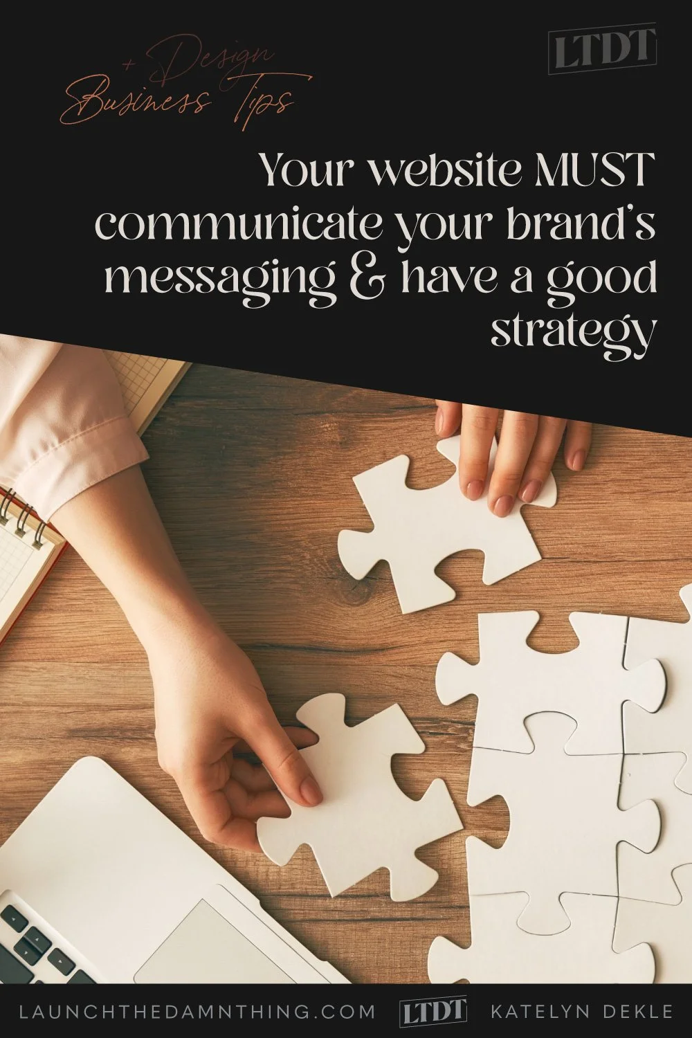
Your website MUST communicate your brand’s messaging & have a good strategy
Table of Contents Show
We’ve all done it! Nervously pushed that PUBLISH button on our website... launched our websites into the ether …and crickets.
*chirp, chirp* 🦗
After a week, ...or two, ...or even a month you’re thinking something like, ‘is my site really that bad? Where IS everyone??’
Right? Yeah, I know. I did the same thing, and I felt that way too.
Getting a whopping 14 page views per day felt like an accomplishment at one point in those early days, and over a thousand page views in a whole month?! Whoa. 🤯
But here's the thing, the whole 'build it and they will come' thing doesn't work anymore. So if you want that traffic, you WILL have to work for it. 😬 #sorrynotsorry
And ––are you ready for more bad news?–– with an industry-wide standard conversion rate of only 1-2% (ie: that’s the average percentage of your audience, no matter the size, that may be willing to buy your thing), you will need a larger audience.
1-2% of 14 people is… LESS than 1 person.
It’s 0.14 of 1 person, to be exact. That means, if that one person is on the fence, most likely they left without buying or contacting you. #wompwomp 😕
I know, it’s kind of depressing, –because that also means that on average 98-99% of the rest of the people coming to your website won’t buy. ...It’s almost like the very presence of those 14 people in your analytics is mocking you, right?!
So, what can we do to help move things along?? 😳
Well, there's actually a fair bit we can do! But let's start with the easy stuff!
Read through it below or click here to join the other students inside my 6-part website strategy mini-course & get the video lessons too!
📌 Pin it!
6 basic strategies to get more sales and eyes on your website (Part 2)
Things to consider while implementing the branding and messaging
Last week we talked about why having a good brand strategy is important. This week we’re figuring out how to pull that into your website, logistically. How to start setting up the website to almost take over from there, displaying the brand’s messaging through your fonts, colors, and other design choices.
❶ Communicate the brand’s messaging through the visuals, first
If you take the time to create the proper design settings in your website FIRST, then you’ll be able to move a lot quicker through the design process after that’s done and be able to focus more on the content you’re adding later too.
So to be clear, we’re setting the… well, Settings first and then we will carry over the rest of the brand’s message in your copy (that’s the text on your website) when we begin building out the pages later.
The first step is to create a Template Style Guide. Basically, that’s just a long-scroll page with many of the basic elements your site is most likely to have: buttons, images with captions in varying styles, setting fonts and colors, styling your forms and the links in your header/footer, etc.
Once you have that set up, you can take a deep dive into your design settings (in Squarespace, that’s your Site Styles) to set your 10 Color Themes ready to use. If you set the 5 colors in the color palette strategically, then your Color Themes will auto-populate with little need to go through each of them granularly.
…If you don’t set the colors strategically, you can expect to take a few HOURS going through each Color Theme and manually setting nearly every option in there. Trust me, hand-to-heart, I’ve been there and done that. It’s so much easier to just set the color palette correctly.
For details on which color goes into each part of the palette, check out my 6-part mini-course, that info is in Lesson 2.
❷ Guide the user through the website

Next, you want to start creating empty pages for each of the main areas you KNOW at the outset that your website will need. This will include things like your Home page, About page, Contact page, and Services page (or Shop depending on your business model), etc.
Once you have created a few empty placeholder pages with nothing on them (because you’re not ready for that quite yet!), you can start adding navigation links to your header and building out your basic footer because the (empty) pages exist & so do their URLs for linking everything up.
Choose THE MOST important pages to put in the header. On average 5 is the maximum I’d want to see on your site, including the button –if you have one. If you do have a button, make it the MOST important page or place for them to click on your whole site, because it will by default attract more attention than the smaller text links next to it.
Keep the link names short (1-2 words), clear, and to the point. This isn’t the place to get cutesy, making people guess what those words actually mean.
For the rest of your pages, ––because I see you already raising your hand with this question–– put links to the other pages you want people to have access to, in the footer. While there’s not really a maximum allowed number of links for footers, if you have a lot, you will need to organize them into groups that make sense, so that people aren’t scanning through lots of options.
You want people to be able to find what they need quickly and easily. And that’s why we don’t want cutesy titles for things, like “Journal” instead of “blog.” Or “Reach out” instead of “Contact,” etc. Very rarely can a brand easily get away with less clear terminology in their links within headers & footers. (Button text is a different ballgame altogether.)
Now, with those basic navigation areas in place, you’re ready to start thinking about what each page’s function will be, and what stage each page belongs in, from the user’s starting point to when they exit your site.
So this is a great time to break out your ClickUp account for that built-in mind-mapping feature or sign up for the free plan with Miro to start mapping this out like sticky notes on a whiteboard. (Of course, you can do it the analog way with actual sticky notes if you’re averse to all things digital, too.)
Map out your user’s journey from start to finish:
on the Home page: from here, where do you want viewers to go? Which next step makes the most sense for viewers if they land here first?
About - what’s the next step from here?
Services/Shop - what’s the next step from here? etc
When you begin to build out your page designs, keep your CTAs (call-to-actions; AKA buttons or page links) to 1 or 2 separate decisions on each page, but sprinkle the opportunity for viewers to make those decisions throughout the entire page. Read this post for more on how many buttons on the same page are too many.
It’s redundant, yes, but it also empowers your viewers to click through when THEY are ready, ––not when you think they will be. If the “Buy now” button is available from every section on the page, then the viewer has access to the link no matter where they are and they won’t have to go scrolling back up or down to find it.
Then you should build some extra features into your site, that you know will help users find content easier. That means, having a search bar somewhere, or a link to your website’s search area, an Error 404 page for handling broken links, filters & sorting for large blogs and shops, FAQs, and more.
This is especially important for services or products that are expensive, or things that people don’t buy/do very often, like buying a home or a new Macbook Pro from Apple, etc.
If you’re not sure what you might need, think about the sites you use most often and what features they have that you use when you don’t know what you’re looking for there.
Luckily, Squarespace makes adding these features pretty easy. The following are ALL built-in and super easy to set up on Squarespace:
hide/show FAQ accordions
search bars
archive features like a category drop-down, word cloud, or index of posts
an animated scrolling marquee to announce something important
online contact forms
2 common mistakes
Don’t want your DIY site to look amateur hour? There are 2 really simple mistakes that throw up the Bat-signal, telling the world (& fellow web designers) that a professional wasn’t part of the design process.
❶ Too many header navigation links &/or too few footer links
If the navigation is either overwhelming or underwhelming (read: confusing or unhelpful), the viewer is much less likely to make a decision about where to go next, –and just bail.
You’ve been on those sites before too, right? The header navigation has dropdowns galore and there are so many links to choose from, but maybe they seem unorganized or the linked text uses terms you’re not familiar with, or the link titles seem vague…
If you’re not sure, how likely are you to click through anyway and poke around? It depends on your initial determination, typically. If you were super stoked to check out that person’s site you may stick around for a bit and lurk, but if you were iffy to start with, –ya bailing. Aren’t ya?
Don’t do that to your customers. Limit the navigation decisions at the top in your header, and organize the larger cluster of links in the footer so your viewers can find things quickly and simply without having to second-guess everything.
If you’re not sure if your links are clear, show your website to other people! Find people that are similar to the type of client or customer you want to work with and ASK them!
It’ll probably be a little bit scary, yes. (I just heard that squeak or gasp, ––“You want me to seek out conSTRUCTive criticism?!” 😳)
But it will also help you get an outside perspective that you desperately need, in order to take those 20 steps back in order to see the website from their view, not knowing all the things you know (and maybe take for granted that you know) about your business. Such as industry terminology that you forget is industry lingo, or the fact that people don’t know what to expect when potentially working with you because your prices aren’t listed so they’re scared to reach out.
❷ Thinking tons of buttons (CTAs) makes customers feel ‘icky’
Again, having multiple CTAs throughout your page will help empower your viewer to decide when and if they’re ready to buy or reach out to you. Don’t make them go ‘a scrollin’ for the button “that sounded like it could be a buy button.”
And yes! You can change up what the buttons actually say, as long as between all of the buttons on the same page, they all do only 1 or 2 different things between them. That makes the choice easy because there are only 1-2 different options in each space/page. Here are some examples of one call-to-action for both service-based and product-based businesses, using different phrases but all essentially saying the same thing:
Let’s work together + apply now + contact us + book a/n appointment/consult, etc
Buy now + get it + make it mine + add to cart + purchase, etc