

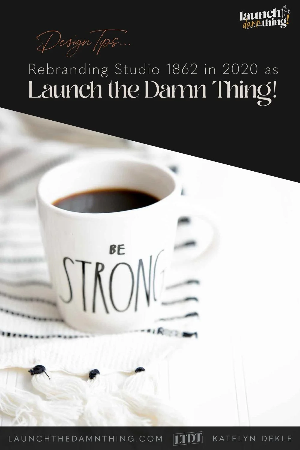
Rebranding Studio 1862 as Launch the Damn Thing!
Table of Contents Show
I originally posted this on Nov. 28, 2019, because I had changed Studio 1862’s branding a bit, in a broken attempt to fix something I couldn’t put my finger on.
After migrating all my blog posts to this new domain recently, I’ve been going through each one & updating them. Obviously, this one needed to be rewritten...
So now I’m rewriting this post on Nov. 29, 2020, almost exactly a year later.
The year of the pandemic.
And let me start by saying to you that I’m feeling particularly, uber-happy & grateful these days.
This year, my husband lost his 97-year-old grandfather; he also lost his father unexpectedly, –barely a week after we went on a week-long family vacation with him & my husband’s brother’s family for the first time in 12 years. A couple of years ago we also lost our 11-year-old dog-hter unexpectedly to lung cancer about a month after it was diagnosed. And about a year before that my Dad, who is quite possibly one of the healthiest & most fit late 60’s adults you’ll ever meet, had a significant heart attack & had 2 stents put in.
But we’ve also had a few truly positive things happen unexpectedly this year:
My husband got to quit his loathsome job, and
I got furloughed from my job, allowing me finally to jump into my business full time.
In 2021 we’ll have the opportunity to close our eyes & pick a new place to move, across the country, –and start fresh in a totally new place.
With all of that, both good & bad, happening in the span of a couple years, –and most of it during a pandemic– it leaves me feeling thoroughly grateful for our families and our fur-babies: Luna & Willow.
Thankful for what we have & the opportunities we’ve been given, even in the face of something sad or stressful.
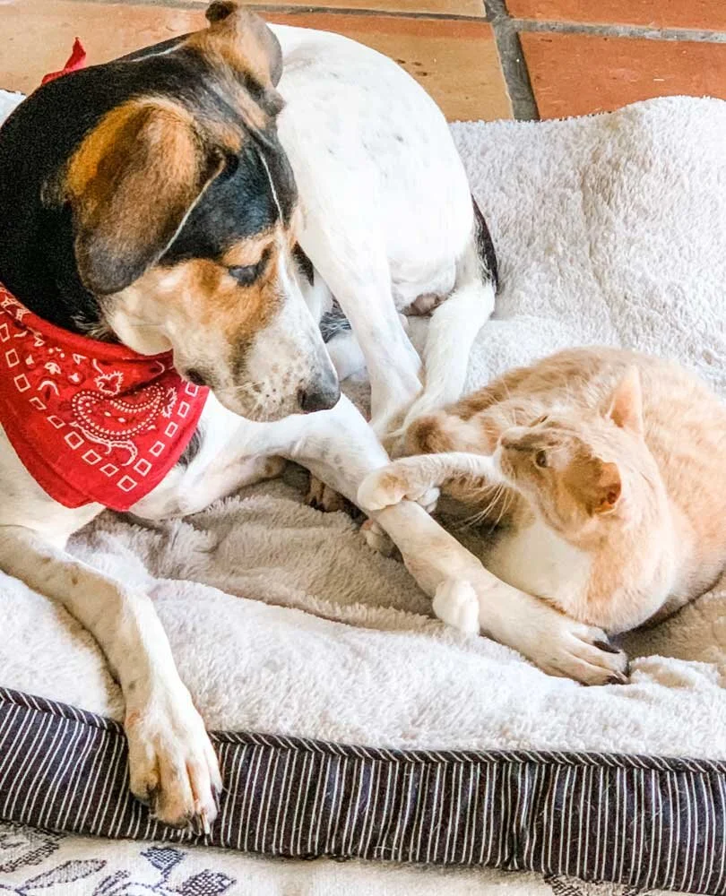
Luna 🐾 and Willow 🐈
It’s also given me the confidence & has emboldened me to make BIG changes in my business, in order to show up for you as a service provider & educator, in my truest form: sarcastic, curse-happy, confident, knowledgeable, and happy to help!
I got SO tired of feeling so sterile & ‘professional.’ The corporate personality I had adopted while being an in-house designer for 10+ years was one I was used to, but it had taken over my business vibe & –I was drowning in it.
No matter what I tried to fix it, it all felt ‘off’ because it wasn’t me. The old Studio 1862 brand was never going to work for the path I wanted to be on.
That said, rebranding for yourself is so tough, especially for designers. Why?!
You’d think, because we have the capability, the software, the hardware, the knowhow, –and yet? It’s still so damn hard.
Why is branding for yourself so much harder?
Ask literally any designer this question. We can all relate!
I began noticing this as I kept tweaking my own brand. Changing colors, swapping brand fonts, …changing colors again. I’d post an in-progress pic or something to get some feedback in Facebook groups where I know a lot of other designers are members, saying ‘branding for myself is so much harder than for my clients––I need some help!’ And I’d always get the same type of comments.
‘Girl, I KNOW!’ or
‘ 🙌🏻’ or
‘I totally agree; I spent months/years on mine!’
On the one hand it made me feel better about the countless changes & iterations I’ve put my own brand through, and on the other I began to wonder why we’re all having this problem?!
Isn’t this what we do?! What makes it so much harder to do this for ourselves, than for our clients?
It came down to 3 main problems:
Problem #1:
my perspective
The grass is always greener; can’t see the forest for the trees, –and all that.
It’s always clearer from the outside looking in, –and we can’t look at our own business from the outside because we’re inside it.
We’re too “in it.”
Getting an outside perspective is nearly impossible to do unless we hand over the business to someone else and brand for them!
It’s one of the main reasons clients hire someone else to do their branding, apart from maybe not having the skill set themselves.
Frequently though, designers rebrand because we do have the skill, but it takes so much more thought & time & effort, etc. to do this without that outside perspective to get us thinking outside the box of how we view ourselves & our business from the inside.
So, I desperately needed to take a step back and look at things more objectively.
What WAS working?
What WASN’T?
What did I love about my business?
What did I hate doing?
What services did I want to keep vs what I wanted to nix?
How did I want to show up for you?
Who did I want to be? What version of myself?
Problem #2:
Shiny-object syndrome
Guilty! 🙋🏼♀️
As a designer, we’re following (if not using, we at least know about) current trends as they develop & get more popular.
We’re usually designing in our own style and sometimes skewed to accommodate the style our client wants.
We see blog posts & graphics published by other designers we follow.
We’re in the design world so we see other bits & pieces & fonts & color palettes we like. And all of us are guilty of sometimes thinking, ‘ooooh, I wonder what my brand would look like in that style/color/font’ etc.'
Now, whether or not we actually change it every time we think that, changes per person & that person’s willpower 😄 or understanding that they need to maintain their brand’s consistency & can’t keep changing their branding so frequently on a whim… Ahem. 🙋🏻♀️
…on a maybe-bizarre side note: where are all the red-headed emojis??!
But if our brand isn’t solid from the get-go, it’s ridiculously easy to get wrapped up in shiny-object syndrome, which I believe is what had happened to me.
Problem #3:
Mindful design choices
I was choosing some things arbitrarily, which didn’t provide a good, solid foundation.
TYPOGRAPHY
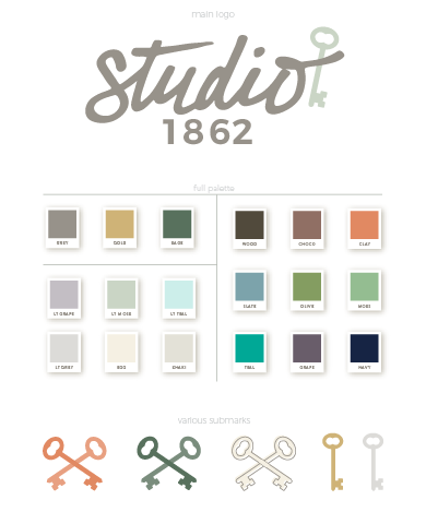
Sure I initially designed my logo using my own handwriting and a simple skeleton key I actually found in our old log cabin when we were moving in.
But while I love and dearly appreciate hand-lettering, it’s not a strong skill that I possess, myself. Yes, I follow Seb Lester (he’ll make any hand-lettering artist or typography nerd jealous!) and appreciate the talent itself, but displaying that kind of hand-lettering in my own logo isn’t representative of my design style at all, even if it being my own handwriting does make it representative of me, in a way.
I don’t offer hand-lettering or calligraphy services, so why was that in my logo?
The fact that it was my own handwriting was cool & unique, but it also made choosing typography difficult since my cursive “Studio” wasn’t a font in itself. Was I going to handwrite and upload a photo of every bit of text I wanted to be in the same “font?” NOPE.
Since I didn’t have that main font available, I cycled through a ton of different options to pair with my logo. And they looked fine, but they never fully sat well with me.
…And then with the renaming of my business from an uppity “Studio” to “Launch the Damn Thing!” the font had to change, AGAIN.
This time I tried to be more strategic with it & picked something unusual and bold. Something with several weights so I can decide how bold I wanted to be, and when.
COLORS
The colors I initially picked, back in 2016 or so, were based on a sunrise or sunset. They were beautiful but it made everything look so feminine & passive.
Also, I’m not a girly-girl. I’m more of a tomboy who loves makeup. I grew up on a hobby farm, rode horses with my Dad, and lived in a log cabin built in 1862, on 15 acres with an orchard on it & next to a neighbor with lots of horses (which sometimes hopped the fence & ended up in our yard) with my husband, 2 cats, 1 hound dog & 5 snakes (that last is his hobby, not mine). 😂
I love earth tones, gem tones, natural and neutral colors. I’ve got a monotone voice (think Daria or Zoey Deschanel, but totally not on purpose), and am generally pretty happy & laid back, while also being a Type A planner (thank you, Enneagram 6!).
It’s an unusual combination, I know. But that’s me!
So, to have my brand use bright, feminine or energetic colors –while fun– were totally not representative of me or what to expect FROM working with me. And I really needed to fix that.
I realized I was breaking all of the design rules...
& ignoring the reasons why we generally abide by them in the first place.
I realized I need to regroup, –badly.
I had tweaked my brand so much that over 5 years it had become nearly unrecognizable and not at all representative of ME anymore.
I wanted to present myself and my business differently. More accurately –and with less of a serious tone, because one thing you’d notice when we talk is that I laugh, A LOT.
So, here you can see the 5 stages of my branding between 2016 and 2020. 🙈😂


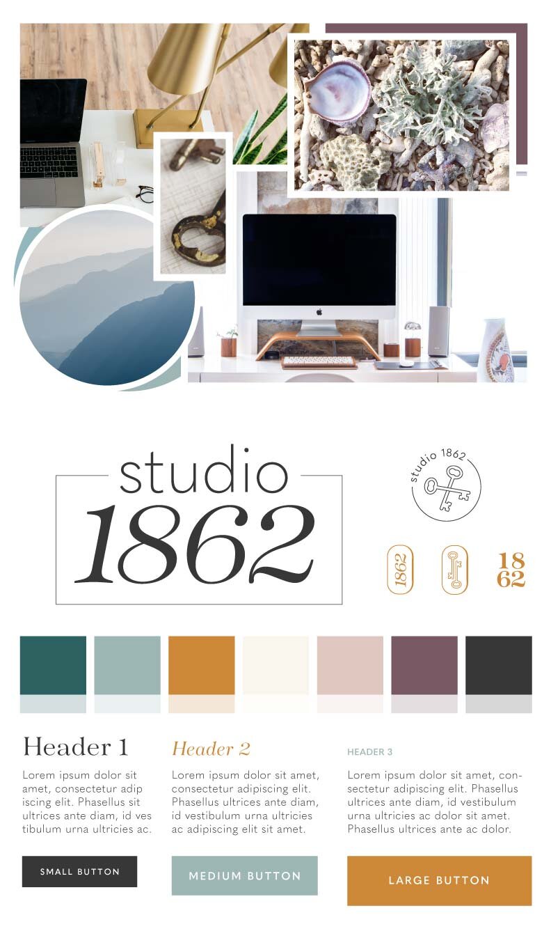

confident, bold, warm & fun
COLORS
I really struggled with the color palette for that. Really struggled.
After a lot of thought, some fantastic feedback to help me narrow it down, from family, friends & other designers, I landed on these five:
an off-white, light khaki bc pure white is too pure & clean; this color is warmer, used & safer to start with
gold, not because it’s trendy but because if handled correctly it can be classy or vibrant, energetic & fun. Also, in real life I have a metal allergy & literally the only metals I’ve found so far that don’t bother me are stainless and anything solid or plated gold (white, rose or yellow)
a calming slate blue-grey, because my patience is seemingly never-ending, my optimism is usually high and my loyalty apparently knows no bounds
a coral-red, because I am a redhead and I wanted something bright, fun and warm, but not terribly feminine. I’m generally not a fan of pink.
a softer black because it’s bold, stark, confident, and can bring class back to a brand with a curse word in it, and
+ darker tones of my main colors for accents
FONTS
For my body copy & buttons I wanted something clean, basic/plain, and that would be legible.
For the main titles & display text, I chose a bold serif typeface that’s very modern, a tad risky, –and very bold.
Both fonts come in many weights & additional styles that will help give me variety when I need it. Having only 2 makes things so much easier to layout my designs.
Next I wanted to choose 1 handwriting style to use as needed here or there for a human-factor & some relatability vibes.
💨 I breathed a sigh of relief
I’ve finally landed on a brand I’m truly proud of, that fits me & my vibe SO much better. I can see that it resonates better with you too, because my website’s traffic patterns have almost tripled since LTDT’s launch in Oct, and I get wonderful feedback from you ALL the time!
So I hope you’ll continue to stick around with me as I move into a new season & a new ‘era’ of my business (& my passion)!

Katelyn, here.
I’m the owner, CEO, designer & educator at Launch the Damn Thing, previously Studio 1862.
I love coffee, cursing & carefully laid plans. 😂
Like my vibe? Let’s find a way to work together!
