

3 hacks for overlapping elements across sections –without code
Table of Contents Show

One thing Fluid Engine is really good at is overlapping elements and creating a very collage-like design. Wherever you drop a block is where it stays on the grid, until the design resizes/rearranges for mobile view.
But still, one question I get a lot is, “how can I make it look like something in one section is overlapping the section next to it?" And what is the code?”
It’s a fair question because we used to need custom code for that kind of repositioning, in the early versions of Squarespace with Classic Editor, on both the initial version of 7.1 and its predecessor on 7.0.
But you actually don't need code anymore to create the same effect in Fluid Engine. And I'm going to show you how to do it yourself, in today’s video!
It's not actually a trick statement, but it is considered a Squarespace hack. You just have to get a little bit creative.
Luckily, it’s an easy thing to do, so this will be a very short tutorial –and I know you're excited about that!
Let’s take a look…
ℹ️ Note:
This tutorial is a visual how-to with screen sharing, so the video will work best as a teaching tool today. If you prefer to read instead, you can find the transcript below or follow along with the closed captions in the video.
watch the tutorial
3 ways to overlap blocks across section borders without writing Custom CSS
I'm actually going to use a client site to show you that you don't need code to do something like this, in a design that’s already established. Don’t worry, I checked with her first & she doesn't mind being featured. 😉
First and foremost though, 2 of these 3 methods are hacks –i.e.: ways to FAKE the section overlap convincingly– because I believe that not everything NEEDS a coded solution and any time we can figure out a way to achieve the same effect WITHOUT adding custom code, it’ll be in your favor.
Why? Because custom code needs to be managed and maintained by someone; with Squarespace constantly improving their platform, updating their base code periodically over time (but not our customized code), our custom-coded solutions may “break” or stop working when Squarespace’s developers change the elements our custom code is targeting.
Method ❶
Moving the focal point
❶ PNG + background graphic
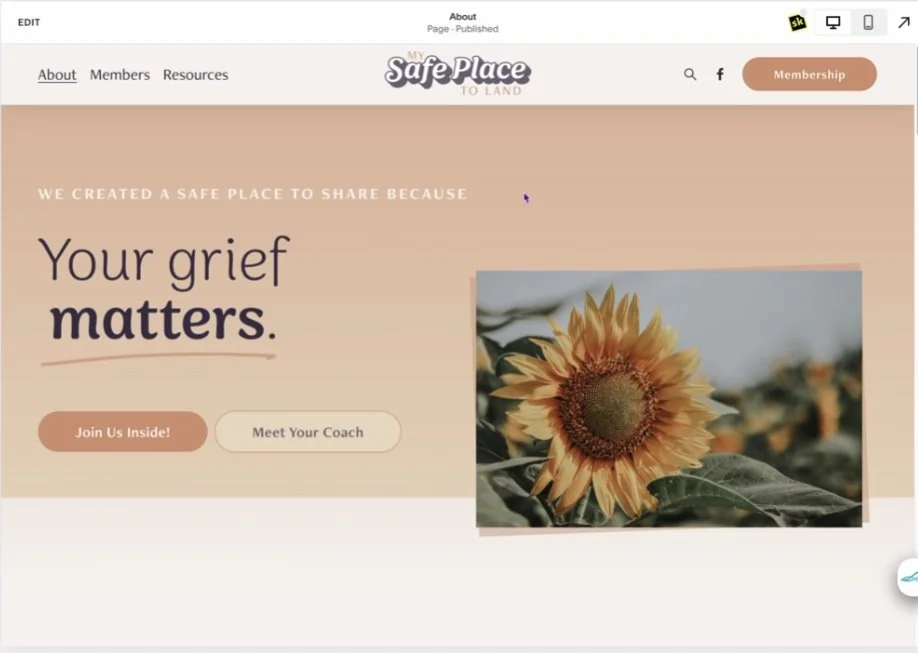
We're actually going to go into her about page, which is a great example of this simple strategy, or this hack.
This is the live site and you can see that line, that section line in the background, is kind of moving just a little bit with the scroll speed.
And that is because I've designed a background graphic in Canva. So if we go and edit background, you can see most of the background is the brand peach color, but the bottom is her branded off white color. And I've moved the focal point down to the bottom center so that I can force the section to focus and crop down to the bottom half of this graphic.
So if I wanted the background to be only peach, I can move the focal point further up, but I actually want that line to show here.
I've also applied an image of fact so that I can get that parallax, that we loved so much in 7.0. I've turned that on, customized the sliders just a little bit.
Then on top of that background graphic we uploaded in the Section settings, I added an image block into the section grid. I applied the shadow to the image in a Canva design before downloading the graphic, then moved that image down to the bottom of the section.
You can see the image boundary of this element is touching the bottom of the section boundary in the screenshot below:
Placing the image at the very bottom edge of the section
Turn OFF the Fill Screen option in Section Settings
In order to get the image so close to the edge, we need to go into the Section Settings and turn off the fill screen option. The fill screen option will give you additional padding (space) on the top and the bottom of the section to help fill the screen for sections with minimal content, with either small, medium, or large padding. It also allows you to align the content inside the editable area of the section to the top, center, or bottom of the section, adding more space to the opposite area in order to push the content in the direction you align it in.
But we actually don't want any padding on the section here because we need to get the image right on the section’s edge. So we turn that off, and that allows us to put any element right up against the bottom of the section.
Next, we just have to make sure the background color at the bottom of the Canva graphic matches the background of the Color Theme in the next section below it.
If I’ve moved the image down to the bottom and I have the focal point on the bottom of the background graphic I designed in Canva, and both have matching colors at the edge of the sections, it actually makes it look like the image is overlapping the next section, even though it isn’t.
This is the first good example of an alternative option that you can do yourself with no code that makes it look like the element(s) are overlapping section borders.
PRO TIP:
You can also apply an animated parallax effect to the background with the background Image Effect Settings for some extra movement as the user scrolls through the design.
❷ PNG graphics + Image Block as background
Both Example 1 and 2 are essentially the same, but using different color combinations and different types of graphics to overlap the image in the background.
Method ❷, Example 1
example 1
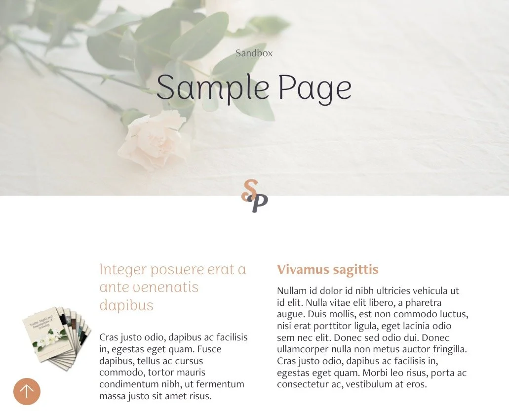
On this sample page, we have a blank section. With an image that spans the full width of the section. We've just dragged that image all the way to the left and right edges of the section until it snaps to the far edges of the screen and we've drug it all the way to the top of the section to fill the space we want from edge to edge.
I've adjusted the section settings to turn off that fill screen option again.
Then I’ve added an image block with a PNG graphic of the guide booklet which has a transparent background; this is another graphic created in Canva with applied shadows inside the Canva design before we downloaded the image.
The PNG graphic is laying halfway on top of the solid color background and halfway on top of the image block acting as a section background, which makes it look like the image is overlapping a background section and onto the following section.
This method works a bit differently than the first, but achieves the same effect, showing off Fluid Engine’s flexibility!
Since we have the image overlay color options now, when we have an image in here, we can go to design and turn on the overlay, choose a color, and adjust the opacity of the color overlaying the image, in order to do an effect like this, without having to create the background graphic in Canva, like we did in the other page.
Image Block - overlay color settings
adding sections underneath
Now, we could add a new blank section and if I add a shape block here, I could extend that block, the full width of the section, dag it up so that it touches the image, and move this to the front.
Then, if we change the color theme of the section beneath it to be the same color we made the shape block, we can make it look like this image is overlapping the section below it in a different color combination. Right?
Use a combination of image blocks, shape blocks, and section colors to achieve an overlapped look without it actually overlapping the section. You’ll be able to get really creative with that kind of out-of-the-box thinking!
Method ❷, Example 2
example 2
In the same sandbox space, I've created a very basic section layout underneath.
You could apply the same methods to a graphic or logo, a slideshow gallery (for Circle Members with access to that block type), a video, or an image with a shape applied to it (like a circle), and rest that over the same place as our guide booklet graphic in the previous example.
We could add our “SP” graphic (a PNG image with a transparent background) into this top section, then add extra rows to that top section to create blank space under the image block acting as a background image.
Then if we were to change the Color Theme in both sections, making sure the background color matches in the bottom of the top section & in the second section (you may need to adjust the colors in your text boxes, depending on your Color Theme’s settings).
Select everything in the bottom section and move it a bit to help create the illusion that both the “SP” graphic and the contents of the section beneath it are in the same space.
That has the effect that we want.
❸ Position with SquareKicker
If you wanted to literally overlap an element across the border between two sections of the same page, you DO need custom code.
However, you CAN do this without actually writing the code yourself, or sourcing it from elsewhere, copying & pasting it into your site –if you have the right tools!
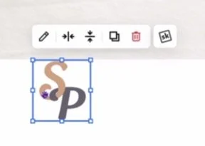
If we go back to square one, either by clicking Undo a bunch of times, or selecting the “SP” graphic, copying, and pasting it into the section below, then deleting it from the top section, we can use SquareKicker to reposition it easily.
SquareKicker is one of my favorite tools to put on 7.1 websites, because it writes the custom code FOR you –among a LOT of other really cool things. 🤩
If you have SquareKicker installed on your website, you'll see that little logo appended to the topmost menu of the preview side of your website while logged into Squarespce,
SquareKicker’s logo appears in top right corner when installed
…or appended to the settings menu for every element you add to the page, which gives you additional styling options that vary between block types.
If you click the SK logo, you’ll get SquareKicker’s menu of options, all of which basically write the code for you as you make changes within the SK menu panel.


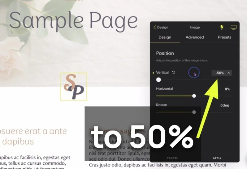
Click on position.
Then you can use the slider for Vertical position changes, to adjust the position of the graphic.
Negative values will pull the image UP, and positive values will push the image DOWN.
If you use a negative percentage, like 25% the image will overlap the topmost border of the section by 25% or 1/4 of the height of the image block.
You're not limited to the values you can access from the slider, though. So if –25% isn’t enough of an overlap for your preferences, just click on the percentage number field, and type in a new value.
For example, a value of –50% will overlap the image block halfway across the top border between both sections.
Click apply and the SquareKicker will save your changes in the custom Code Injection area of your website.
That’s what makes this little plugin mighty! It wrote the code for me, it keeps track of the code for me, and the SK team keeps it updated for me so that with any changes Squarespace’s developers make to the platform, the custom code SquareKicker wrote for me can also be updated & maintained to keep my changes intact.
Now I can ALSO save the page edits in Squarespace, and then I’ll forever and always have that “SP” graphic resting over the border between both of those sections –with code, but without having written it yourself!
Learn more about Squarekicker in these posts too:


final thoughts
That's my short hack for the day! I hope it helps ya get even more creative on your website!
Now you have three different ways to do this yourself, without actually writing, pasting, editing or managing any custom code yourself.
If you've loved today's tip, please leave a comment below, and make sure you like and subscribe to keep supporting my blog & YouTube channel so I can keep creating awesome content for you!
If you have an idea for a future tutorial, make sure you leave a comment below, because I do love getting your feedback and I can't wait to hear what you have to say.
